Vibrant colors and symbolism in The Hunger Games German cover
•
0 gefällt mir•181 views

This document summarizes and compares the cover design of the German version of The Hunger Games book to the American version. It notes that the German cover has a more complex and cluttered design than the simple American cover, featuring a model with red leaves in her hair and green in her eye against a backdrop of the book's German title in large text. Unlike the American cover, the Hunger Games logo is not featured prominently. The vibrant colors on the German cover are said to represent themes from the book like fire and rebellion.

Empfohlen
Weitere ähnliche Inhalte
Was ist angesagt?
Was ist angesagt? (17)
Ähnlich wie Vibrant colors and symbolism in The Hunger Games German cover
Ähnlich wie Vibrant colors and symbolism in The Hunger Games German cover (20)
Mehr von Aaron Newbigging
Mehr von Aaron Newbigging (20)
Vibrant colors and symbolism in The Hunger Games German cover
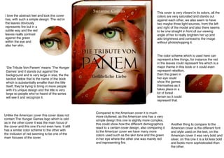
- 1. I love the abstract feel and look this cover has, with such a simple design. The red in the leaves obviously represents fire but in a subtle way and the red leaves really contrast against the green within the eye and also her skin. ʻDie Tribute Von Panemʼ means ʻThe Hunger Gamesʼ and it stands out against the background and is very large in size, the the section below that is the name of the book which is substantially smaller than the title itself, theyʼre trying to bring in more people with itʼs unique design and the title is very large so people whoʼve heard of the series will see it and recognize it. Unlike the American cover this cover does not contain The Hunger Games logo which is odd as in the other cover it was the main focus of the cover and this one itʼs not even here. It still has a similar color scheme to the other with the inclusion of red seeming to be one of the main focuses of the cover. This cover is very vibrant in its colors, all the colors are very saturated and stands out against each other, we also seem to have two maybe three light sources, from the left and right of the model and also there seems to be one straight in front of our viewing angle of her to really brighten her up and add brightness and contrast to the image without photoshopping it. The color scheme which is used here can represent a few things, for instance the red in the leaves could represent fire which is a major theme in this book or it could even represent rebellion, then the green in her eye could show the games themselves as it takes place in a lot of forest terrain so it could represent that. Compared to the American cover it is much more cluttered, as the American one has a very simple design this one is slightly more complex, this could show how the different demographics react to a certain cover design, also comparing it to the American cover we have many more colors used such as the skin tone and the green in her eye where the other one was mainly red and representing fire. Another thing to compare to the American cover is the different font and style used on the text, on the American cover it was very bold and silver, on this one it is a lot less bold and looks more sophisticated than the other.