SlideShare ist ein Scribd-Unternehmen logo
1 von 3
Looking at the three pages it is evident that all 3 pages have the same colour scheme being applied to it of yellow, black and white. This is part of their house
style and this contributes towards brand recognition. The magazine itself comes across to be quite messy and loud yet it is actually quite organised. The
masthead appears to have a ‘shattered glass’ effect on it and it has the slogan too ‘Life is loud’ which is onomatopoeic and suggests the music that the
magazine covers. The messy and loud look that Kerrang! have relates to their target audience of rockers and it gives the magazine a very formal approach.
The main title on the front cover is the unique selling point of this magazine and entices readers to buy this issue. Next to the title there are some pictures
which are separated into a yellow column. These pictures relate to the title and suggest that they have some kind of involvement. Looking at the contents
page in the middle the colour scheme is being used quite effectively yet on the inside the magazine doesn’t seem to be as messy and loud. I think as well the
colours help to draw you into the most important pieces of
In my magazine I will have to consider the different types of font that I can use in my magazine so that it appeals to my niche market.
Beneath I will show a range of different possible fonts that I could use which I think would look good for my target audience. With these
fonts, I’m hoping to pick a dazzling font and place a splatter of paint behind it so it appeals to the target audience, as people associate them
as being messy and that they like bright colours.
I think this font could be applicable because it’s neat yet it still looks
rather funky relating to my target audience.
I think this font is quite good because it has a rough look to it and relates
to the grungy rock side of my niche market.
I think this font would look could because it’s very statement-
like and would look could with bright colours applied to it.
However the spacing between the ‘o’ and the ‘w’ is quite large
and makes it look like there are two separate words.
I think this font is quite easy on the eye yet it seems to be quite
girly and angelic which wouldn’t appeal to me target audience.
I think this font is okay because it’s not the neatest and may appeal to
my target audience, however it looks too plain.
I think this font is really quite appealing especially for the target
audience as it has that messy effect to it with the splatters too
and it relates directly to their fashion and personalities.
This font is also quite good because it is really easy to read
and looks quite childlike but also it will appeal to the
target audience as it similar to graphics that are put onto
their typical clothing.
This font isn’t too bad as again it’s easy to read and would look good
with the splatter behind it. However, some may think this font is quite
plain.

Weitere ähnliche Inhalte

Empfohlen

How Race, Age and Gender Shape Attitudes Towards Mental Health
How Race, Age and Gender Shape Attitudes Towards Mental HealthHow Race, Age and Gender Shape Attitudes Towards Mental Health
How Race, Age and Gender Shape Attitudes Towards Mental Health
ThinkNow
 
Social Media Marketing Trends 2024 // The Global Indie Insights
Social Media Marketing Trends 2024 // The Global Indie InsightsSocial Media Marketing Trends 2024 // The Global Indie Insights
Social Media Marketing Trends 2024 // The Global Indie Insights
Kurio // The Social Media Age(ncy)
 

Empfohlen (20)

2024 State of Marketing Report – by Hubspot
2024 State of Marketing Report – by Hubspot2024 State of Marketing Report – by Hubspot
2024 State of Marketing Report – by Hubspot
 
Everything You Need To Know About ChatGPT
Everything You Need To Know About ChatGPTEverything You Need To Know About ChatGPT
Everything You Need To Know About ChatGPT
 
Product Design Trends in 2024 | Teenage Engineerings
Product Design Trends in 2024 | Teenage EngineeringsProduct Design Trends in 2024 | Teenage Engineerings
Product Design Trends in 2024 | Teenage Engineerings
 
How Race, Age and Gender Shape Attitudes Towards Mental Health
How Race, Age and Gender Shape Attitudes Towards Mental HealthHow Race, Age and Gender Shape Attitudes Towards Mental Health
How Race, Age and Gender Shape Attitudes Towards Mental Health
 
AI Trends in Creative Operations 2024 by Artwork Flow.pdf
AI Trends in Creative Operations 2024 by Artwork Flow.pdfAI Trends in Creative Operations 2024 by Artwork Flow.pdf
AI Trends in Creative Operations 2024 by Artwork Flow.pdf
 
Skeleton Culture Code
Skeleton Culture CodeSkeleton Culture Code
Skeleton Culture Code
 
PEPSICO Presentation to CAGNY Conference Feb 2024
PEPSICO Presentation to CAGNY Conference Feb 2024PEPSICO Presentation to CAGNY Conference Feb 2024
PEPSICO Presentation to CAGNY Conference Feb 2024
 
Content Methodology: A Best Practices Report (Webinar)
Content Methodology: A Best Practices Report (Webinar)Content Methodology: A Best Practices Report (Webinar)
Content Methodology: A Best Practices Report (Webinar)
 
How to Prepare For a Successful Job Search for 2024
How to Prepare For a Successful Job Search for 2024How to Prepare For a Successful Job Search for 2024
How to Prepare For a Successful Job Search for 2024
 
Social Media Marketing Trends 2024 // The Global Indie Insights
Social Media Marketing Trends 2024 // The Global Indie InsightsSocial Media Marketing Trends 2024 // The Global Indie Insights
Social Media Marketing Trends 2024 // The Global Indie Insights
 
Trends In Paid Search: Navigating The Digital Landscape In 2024
Trends In Paid Search: Navigating The Digital Landscape In 2024Trends In Paid Search: Navigating The Digital Landscape In 2024
Trends In Paid Search: Navigating The Digital Landscape In 2024
 
5 Public speaking tips from TED - Visualized summary
5 Public speaking tips from TED - Visualized summary5 Public speaking tips from TED - Visualized summary
5 Public speaking tips from TED - Visualized summary
 
ChatGPT and the Future of Work - Clark Boyd
ChatGPT and the Future of Work - Clark Boyd ChatGPT and the Future of Work - Clark Boyd
ChatGPT and the Future of Work - Clark Boyd
 
Getting into the tech field. what next
Getting into the tech field. what next Getting into the tech field. what next
Getting into the tech field. what next
 
Google's Just Not That Into You: Understanding Core Updates & Search Intent
Google's Just Not That Into You: Understanding Core Updates & Search IntentGoogle's Just Not That Into You: Understanding Core Updates & Search Intent
Google's Just Not That Into You: Understanding Core Updates & Search Intent
 
How to have difficult conversations
How to have difficult conversations How to have difficult conversations
How to have difficult conversations
 
Introduction to Data Science
Introduction to Data ScienceIntroduction to Data Science
Introduction to Data Science
 
Time Management & Productivity - Best Practices
Time Management & Productivity -  Best PracticesTime Management & Productivity -  Best Practices
Time Management & Productivity - Best Practices
 
The six step guide to practical project management
The six step guide to practical project managementThe six step guide to practical project management
The six step guide to practical project management
 
Beginners Guide to TikTok for Search - Rachel Pearson - We are Tilt __ Bright...
Beginners Guide to TikTok for Search - Rachel Pearson - We are Tilt __ Bright...Beginners Guide to TikTok for Search - Rachel Pearson - We are Tilt __ Bright...
Beginners Guide to TikTok for Search - Rachel Pearson - We are Tilt __ Bright...
 

Kerrang Analysis & Possible Fonts

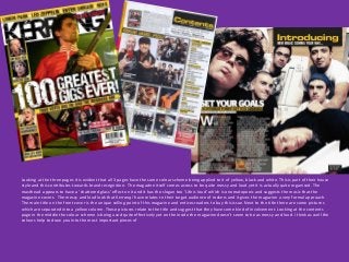
  • 1. Looking at the three pages it is evident that all 3 pages have the same colour scheme being applied to it of yellow, black and white. This is part of their house style and this contributes towards brand recognition. The magazine itself comes across to be quite messy and loud yet it is actually quite organised. The masthead appears to have a ‘shattered glass’ effect on it and it has the slogan too ‘Life is loud’ which is onomatopoeic and suggests the music that the magazine covers. The messy and loud look that Kerrang! have relates to their target audience of rockers and it gives the magazine a very formal approach. The main title on the front cover is the unique selling point of this magazine and entices readers to buy this issue. Next to the title there are some pictures which are separated into a yellow column. These pictures relate to the title and suggest that they have some kind of involvement. Looking at the contents page in the middle the colour scheme is being used quite effectively yet on the inside the magazine doesn’t seem to be as messy and loud. I think as well the colours help to draw you into the most important pieces of
  • 2. In my magazine I will have to consider the different types of font that I can use in my magazine so that it appeals to my niche market. Beneath I will show a range of different possible fonts that I could use which I think would look good for my target audience. With these fonts, I’m hoping to pick a dazzling font and place a splatter of paint behind it so it appeals to the target audience, as people associate them as being messy and that they like bright colours. I think this font could be applicable because it’s neat yet it still looks rather funky relating to my target audience. I think this font is quite good because it has a rough look to it and relates to the grungy rock side of my niche market. I think this font would look could because it’s very statement- like and would look could with bright colours applied to it. However the spacing between the ‘o’ and the ‘w’ is quite large and makes it look like there are two separate words. I think this font is quite easy on the eye yet it seems to be quite girly and angelic which wouldn’t appeal to me target audience.
  • 3. I think this font is okay because it’s not the neatest and may appeal to my target audience, however it looks too plain. I think this font is really quite appealing especially for the target audience as it has that messy effect to it with the splatters too and it relates directly to their fashion and personalities. This font is also quite good because it is really easy to read and looks quite childlike but also it will appeal to the target audience as it similar to graphics that are put onto their typical clothing. This font isn’t too bad as again it’s easy to read and would look good with the splatter behind it. However, some may think this font is quite plain.