Call Girls Manjri Call Me 7737669865 Budget Friendly No Advance Booking
Analysing Magazine Articles
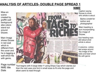
1. ANALYSIS OF ARTICLES- DOUBLE PAGE SPREAD 1 NME Mise en scene created by graffiti wall background also colurs stand out around Dizzee. Main Image shows Dizzee in red coat which is different from the cover and he is tagging a wall which fits with genre. Page number NME title Date Byline (credit for author and photographer Sub heading says abit about what article is about. Main heading is pun incorporating the image of Dizzee. 4 columns –notice text wraps around the image of the radio and beer which fits with genre Caption saying Dizzee to show who article is about Text begins with A large letter Y using Drops Cap which stands out then the rest uses one font in small sizes to fit onto the page and allow users to read through
2. Analysis of written article The article itself is basically about Dizzee Rascals rise to fame and how he went from the streets to stardom. The style of the article is laid out in a neat way with the headline in a uneven font showing that he is part of a hip hop genre which doesnt fit with all rules. It is written in 4 short columns each of approx75-100 words so they are not too long to read and interest the reader. The main heading/headline is quite dramatic and in large bold text to stand out so readers can instantly find out what the article is about.
3. ANALYSIS OF ARTICLES- DOUBLE PAGE SPREAD 2 Main image is Of lead singer Of band in a Medium shot. He has tattoos And piercings Which fit with Genre. Headline is in pink And white text on A black backgrou- nd to stand out With occasional Words in pink to Break typical rules And conventions. Text is black to Stand out in 3 Columns for easy Reading. Background is A simple grey With white lights Around to Suggest fame & Stardom.
4. Analysis of written article 2 The main article looks at a basic interview With the lead singer of the rock/metal band AFI. There are quotes extracted from the text And placed in the headline. The headline is in bold text but with different Font sizes which goes against standard rules Which is the same as the genre also the Different colours of text do the same thing. It is in 3 longer columns with headings for each Question allowing readers to read along with The article at their ease.
5. Analysis of double page spread 3 x Side note gives Information about Other articles Featured in other Parts of the Magazine. The Colours fit in with The rest of the Page allowing Reading ease. Main image is Of the band And takes up All of the left Hand side of The page. It is A group shot of The members Of the band. Small Q+A With the band In the bottom Corner to show readers A little bit more than they Would normally find out. 2 columns with text black on white Allowing it to stand out and be easily Visible to the reader.
6. Analysis of written article 3 x The article is basic knowledge of the band Giving us a bit of background information on Them. It is divided into 2 columns and starting the Paragraph with a drop caps 'T' to show where The paragraph starts. The colours fit in well With the rest of the page by using white, black And blue. Headline is blue background with black large Text to stand out to readers and simply reads 'The Teenagers' which is the name of the band Featured.