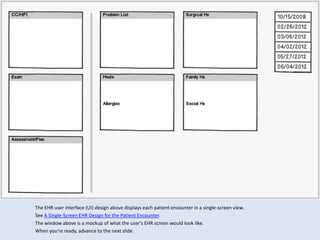
This document summarizes a single-screen electronic health record (EHR) user interface design that displays all information for a patient encounter together. Key aspects include:
- Each category of data like assessment and plan is assigned a fixed pane on the screen for consistency.
- Navigation between encounters is by selecting the encounter date from a sorted list.
- Changed information since the previous encounter is blue while unchanged data remains black for emphasis.
- The design aims to show the patient's medical history and context as a narrative that unfolds over multiple encounters in a single screen.
1. The EHR user interface (UI) design above displays each patient encounter in a single-screen view.
See A Single-Screen EHR Design for the Patient Encounter.
The window above is a mockup of what the user's EHR screen would look like.
When you're ready, advance to the next slide.
2. Each category of data is assigned to a pane of fixed location on the screen – for instance, the Assessment and Plan
is displayed in the pane on the bottom left.
This design is similar to that of a chart note recorded on a paper form (see Why T-Sheets Work), except that the
panes, the data fields within those panes, and the elements within the data fields can all expand to display more
information on demand (see A Single-Screen Design and Pane Management -- Part 1).
3. Navigation from one encounter (for instance, an office visit) to another is accomplished by selecting the date
of the encounter in the date-sorted list at the upper right of the screen.
Each screen is a snapshot, capturing the patient’s story as it existed at the time of that visit.
4. In this design, information that has changed since the previous exam is indicated by the color blue, while
unchanged information is shown in black. A different visual channel, such as contrast (gray vs. black text) or
shape (different fonts) could have been used instead.
In order to get a sense of how the user would experience this design, first study the screen mockup, then read
the notes here, and then return to the mockup before advancing to the next slide.
5. This is the story of an elderly woman who had been followed for years for mild glaucoma in her right eye (OD).
While previous encounters exist, for this demo we begin with her office visit of 10/15/2008 (selected above).
We see that in 2008 the patient’s eye pressure is well controlled on Alphagan drops, that her visual field and
optic disc (optic nerve head) are normal, and that she is planning to move to Florida.
Step through the subsequent slides at your own pace, taking enough time to see the narrative unfold.
6. The next time we see this patient is more than three years later. The information is mostly self-explanatory.
Like many patients, she had not been consistently taking all of her medications, in this case Alphagan drops for
glaucoma of her right eye (OD). Her pressure of 31 is too high for her optic disc, which shows damage to the
lower (inferior) half. The cross-hatching in the upper (superior) half of her visual field indicates loss of vision in
that region, corresponding to the damage inferiorly to her optic disc.
7. Note that information unchanged from the previous exam is less prominent both because the font color is
black and because it can usually be displayed in exactly the same location on the screen, meaning that
attention is not drawn to it.
8. The single-screen design, showing all categories of information for a patient encounter, can help the clinician take
care of whole patient. We see that this patient’s daughter was recently diagnosed as a glaucoma suspect, suggesting
yet another cause for anxiety, both for the patient and for her family. Because the family and social history are
included in a single-screen view, it’s easier for the clinician to keep in mind and address the emotional and social
aspects of a patient’s disease in addition to managing the medical aspects.
9. Major changes or values that are markedly out of range can be emphasized by using a different visual cue -- in
this case, by making the font color red.
10. Note that in this snapshot-in-time design, the whole concept of “copy-and-paste” (or more accurately,
“carry-forward”) takes on a different meaning. In this design, unchanged information carried forward from
the previous encounter should not be thought of as a barely-tolerated expedient, but rather as an integral
design element. The unchanged information is the counter-balance against which all new information is
weighed.
11. This is the last slide.
In my next post I will show the more common EHR design solution for presenting longitudinal data – a
summary screen of current information with date-sorted lists for past information.
I look forward to your comments and suggestions.