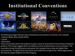
1. The following images all have many institutional conventions in common. For example:
• Colours: Black, Blue, Gold & White
• Clouds
• Mountains
These conventions allow the audience to get a sense of what kind of movie these companies
produce. The clouds suggest that it is related to some celestial factors such as dreams . The
mountains reveal the dominance and power the company has as they are higher than
everyone else. The gold shows the power and wealth the company has. These logos attract
the specific target audience for the company.
2. Warner Bros. Entertainment Inc., formerly known as Warner Bros. Studios is an
American producer of film, television and music entertainment. One of the
major film studios, it is a subsidiary of Time Warner. The industry was founded in
1923 by the Warner family. (Source From: Wikipedia)
As you can see the image is of a emblem representing Warner Bros. Pictures, in the
background there are clouds which could symbolise that the company is higher than
everyone else and the dominance they have. Furthermore, the golden shield could
represent how strong and almighty the company is which attracts the target
audience. The colour gold is a rich powerful colour which connotes the power and
authority the company has.
3. Twentieth Century Fox Film Corporation also known as 20th Century Fox, or 20th century
Fox Pictures, is one of the six major American film studios. The studio used to be a
subsidiary of News Corporation, but now it’s currently of 21st Century Fox. The company
was founded on May 31st 1935, the founders of the company are Joseph M. Schenck and
Darryl F. Zanuck. The subsidiaries are Blue Sky Studios and Fox Star Studios. (Source From:
Wikipedia)
The image is of a golden statue from a low angle shot which represents the
dominance and from our perspective the upper class the company have. The lights
shining towards the sky represents a stage making the statue look powerful and the
main attraction. The night sky makes the target audience feel cosy and comfortable as
well as the great movies this company produces. The colour gold is a rich powerful
colour which connotes the power and authority the company has.
4. Paramount Pictures Corporation is a film and television production/distribution
studio, consistently ranked as one of the largest film studios. It is a subsidiary of U.S. Media
conglomerate Viacom, Paramount is a member of the Motion Picture Association of America
(MPAA). It has distributed various commercially successful film series, such as
Shrek, Transformers, Kung Fu Panda, Paranormal Activity and so on. (Source From: Wikipedia)
The mountains and clouds in the background suggest that it is high up in the sky which
reveals the power and dominance the company has. The word ‘Paramount’ is on the tip of
the mountain which could suggest that the company has power and authority but also the
success they have as reaching the top of a mountain is a huge achievement. Also to be on the
very top of the mountain shows that they are higher than everyone else and the dominance
the company has. The stars surrounding the top of the mountain suggest the brilliance and
connotes that these types of films are made for nighttimes as well as the kaleidoscopic clear
sky which makes the audience feel comfortable and cosy. The stars could also represent
dreams which could mean that the company is trying to build a great imagination and create
dreams for the target audience.
5. Metro Goldwyn Mayer Studios Inc. Is an American media company, involved
primarily in the production and distribution of films and television programs. Once
the largest and most glamorous of film studios, MGM was founded in 1924 when
the entertainment entrepreneur Marcus Loew gained control of Metro
Pictures, Goldwyn Pictures Corporation and Louis B. Mayer Pictures. (Source From:
Wikipedia)
The roaring lion suggest the sheer power and resilience the company has, to
put a lion as the face of a company shows how almighty and strong the film
production is. The golden film strips twisting away from the lion shows that
the company has the ability to produce great movies especially because the
colour gold is rich and powerful.
6. Columbia Pictures Industries, Inc. Is an American film production and
distribution studio, that is part of the Columbia TriStar Motion Picture
Group, owned by Sony Pictures Entertainment, a subsidiary of Sony
Entertainment. (Source From: Wikipedia)
The image show a women wrapped in unique clothing holding a light whilst
the background explodes with imagination. The kaleidoscopic background
suggest that the statue is high up in the sky which reveals the power and
dominance the company has. The light shows the power and authority the
film production has and promises to produce great films as light connotes
hope.
7. DreamWorks Studios is a California film studio which develops, produces and
distributes films, video games and television programming. It has produced or
distributed more than ten films with box office grosses totalling more than $100
million each. Most of DreamWorks' films are marketed and distributed by The Walt
Disney Studios under its Touchstone Pictures label. (Source From: Wikipedia)
DreamWorks is mostly targeted at children due to the films they have produced and the image
they have created. The image shows a boy sitting on a moon with a fishing net reaching down
onto earth with clouds surrounding him. As the boy is on the moon this suggest that the company
is higher than everyone else and has the power to control the audience’s dreams. The fishing net
reveals that the boy is trying to grab the target audiences minds and create imaginations and
dreams so that they can enjoy the films. The colours suggest that this film production is mainly
effective at nighttimes especially with the moon insight.
8. Universal studios Inc. Is an American motion picture studio, owned by Comcast
trough its wholly owned subsidiary NBCUniversal and is one of the six major movie
studios. Its subsidiaries are Universal Animation Studios, Focus Features and
Illumination Entertainment. (Source From: Wikipedia)
The shining globe suggest that the universe is together, almighty and also
symbolises it is global. The background gleaming with stars reveals that the
films could be interesting and creative. Moreover, the bold writing across the
globe shows the power and authority the company has also the name
‘Universal’ unites the world together and makes the target audience feel safe
and excited.
9. Pixar Animation Studios is an American computer animation film studio based
in Emeryville, California. The studio is best known for its CGI-animated feature
films created with PhotoRealistic RenderMan. Pixar only has one subsidiary
which is Pixar Canada. Pixar has produced fourteen feature films including the
likes of Toy Story, Monster Inc. And The Incredibles. (Source From: Wikipedia)
The image is pretty plain and simple which could suggest that
the company is straight forward. Also the ‘I’ in Pixar is replaced
by a lamp which reveals that the company is very imaginative
and creative and also can interact with their title sequences. The
background colour shows the simplicity the company has.
10. Summit Entertainment LLC is an
American film studio and a
subsidiary of Lions Gate
Entertainment . (Source From:
Wikipedia)
Miramax is an American
Entertainment company known for
distributing independent and foreign
films. Its owner is The Walt Disney
Company. (Source From: Wikipedia)
For Summit Entertainment, the logo shows a outline of a mountain as it
represents the simplicity of the logo. For Miramax Films the bold writing
shows the power the company has and the desperation for attraction.
Both images are similar as they are both plain and simple with the colours
black and white to represent their logos. The simplicity from both
companies could disapprove the audience as their is no creativity or
imagination in both logos.