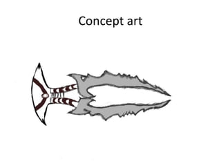
2. Concept art
Firstly I drew my sword by hand. I had to scan it
and then send it to email. I then used pixlr
editing. I added colours via pixlr and fixed my
mistakes and drew over my picture in black. I
chose to draw the sword like this because it is
unique and has 2 blades rather then one. Also It
is larger then life which shows that it is a
photorealistic graphic style, which the graphic
style of my game.
3.
4. Concept art 2
• I went on pixlr.com and opened up my sketch
from my computer, I firstly went over my
sketch with a black ‘’plain’’ brush which added
a great sizzling effect to the lines. I then added
different shades of grey throughout the blades
which made it appealing to the eye, also the
colour scheme is realistic as most swords are
grey/silver. I used the brush tool of sketch, this
added a faded effect on each sharp end of the
sword, which made the sword look dangerous
and it also made the sharp ends stick out.
5. Concept art 3
• I then focused on the handle of the sword, I
added brown as it was different from other
swords which I have seen online. I used the
bucket tool to fill in the blade grey, I then
added different tints of grey to make it stand
out more. I used a light tint of grey for the
inside of the blade, I then used a darker tint to
go over the outline of the blade. I did this
because I didn’t want my colours to be simple,
so I used many different shades of grey.