
Empfohlen
Weitere ähnliche Inhalte
Was ist angesagt?
Was ist angesagt? (19)
Andere mochten auch
Ähnlich wie Kent Life Analysis October 2011
Ähnlich wie Kent Life Analysis October 2011 (20)
Mehr von harrygoldsmithmedia
Mehr von harrygoldsmithmedia (16)
Kürzlich hochgeladen
Kürzlich hochgeladen (20)
Kent Life Analysis October 2011
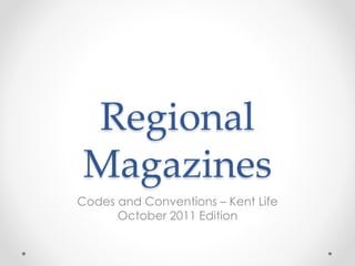
- 1. Regional Magazines Codes and Conventions – Kent Life October 2011 Edition
- 2. The magazine Kent Life, October 2011 edition produced by Archant has a white title. This is used in every Kent Life magazine, and allows it to stand out on the page. The reader would recognise the magazine clearly, and by using the word Kent in the name, they are making it clear the topic of the magazine. By using a white colour, they are allowing the text to stand out on the page by contrasting against the background.
- 3. They have put the Archant logo in the top left corner. They brand the magazine in this way as it is a recognisable logo. This increases the chance of someone buying it if they have read a similar Archant magazine before. They make use of white text across the cover to allow the sell lines stand out from the background. By using the colour white they are creating a connotation of purity and innocence, suggesting that the magazine is something appropriate for all, giving an impression of a ‘nice’ magazine.
- 4. They have used a mixture of white and orange text. The orange blends in with the mainly orange background of the magazine. The use of this background gives the reader a key idea of the topic of the magazine. In this case the main cover line is regarding ‘The birds and the bees’, creating a clear correlation between the background and this. The background is designed to be eye catching, to attract the readers attention. If someone is interested in plants, or bees then they would see the front cover and identify the magazine as something of interest to them.
- 5. The main cover line is coloured white with an orange “&”. By using these colours and a more traditional font they are allowing it to stand out from the background. By using the orange they are tying it in to create a colour scheme on the magazine. They have followed this house style throughout the other sell lines on the page, however they have used a standard serif font to distinguish these from the main cover line.
- 6. The use of a second image at the bottom of the page, gives the reader a glimpse into the magazine and it’s topics without having to open it and start reading. Key Codes and Conventions: • Title gives clear idea of topic • Background of landscape from region • White text, makes background contrast • Mixture of serif and traditional fonts • Additional picture to show glimpse of topics • Clear correlation to region
- 7. This page is a double page spread advert from the Kent Life Magazine. This shows an advert for Padani jewellery store in Royal Tunbridge Wells. An image takes up the entire page, with a vacant looking female. Females are usually used to advertise jewellery as it is considered something the customer could relate to. The woman in the image is wearing lots of jewellery which connotes to the reader what the product is.
- 8. Although the woman is wearing the jewellery, it is not clear without reading the text on the advertisement what the product is. By using the white text on the image, they are allowing the text to stand out from the background. They have used logos from different jewellery makers, which makes it more recognisable by those interested. The use of this double page spread, gives more coverage for the advert.
- 9. The contents page in this magazine also takes up a double page spread. They have opted for an orange colour scheme. This could be because the month this issue covers is October, an Autumnal month and orange is usually associated/connotes in the readers mind autumnal feelings/haloween. The contents page has the content divided between the different topic areas, e.g. News, Home and Garden and Food and Drink.
- 10. By doing this they have made it easier for the reader to identify those topics of interest to them –which also makes the magazine more personal to them. Most topics are regional areas related, again giving the magazine a regional feel. They have used a mixture of traditional and modern typeface, to fit in with the house style of the Kent Life magazine. At the top of the page, they encourage the reader to subscribe to this magazine.
- 11. Around the page there are images from certain topics, this promotes the topic and encourages the reader to read that specific one. This also adds more colour into the page and makes it more interesting to look at for the reader. At the side of the double page spread, they have made use of a personal statement saying why they have subscribed to the magazine, again encouraging readers to do so themselves.