
Empfohlen
Empfohlen
Weitere ähnliche Inhalte
Mehr von gwsis
Mehr von gwsis (20)
Kürzlich hochgeladen
Kürzlich hochgeladen (20)
Five activities answers
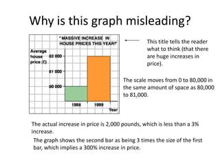
- 1. Why is this graph misleading? This title tells the reader what to think (that there are huge increases in price). The scale moves from 0 to 80,000 in the same amount of space as 80,000 to 81,000. The actual increase in price is 2,000 pounds, which is less than a 3% increase. The graph shows the second bar as being 3 times the size of the first bar, which implies a 300% increase in price.
- 2. A more accurate graph: An unbiased title A scale with a regular interval. This shows a more accurate picture of the increase.
- 3. Why is this graph misleading? The scale does not have a regular interval.
- 4. What does the top of this graph show? •About 12 million people are downloading music legally. •Just over 9 million people are downloading music illegally. The bottom of the graph is misleading. Why? •The graph implies that 1% of the iPods are filled with legally downloaded music. •It implies that the other 99% are filled with illegally downloaded music. Why is this wrong?
- 5. More information: • The iPod graphic appeared in Wired magazine. • A quote from the article: “What’s filling all that excess capacity? Well, despite the efforts of the Recording Industry Association of America, nearly a billion songs are traded on P2P networks every month.” • This article was trying to imply that all of the excess space is filled with illegal downloads, which is likely untrue. • The statistics for the article were provided by the music industry.
- 6. What could be in those iPods besides legally downloaded music? • Empty space – most people don’t have iPods that are filled to capacity. • Songs that were added from legally purchased CDs. • Games, calendars, other applications. • Songs that were downloaded illegally. It is possible that the rest of the iPod contains some illegally downloaded music, but it is unlikely that 99% of a person’s iPod is filled with illegal music.
- 7. Of course, there are many different ways to lie with statistics, and now we’ll show you how it can be done with a pictograph. Of course, there are many different ways to lie with statistics, and now we’ll show you how it can be done with a pictograph. The most deceptive aspect of this graph is the way in which it was drawn. Firstly, the perspective puts barrel 1979 at the forefront and barrel 1973 at the back. This effectively draws reader’s eyes to the 1979 barrel first and then forces him read the rest of the years in descending order. Supporting this deceptive tactic is the fact that only the foremost barrels have complete year to read. The rest are indicated with only the last two digits, as in ‘76. Obviously, the makers of the graph intend for the audience to read in reverse chronological order, which has the effect of making oil prices seem to fall.
- 8. Of course, there are many different ways to lie with statistics, and now we’ll show you how it can be done with a pictograph. Secondly, the perspective makes it hard to judge the numerical difference between each barrel. For example, even though barrel 1975 appears to be over two thirds the height of 1976, in reality, the difference between them is only $0.95. Likewise, barrel 1973 seems less than half the height of 1974, yet they differ by a whopping $8.54! the effect of making oil prices seem to fall.
- 9. Of course, there are many different ways to lie with statistics, and now we’ll show you how it can be done with a pictograph. A third misleading aspect is that this pictograph doesn’t contain a scale or axis’ of any kind. Without it, the reader’s attention might be directed to the area of each barrel instead. Numerically, the smallest barrel should only be about one 1/5 of the largest barrel, but in terms of area, the ratio is about 1/25. This makes the different between the two much larger than it actually is.
- 10. Of course, there are many different ways to lie with statistics, and now we’ll show you how it can be done with a pictograph. Lastly, the way in which the barrels are labeled seem somewhat awkward. Shouldn’t the prices be on the barrel instead of years? Prices written on the barrel will clarify that it is the cost that is changing, not the years. And with more space to indicate years, readers won’t be forced to read in reverse.
- 11. Price per barrel of crude oil leaving Saudi Arabia on Jan. 1 $14.00 $12.00 $10.00 $8.00 Price $6.00 $4.00 $2.00 $0.00 1973 1974 1975 1976 1977 1978 1979 Year This graph neatly depicts the steadily rising prices of crude oil, and shows sudden rises or drops. Each bar represents a number by its height without using fancy images to distract the reader. The presence of the x and y-axis’ also make it much more organized. While the original graph tended to overstate small differences and gloss over wide gaps, this graph is much more honest. One can see that the largest rise occurs between 1973 and 1973, and that it continues to rise by smaller amounts steadily over the next five years. The years on the x-axis are all clearly marked in chronological order as well so that it is easy for readers to understand.
- 12. For this type of information, using a line graph may be even more useful than a bar graph. With a line to define the rise of fall of oil prices, it is all the more obvious what the shape of the changing rates look like. This graph even seems to accentuate the huge rise between 1973 and 1974. The biggest benefits of a using a line graph, however, lies in the fact that each point is marked with small, accurate dots. These are much easier to read than bars, and the line between them outlines the contour of the rise. Price per barrel of crude oil leaving Saudi Arabia on Jan. 1 $16.00 $14.00 $12.00 $10.00 Price $8.00 $6.00 $4.00 $2.00 $0.00 1973 1974 1975 1976 1977 1978 1979 Year
- 13. What makes statistical information reliable and accurate? Although this graph is pleasing to look at, it can also be confusing. The author meant for the Number of Buyers to be calculated by the height of each picture, but the reader’s attention will be more focused on area. What makes it even more biased is that each monitor on the graph is a Macintosh.