3. It was a good look ‘ Are you gonna bang’ is proper jokes skanks It’s a big noise right now ‘ When grime’s exciting, rough edged, almost punk-like sounds emerged five years ago they instantly sang to Donaeo’
4.
5. Style of Text Calibri 10 Serif Font Sans Serif Font Correct
6. Double Page Spread Layout Model Images Article Title Leading text Pull quote Slug Drop Cap Body Text Gutter Anchor Page Number White space
9. Prior Knowledge Needed? ‘ From jungle to garage, grime to bassline and dubstep, and now we have funky’
Hinweis der Redaktion
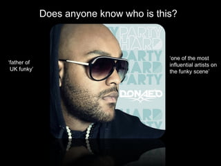
How does the choice of band featured in the article suggest who the target audience will be? The artist featured in this double page spread is Donae’o. He has been producing music for a couple of years now, roaming the underground where he first got recognised for his laid back music and seemingly effortless beats. [Tap Board] The type of music that Donae’os produces is UK funky. This is the music that is listened to by today’s urban youth, and no doubt today’s urban youth is what this double page spread is aimed at. We know this because he has made numerous appearances at 16+ ‘raves’ promotion his new album ‘Party Hard’. Does anybody here actually like funky house? Yes – Well that means that you’re the target audience, an urban youth who like funky house
What type of language is used in the article? Give examples of words or phrases which are specific to the style of the magazine First of all we have all of the colloquial language. [Tap Board 4 times] [Explain how this relates to the target audience being urban] The whole article uses indirect language as it never say words such as ‘you’ or ‘us’ it does use informal language though as it comes across very friendly. Phrases such as [Tap Board] (read aloud) show that this is not formal language.
How is colour used? As you can see from the double page spread the colours are quite dull and grim possibly to represent urban culture. [Tap Board] The concrete background, the top half of the double page spread is similar to the look of council blocks and shows the target audience that this artist came from the same poor, clichéd background as some of the readers themselves. In the photos we can see Donaeo standing in a brightly coloured polo top. This contrast between the bright colours of the polo and the dull grey of the concrete shows that funky house makes urban like more vibrant and exotic. In the bottom half of the page has lots of white space which gives it a cleaner look.
What style of text (font type/colour/size) is used? Is it similar to any other pages? What does it say about the image of the magazine and the audience? Here is the bottom half of the double page spread which is the main body of text The main body of the text is about 10 point and looks like Calibri. This is quite a standard set up for a main body as it makes it easier to read and doesn’t jump off the page too much. [Tap Board] And as we can see it is a Sans Serif Font [Tap Board] As you can see from this double page spread of Rock N Rolla the movie the body text is almost identical. Which shows that the body text in this magazine is using the same conventions.
How is the double page spread laid out? How much of the pages are taken up by images and how much by text? How does this reflect the audience? What do they value? This double page spread is laid out fairly simply. It has on the top half, the [Tap Board] Article Title, Pull quote, model images, a slug & leading text. On the bottom half [Tap Board] a Drop Cap, Body Text, White Space, Page Number, Gutter & Anchor. Here is the rough eye flow for the double page spread. [Tap Board] It is in the shape of a backward S, the conventional eye flow for a double page spread is a Z so this is pretty similar.
How is the artist/band presented to the audience through the images? You may wish to carry out a textual analysis. Here are the two images from the double page magazine. [Tap Board] He is wearing Fila trainers & Polo shirt which shows he his influenced by urban brands. [Tap Board] Wearing sunglasses when its not sunny or even at night is also a common trait in artists from the UK underground and I think Donaeo is trying to keeping in touch with his past underground self.
How does the style of the article match the style of the front cover? The magazine that I chose was iDJ. [Tap Board] I chose it because it was the closest genre to the magazine i wanted to create. Since its a Djing magazine it covers any dance music and so covers many genres. Including the following: [Tap Board and read aloud] [Tap Board x2] Different: colour scheme Fonts Genre of music
Does the article demand any prior knowledge? Give examples. Is there any knowledge needed to understand this?……. YES. For instance [Tap Board] since the target audience of the magazine is DJing amateurs and professionals, the average reader will already know all the history of these genres whereas you and I may not.