1. Click Next to proceed to step 3.
Step 3: Selecting a Style
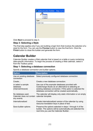
The final step applies only if you are building a login form that involves the selection of a
style for the form. You can use the Preview button to view the final form. Click the
Finish button to close the builder and generate the form.
Calendar Builder
Calendar Builder creates a Web calendar that is based on a table or query containing
date-specific information. To begin the process of creating a Web calendar, select it
from the Toolbox panel.
Step 1: Selecting a database connection
Specify a database connection and builder options.
Option Description
Use an existing database Select previously configured database connection.
connection
Create... Create a new database connection.
or select a sample Use one of the example databases provided with
database CodeCharge Studio as an alternative to selecting an
(Internet/Intranet) existing database connection. If this option is selected the
database connection will be created automatically.
No database used. The calendar will display only static information or an empty
Calendar does not contain calendar template.
any events.
Internationalized Create internationalized version of the calendar by using
resource translation keys in place of text.
Save builder options Preserve the options selected in steps 1 through 4 of the
builder. The options will be automatically pre-selected the
next time you use the Calendar Builder.
272
2. Click Next to proceed to step 2.
Step 2: Select a data source and fields for the calendar
Option Description
Data Source Table(s) for
the calendar
will be based
on. Click
Build Query
to access the
Visual Query
Builder and
design your
database
query or
enter an SQL
query
statement.
The table or
query must
contain at
least one
date or date-
time type
field.
Refresh Refresh the
list of tables
and fields in
the database.
Event Date field The database
field
containing
dates of
events to be
273
3. shown in the
calendar.
Improve performance by retrieving only records that match current period Checking this
box allows to
improve
performance
by retrieving
only records
that match
current
period.
Time stored in a separate field The event
time is stored
in a separate
field in the
database.
Event Time field The database
field
containing
times of
events to be
shown in the
calendar.
Event Caption field The database
field
containing
captions to
be shown in
the calendar.
These can be
event names,
titles,
descriptions,
etc.
274
4. Click Next to proceed to step 3.
Step 3: Specify the calendar and navigation type
Option Description
Type Type of calendar to build. It can be either an annual, quarterly, tri-
monthly, or monthly calendar.
Month format Format to be used to show month names in the calendar header. It can
be a full month name, abbreviated (Jan, Feb, Mar), or numeric.
The format can also be changed later within the quot;MonthDatequot; property.
Weekday Format to be used to represent weekdays. It can be a full weekday
format name, abbreviated (Mon, Tue, Wed), or single letter (M, T, W).
The format can also be changed later within the quot;Weekday Formatquot;
property.
Show days of Display days from the surrounding months. Otherwise the calendar's
nearby cells with dates of different months will be empty.
months
Week Creates customizable area between week rows, implemented as an
separator HTML table cell that by default contains a horizontal line.
Highlight Highlight the calendar cell containing the current date. The highlighting
current day is implemented via separate styles (cascading style sheets), which may
result in a different highlighted look depending on the selected style.
Certain styles may show a highlighted cell background in a different
color, others may place a thicker border around a highlighted cell.
Highlight Highlight calendar cells containing weekends.
weekends
Show event Display event captions within calendar cells, which will result in calendar
captions cells displaying the text from the quot;Event caption fieldquot; selected in Step 2
of the builder. You can convert the label displaying the event captions to
a link that users can click to access another page showing selected
event's details.
275
5. Include quot;No Include a section that will be shown when there are no events for a
Eventsquot; given date. By default this section displays the text quot;No eventsquot;.
section
Navigation Type of navigation that you'd like to include for users to navigate
through calendar periods. Several standard navigation types are
available, plus quot;Customquot; which can be configured with more specific
options.
Click Next to proceed to step 4.
Step 4: Select a style
Select one of the existing styles that you'd like to apply to your calendar, or click Style
Builder to modify an existing style or create a new one. You can also select quot;(No Style)quot;
if you don't want to use any style at all.
See also
Web Calendar Form
•
Web Calendar Reference
•
Directory Builder
The Directory Builder allows you to build multi-level category trees. The Category List
can be displayed in two or more columns. To begin the process of creating a Directory
component, click on the Directory Builder option in Builders tab of the Toolbox.
Step 1: Selecting a Data Source
Select or create a database connection from where the data shown in the directory will
be retrieved. You can select one of the existing database connections, create a new
connection or select one of the sample databases.
276
6. Click Next to proceed to step 2.
Step 2: Setup the properties of the category table
Directory Builder Category Settings
Parameters Description
Category Table Database table that stores the list of categories to be presented in
a directory/index format
Category ID field Category table field that stores the category id
Category Name Field that stores the category names or descriptions
field
Parent Category Field that stores the parent category id
field
Root Category A value of the Parent Category field for the root (highest-level)
identifier categories that do not have a parent, for which you may need to
designate a value, such as 0 or -1 used in the Parent Category Id
field of the root categories. The value will be set as default for the
Data Source property.
No categories Message to be shown to users when the last (lowest-level)
message category is reached and there are no additional sub-categories to
browse.
Number of Number of columns to output the list of the categories. The value
Columns will be set as default for the Number of Columns property.
Create Directory When selected the Path component will be automatically
Path for the current configured and placed above the Directory component on the
directory page. Otherwise the Path will not be created.
277
7. Click Preview to view the final form in its current state or Next to proceed to step 3.
Step 3: Selecting a Style
The final step is to select a style for the form.
Click Preview to view the final form with the selected style. Click Finish to close the
builder and generate the form.
Editable Grid Builder
The simplest and most convenient way of building an Editable Grid is to use the
Editable Grid builder located under the Builders tab of the Toolbox. Open or create a
new page where the Editable Grid will be located then with the cursor placed at the
location where the form should appear, click on the Editable Grid option under the
Builders tab of the Toolbox.
Step 1: Selecting a Data Source
Select or create a database connection from where the data to be edited or added using
the record form is stored. If you already have a connection configured for the project,
you can elect to use one of the tables in this connection to create the Editable Grid.
Alternatively, you can create a new connection or use one of the sample databases.
278
8. The Autoincremented primary keys checkbox should be activated if the records that
will be contained in the Editable Grid will have autoincrement primary keys that are
provided automatically by the database. With this option selected, the Editable Grid will
not have an editable or submittable control for the primary key since that would result in
a database error. Conversely, if primary keys are user provided, then this option should
not be selected. In this case, the Editable Grid would have a field where the user can
enter a value for the primary key.
Click Next to proceed to step 2.
Step 2: Editable Grid Fields
You now have to select a data source as well as the fields to be included in the editable
grid form.
Editable Grid Field Settings
Parameter Description
Data Source Select the table or query that contains the fields to be used in the
EditableGrid.
Build Query Opens the Visual Query Builder where you can construct a join query
which retrieves fields from multiple tables. Within the Visual Query
Builder window, you can select multiple related tables then select fields
from those tables.
Refresh Refreshes the connection if you make changes to the database after
having begun using the builder.
Primary Key If your design time connection is made using an OLEDB provider,
CodeCharge Studio will automatically set the primary key for the
selected table if one is defined in the database. ODBC drivers and
connections to databases such as MySQL do not support the automatic
discovery of the primary key field; you have to specify it manually. If the
table contains a compound primary key that is made up or more than
one field you must use the Build Query button described above to
specify all the primary keys.
Within the Visual Query Builder dialog, right-click on each of the fields
that make up the primary key field and select the Primary Key option.
279
9. The selected fields should then appear in bold.
Available This list-box shows all the fields available in the table or query.
Fields
Fields for the These are the fields to be shown in the record form. They are selected
Record from among the Available Fields.
Select an Available Field then click this button to add it to the form.
Click this button to add ALL Available Fields to the form.
Select a form field then click this button to remove it from the form.
Click this button to remove all fields from the form.
Select a form field then click this button to move it upwards in the order
of appearance.
Select a form field then click this button to move it downwards in the
order of appearance.
Order by Select a field for the records to be ordered by when initially displayed.
Control Type Specify the control type to be used for each of the fields in the form.
After adding fields to the editable grid and setting the optional Order by field, you can
click on the Preview button to view the final editable grid. Note that if you are satisfied
with the form at this point, you can click on the Finish button to close the builder and
generate the form.
Click Next to proceed to step 3.
280
10. Step 3: Adding Search Fields (optional)
Add a search form that can be used to filter the records displayed in the editable grid
form. This step is optional. If you don't want a corresponding search form for the
editable grid, you can simply click the Next button to proceed to the next step.
Editable Grid Search Field Settings
Parameter Description
Create Activate this option to indicate your intention to create a search form.
Search/Filter
Sorting list box Gives the search form two list-boxes for sorting. The first will contain a
list of all the available fields so that the user can select the field to sort
by. The second list-box will indicate the desired sort order (ASC,
DESC).
Records per The search form will have a list-box that can be used to specify the
page list box number of records to be returned per page.
Orientation Specifies vertical or horizontal orientation of the search form.
Advanced... Additional features for the search form. You can specify whether the
form should be submitted using the POST or GET method. You can
also specify whether you want each database field to be represented
by a search form field or alternatively have one search form field which
can be used to search all database fields using the OR operator.
You can also opt to have a Clear option to clear the search fields when
clicked. Additionally, you can specify that the search button be the
default button so that hitting the enter key would be the same as
clicking the search button.
Available This list-box shows all the fields available in the table or view.
Fields
Search Fields These are the fields to be shown in the search form. They are selected
from among the Available Fields.
Select an Available Field then click this button to add it to the form.
Click this button to add ALL Available Fields to the form.
Select a form field then click this button to remove it from the form.
Click this button to remove all fields from the form.
Select a form field then click this button to move it upwards in the order
of appearance.
Select a form field then click this button to move it downwards in the
order of appearance.
Control Type Specify the control type to be used for each of the fields in the form.
281
11. During the process of creating the search form, you can use the Preview button to view
the final form looks with the selected options. You can try out various options and
preview them before deciding on the appropriate one.
Click Next to proceed to step 4 .
Step 4: Customizing the Editable Grid
At this juncture, you can further customize the editable grid form by selecting the
caption to be used for sorting as well as the navigational controls.
Editable Grid Search Field Settings
Parameter Description
Sorting Select the type of sorting controls that you want to have in the grid.
Page Navigator Select the type of Navigation controls that you want to have in the
grid.
Modify If you want to have custom navigation controls on the form, click
Modify to open the Custom Navigator window. You can
customize the controls to suit your needs.
First - Text for the link to the first record
•
Previous - Text for the link to the previous record
•
Next - Text for the link to the next record
•
Last - Text for the link to the last record
•
Use images for links - To have images instead of text for the
•
navigation links
282
12. Disabled links are not visible - Links to pages that cannot
•
logically be browsed are not shown (e.g. if you are on page one,
you cannot browse using the first or previous links).
Page Numbers - Apart from having the four links mentioned
•
above, specify whether you also want to have links to the
individual pages and how they should appear.
Number of Pages - Specify how many page links should be
•
displayed.
Show total pages - Display the total number of pages that
•
can be browsed.
Records per page Specify the default number of records to be shown per page
No records found Specify the message that will be displayed in the grid form if there
message are no records to be shown.
Display the total Display the total number of records that are retrieved in a form.
number of records
Grid layout Tabular layout represents data in an ordinary datasheet
•
view.
Columnar layout places each data source field into one row
•
with column caption on its left.
Justified layout represents each data source field in two
•
consecutive rows: field name is placed in one row and the data
is shown in the second row.
283
13. Once you have made all the selections, you can use the Preview button to view the
final form and make adjustments.
Click Next to proceed to step 5.
Step 5: Selecting Editable Grid Options
You now have to decide the kind of functionality that will be available in the editable grid
form. You can uncheck any of the options if you don't want the form to have the
corresponding functionality.
Editable Grid Operations
Parameter Description
Allow Insert Specify whether the Editable Grid should allow the user to insert
new records. Use the Number of empty rows property to specify
the number of empty rows that should be provided for the purpose
of inserting new records.
Allow Update Specify whether the Editable Grid should allow the user to update
existing records.
Allow Delete Specify whether the Editable Grid should allow the user to delete
existing records.
Allow Cancel Specify whether the Editable Grid should have a cancel button
which would abort any current operation and return to the page
specified in the Return Page property of the form.
Show Prompts the user to confirm the insert, update or delete operations.
Confirmation
dialog for submit
Click Next to proceed to step 6.
Step 6: Selecting a Style (optional)
Select a style for the editable grid form. This step is optional.
Editable Grid Style Options
Parameter Description
Style This element contains a list of styles to choose from.
284
14. Click the Preview button to see how the form will look with a particular style applied.
After selecting a style, click the Finish button to generate the form to the page.
Flash Chart Builder
Flash Chart Builder provides a visual method for designing and including Flash charts
within a Web page. The created Flash Chart component will retrieve data from the
database at run-time and present it as a visual graph.
The Flash Chart Builder provides various options for configuring the chart's data
source, style, layout, colors and captions.
The Flash Chart Builder is available under the Builders tab of the Toolbox. After
launching the builder you will be provided with the following configurations steps.
Data Source
Specify a data source and fields to be charted.
Parameter Description
Connection Select or create a database connection to be used to retrieve data.
285
15. You can select one of existing database connections or create a new connection.
Data Table, view, SQL query or Stored Procedure that provides values to be charted.
Source Click the [...] button to open the Visual Query Builder where you can design the data
query or provide your own SQL statement or Stored Procedure to be used as Data
Source.
Sample Data Source configuration via Visual Query Builder:
Value fields The list of available fields that can be charted, provided by the Data Source. Select
to be presented graphically by the chart.
Caption Select field whose value contains captions for the charted data.
field
Order by Select field by which the displayed data should be sorted.
Max records Maximum number of records (values). For example you may limit the number of 20
records to be charted.
Data series Select Rows or Columns, depending on your data series.
in Rows: specifies that your data series are from the rows of the data.
Columns: specifies that your data series are from the columns of the data.
Type
Select a type of chart that you like to use. Column, bar, linear, area and pie charts are
available.
286
18. Specify chart options.
Option Description
Size Desired size of the chart in pixels. Specify both width and
height.
Chart title Title to be shown at the top of the chart.
Legend Specify whether to display the legend for data series (Y-axis)
Values Specify whether to label chart values.
Grid lines Specify whether to display grid lines.
X-Axis Label Direction of labels shown below the chart (X-axis)
Direction
Layout
289
19. Select where and how the chart legend should be displayed.
Style
Select chart style, which controls the colors, fonts, animations and other visual attributes
associated with the chart. Styles can be reused across multiple charts.
You can also create custom chart styles and modify them via the built-in Flash Chart
290
20. Style Builder. Select an available style and click quot;Modifyquot; to access this feature.
Flash Chart Style Builder
Flash Chart Style Builder provides global customization options for charts, which can be
reused and applied across multiple charts.
The default styles cannot be modified, however, you can click the quot;Save Asquot; button to
save the current changes as a new style. The new custom styles can be further
291
21. modified and saved via the OK button.
Gallery Builder
Gallery Builder is designed for creating a Web based image gallery as part of your
application. The resulting gallery displays images in horizontal grid-like format and in
fact it is fully based on the standard CCS grid component. The Gallery Builder creates a
gallery by placing the grid component on the page and altering its HTML template to
produce horizontal layout. Additionally, the the quot;Gallery Layoutquot; action is applied to the
grid's Before Show Row event, which opens and closes grid's table row tag (<tr>)
based on the desired number of columns to be used in the gallery.
The Gallery Builder is available under the Builders tab of the Toolbox. When launching
it you will be provided with the following 6 simple steps to generate a gallery.
Step 1: Creating a Database Connection
Select or create a database connection from where the data shown in the gallery will be
retrieved. Here you can select one of the existing database connections, create a new
connection or select one of the sample databases.
292
22. Click Next to proceed to step 2.
Step 2: Gallery Data Source
In this step you need to specify a data source and the fields to be included in the
gallery.
Gallery Data Source Settings
Parameter Description
Data Source Select a table or view to base your gallery on.
Build Query Opens Visual Query Builder where you can design the database query or
provide your own SQL statement or Stored Procedure to be used as
gallery Data Source.
Refresh Refreshes the list of tables and fields if you make changes to the
database after having begun using the builder.
Available The list of fields available in the specified table or query.
Fields
Gallery These are the fields to be shown in the gallery. They are selected from
Fields among the Available Fields.
Select an Available Field then click this button to add it to the gallery.
Click this button to add ALL Available Fields to the gallery.
Select a gallery field then click this button to remove it from the gallery.
Click this button to remove all fields from the gallery.
Select a gallery field then click this button to move it upwards in the order
of appearance.
Select a gallery field then click this button to move it downwards in the
order of appearance./td>
Control Type Specify the control type to be used for each of the fields in the form. Here
you should specify Image or Image Link type for the picture field.
Any number of fields can be specified where at least one of them should contain the
URLs of images to be displayed, while others can contain image caption and any other
information to be displayed above or below images.
293
23. After fields have been selected, click Next to go on to step 3, or click the Preview
button to view a basic gallery template.
Step 3: Adding a Search Form (optional)
Step 3 is optional and should be used only if you want to provide a search form that will
allow users to filter records displayed in the gallery.
Gallery Search Settings
Parameter Description
Create Activate this option if you decide to create a search form for your
Search/Filter gallery.
Sorting list box Adds to the search form two listboxes for sorting. The first listbox will
contain a list of all the available fields so that the user can select the
field to sort by. The second listbox will indicate the desired sort order
(ASC, DESC).
Records per If this option is selected the search form will have a listbox that can be
page list box used to specify the number of records to be returned on each page.
Orientation Specifies vertical or horizontal orientation of the search form.
Advanced... Click this button to specify additional features for the search form such
as submit method (POST or GET), search type (meaning AND/OR
conditions), Clear option to clear the search fields when clicked, etc.
Available Fields This listbox shows all the fields available in the table or view.
Search Fields This listbox displays the fields that will be shown in the search form.
They are selected from among the Available Fields.
Select an Available Field then click this button to add it to the form.
294
24. Click this button to add ALL Available Fields to the form.
Select a form field then click this button to remove it from the form.
Click this button to remove all fields from the form.
Select a form field then click this button to move it upwards in the
order of appearance.
Select a form field then click this button to move it downwards in the
order of appearance.
Control Type Specify the control type to be used for each of the fields in the form.
Click Next to proceed to step 4.
Step 4: Define Gallery Options.
Step 4 allows you to define the following gallery layout options:
Gallery Options
Parameter Type Description
Layout
Columns Number of columns to be used in the gallery.
Rows Number of rows to be displayed per page.
Note: the total number of records per page will be equal to
the number of Columns multiplied by the number of Rows.
Non-breaking Inserts a non-breaking space ( ) into empty gallery
space in cells. This option is used to improve the gallery layout
empty cells since some web browsers do not display cell borders when
295
25. a cell is empty.
Display the Add a label that displays the total number of records
total number (images) retrieved by the gallery (data source).
of records
No records Message text to be displayed if there are no records
found (images) returned by the data source.
message
Images
Images folder Either absolute or relative path to the image folder on the
server. If relative path is specified, it should be relative to
the folder of the current page. You can leave this option
blank if images are stored in the same folder as the current
page, or if your database contains absolute image URLs.
Use original Select this option if you want to display images in their
image size original size.
Use browser Select this option if you want to resize your images to
scaling match specific width or height. The images will be resized
by the Web browser, which may result in poor image
quality.
Width Specifies pixel width of the image to be resized. Leave
blank if you want the width to be calculated based on the
height specified below while preserving aspect ratio of the
original image.
Height Specifies pixel height of the image to be resized. Leave
blank if you want the height to be calculated based on the
width specified above while preserving aspect ratio of the
original image.
296
26. Click Next to go on to step 5.
Step 5: Define Navigation Options of Gallery
Further customize the gallery by selecting the caption type to be used for sorting as well
as the navigational controls.
Gallery Option Settings
Parameter Description
Sorting Select the type of sorting controls that you want to use in the gallery.
Page Select the type of Navigation controls that you want to use in the
Navigator gallery.
Modify Opens 'Custom Navigator' window where you can configure custom
navigation controls.
Once you have made all the selections, you can use the preview button to to view how
the final form template looks with the selected options.
Click Next to proceed to step 6.
Step 6: Selecting a Style (optional)
The final step is optional and involves selecting a style to be applied to the Gallery. The
Preview option provides immediate feedback on the form style you have chosen. You
can also select quot;(No Style)quot; if you don't want to use any style or Ó(Dynamic)Ô if you
want to assign a style dynamically at runtime.
Click the Finish button to close the builder and generate the form.
Press F9 to publish your project and enjoy!
297
27. Grid Builder
Use the Grid builder to create grid forms that can have an optional related search form.
The builder provides many options that would otherwise require a considerable amount
of time to add manually. To begin the process, click on the Grid Builder option in the
Builders tab of the Toolbox.
Step 1: Creating a Database Connection
Select or create a database connection from where the data shown in the grid will be
retrieved. You can select one of the existing database connections, create a new
connection or select one of the sample databases.
298
28. Click Next to proceed to step 2.
Step 2: Grid Data Source
You now have to select a data source as well as the fields to be included in the grid.
Grid Data Source Settings
Parameter Description
Data Source Select the table or view to use as the data source.
Refresh Refreshes the connection if you make changes to the database after
having begun using the builder.
Build Query Opens the Visual Query Builder window where you can setup a SQL
query that will act as the grid data source.
Available This list-box shows all the fields available in the table or view.
Fields
Fields for the These are the fields to be shown in the grid. They are selected from
Grid among the Available Fields.
Select an Available Field then click this button to add it to the grid.
Click this button to add ALL Available Fields to the grid.
Select a grid field then click this button to remove it from the grid.
Click this button to remove all fields from the grid.
Select a grid field then click this button to move it upwards in the order
of appearance.
Select a grid field then click this button to move it downwards in the
order of appearance./td>
Order by Select a field by which the records will be ordered by when initially
displayed.
299
29. Previewing the Grid
Once the fields have been added to the grid, you can click Preview to view the final
grid. For the above setup, the illustration below shows how the grid will look with the
current settings.
After previewing the grid, close the preview window. Note that if you are satisfied with
the form at this point, you can click on the 'Finish' button to close the builder and
generate the form.
To continue, click Next to proceed to step 3.
Step 3: Adding a Search Form (optional)
Add a search form that can be used to filter the records displayed in the grid form. This
step is optional and if you don't want a corresponding search form for the grid, you can
simply click the Next button to proceed to the next step.
Grid Search Settings
Parameter Description
Create Indicates your intention to create a search form.
Search/Filter
Sorting list box Gives the search form two list-boxes for sorting. The first one will
contain a list of all the available fields so that the user can select the
field to sort by. The second list-box will indicate the desired sort order
(ASC, DESC).
Records per The search form will have a list-box that can be used to specify the
page list box number of records to be returned per page.
Orientation Specifies vertical or horizontal orientation of the search form.
Advanced... Click on this button to specify the advanced search option such as
submit method, type and other properties. If AND is selected, the
search form will have an input form control for all the fields. Otherwise,
if OR is selected, the search form will have only one input form control.
300
30. Any value entered into the single control will be used to search against
all the fields in the form. After you set the advanced options you can
use the 'Preview' button to see how the form looks like with either
option selected.
Available This list-box shows all the fields available in the table or view.
Fields
Search Fields These are the fields to be shown in the search form. They are selected
from among the Available Fields.
Select an Available Field then click this button to add it to the form.
Click this button to add ALL Available Fields to the form.
Select a form field then click this button to remove it from the form.
Click this button to remove all fields from the form.
Select a form field then click this button to move it upwards in the order
of appearance.
Select a form field then click this button to move it downwards in the
order of appearance.
Control Type Specify the control type to be used for each of the fields in the form.
During the process of creating the search form, you can use the Preview button to view
how the final form looks with the selected options. You can try out various options and
preview them before deciding on the appropriate ones.
Click Next to proceed to step 4.
Step 4 Define Grid options
Select the desired design of the grid template and placement of components inside it.
Here you have four layouts to choose from:
301
31. Parameter Description
Tabular Grid layout that represents data in datasheet view, i.e in a form of
rectangular table with column captions across the top, row identifiers
(usually listed down the left margin), and the data in the cell where the row
and column intersect.
Columnar Grid layout, with column captions placed to the left of the data row. Each
data source field corresponds to one row.
Justified A layout where each data source field corresponds to two grid rows: field
name is placed in one row and the data is shown in the row below it.
Gallery Horizontal grid layout that is generally used for displaying an image
Style gallery.
NOTE: When selecting the Gallery Style layout you may need to convert at
least one of your controls to an image. You can do this after completing all
Builder steps by right-clicking on the control in the Design mode and
selecting Change To -> Image.
You can also configure the following options if desired:
Parameter Description
Records per page The number of records to be displayed per page by
default.
Record separator If checked, a template block called Separator will be
inserted between rows (and alternating rows).
Rows per page Number of gallery rows.
(available when Gallery
Style is selected)
Columns per row Number of gallery columns.
(available when Gallery
Style is selected)
302
32. Click Next to proceed to step 5.
Step 5 Define Grid Options
Further customize the grid form by selecting the caption to be used for sorting as well as
the navigational controls.
Grid Option Settings
Parameter Description
Sorting Select the type of sorting controls that you want to have in the
grid.
Page Navigator Select the type of Navigation controls that you want to have in
the grid.
Modify The 'Custom Navigator' window allows you to add custom
navigation controls to the form.
Records per page Specify the default number of records to be shown per page.
No records found Specify the message that will be displayed in the grid form if
message there are no records to be shown.
Non-breaking space Inserts a non-breaking space ( ) into empty grid cells.
This option is used to make browsers display cell borders even
if a cell is completely empty.
Display the total Specify if the label which shows the total number of records in
number of records the record set should be displayed above the grid.
Add Panels to each Specify if all controls are taken into the blocks of the following
303
33. column (for Hide/Show type: <!-- BEGIN ControlType ControlName --><!-- END
functionality) ControlType ControlName --> It will be used to dynamically
hide/show controls on the page.
Alternate records
If this option is checked, every other record in the grid will appear in a row with a
different style than the preceding record. You can further choose how the alternate rows
should be implemented. Selecting ÓCreate alternate controlsÔ will create two data
rows, where one row will have a different background color to emphasize the separation
between consecutive rows. Selecting ÓUse CSS styleÔ applies the Set Row Style
action to the Before Show Row event of the grid, where in turn the main and alternate
CSS style classes are specified. By default the Set Row Style action will apply the Row
style class to standard grid rows and the AltRow class to alternate grid rows. Both
these classes are defined within the quot;Style.cssquot; file used by the current page or grid and
can be modified as needed.
Step 6: Selecting a Style (optional)
The final step is optional and involves selecting a style for the form.
Grid Style Settings
Parameter Description
Style This element contains a list of styles to choose from.
Clicking the Preview button now will show the forms as they will look when generated.
The search form appears at the top with the grid right below it. Once done, click Finish
to close the builder and generate the form.
304
34. Grid and Record Builder
Often a grid form is used in conjunction with a record form to display multiple records
and a link from the grid form records to the record form where the details of the record
can be viewed and edited. For this purpose, the Grid and Record builder can be used to
produce a grid form with an attendant record form. To begin, click on the Grid and
Record Builder option in the Builder tab of the Toolbox.
Step 1: Selecting a Data Source
Select or create the database connection whose fields will be used in the two forms.
You can select one of the existing database connections, create a new connection or
select one of the sample databases.
Grid and Record Builder Settings
Parameter Description
Autoincremented If the database table has an autoincremented primary key field
primary keys this prevents the builder from creating a record form with the
primary key field since it will be provided by the database when a
new record is inserted.
Click Next to proceed to step 2.
Step 2: Grid and Record Builder Fields
Select the fields to be shown in the grid form.
Grid and Record Builder Field Settings
Parameter Description
Data Source Select the table from where the data will be retrieved.
Build Query Brings up the Visual Query Builder window where you can setup a SQL
query that will act as the grid data source.
Refresh Refreshes the connection if you make changes to the database after
having begun using the builder.
Available This list-box shows all the fields available in the table.
Fields
Fields for the These are the fields to be shown in the grid. They are selected from
305
35. Grid among the Available Fields.
Select an Available Field then click this button to add it to the grid.
Click this button to add ALL Available Fields to the grid.
Select a grid field then click this button to remove it from the grid.
Click this button to remove all fields from the grid.
Select a grid field then click this button to move it upwards in the order
of appearance.
Select a grid field then click this button to move it downwards in the
order of appearance.
Order by Order the records in the grid will be initially displayed.
Click Next to proceed to step 3.
Step 3: Creating a Search Form (optional)
Step 3 is optional and should be used only if you want to have a search form that can
filter the records displayed in the grid. If a search form is not needed click Next to
proceed to step 4.
Grid and Record Builder Search Settings
Parameter Description
Create Indicates your intention to create a search form.
Search/Filter
Sorting list box Gives the search form two list-boxes for sorting. The first one will
contain a list of all the available fields so that the user can select the
field to sort by. The second list-box will indicate the desired sort order
(ASC, DESC).
Records per The search form will have a list-box that can be used to specify the
page list box number of records to be returned per page.
Orientation Specifies vertical or horizontal orientation of the search form.
Advanced... Specify advanced search options such as submit method, type and
other properties. If AND is selected, the search form will have an input
306
36. form control for all the fields. If OR is selected, the search form will
have only one input form control. Any value entered into the single
control will be used to search against all the fields in the form. After you
set the advanced options you can use the Preview button to view the
final form with your selection.
Available This list-box shows all the fields available in the table or view.
Fields
Search Fields These are the fields to be shown in the search form. They are selected
from among the Available Fields.
Select an Available Field then click this button to add it to the form.
Click this button to add ALL Available Fields to the form.
Select a form field then click this button to remove it from the form.
Click this button to remove all fields from the form.
Select a form field then click this button to move it upwards in the order
of appearance.
Select a form field then click this button to move it downwards in the
order of appearance.
Control Type Specify the control type to be used for each of the fields in the form.
Click Next to proceed to step 4.
Step 4: Selecting Grid Options
Specify the type of sorting and navigation controls to appear in the grid form.
Grid and Record Builder Option Settings
Parameter Description
Sorting Select the type of sorting controls that you want to have in the
grid.
Page Navigator Select the type of navigation controls that you want to have in
the grid.
Modify Opens the 'Custom Navigator' window where you can
307
37. customize the controls to suit your needs.
Records per page Specify the default number of records to be shown per page.
No records found Specify the message that will be displayed in the grid if there
message are no records to be shown.
Display the total Specify if the label which shows the total number of records in
number of records the record set should be displayed above the grid.
Click Next to proceed to step 5.
Step 5: Linking the Grid to the Record
The last step in configuring the grid is selecting the field to be used to link the records in
the grid to the details in the record form. You can select any one of the fields that are
already in the grid or specify a new column to act as the link to the record form.
308
38. Click Next to proceed to step 6.
Step 6: Configuring the Record Form
The record form will be based on the same table as was the grid form but you have the
option of selecting different fields to appear in the record form. After adding the fields,
you should also select the Control Type to be used for each of the fields.
At this point, you can use the Preview button to view the final form.
Click Next to proceed to step 7.
Step 7: Selecting Record Options
Select the type of operations you want the user to be able to perform using the record
form. In the illustration below, the 'Allow Delete' option is disabled meaning that the
record form will not allow the user to delete any existing records.
309
39. Click Next to proceed to step 8.
Step 8: Selecting a Style
Select a style to be used to display both forms. You can use the Preview button to view
the final form. Click the Finish button to close the builder and generate the forms.
Menu Builder
Menu Builder provides a visual method for designing and including menus within Web
pages. Menus can be based on data from a database or static values specified in the
builder.
The Menu Builder is available in CodeCharge Studio under the Builders tab of the
Toolbox and provides various options for configuring the menu's data source, style and
layout. After launching the builder you will be provided with the following configurations
steps.
Step 1: Specifying Type of Menu Items
Specify whether you want the menu should be based on database values or static
values.
310
40. The following steps in the Menu Builder depend on your selection on the above screen:
Creating menus based on static list of menu items
•
Creating database driven menus
•
Creating menus based on static list of menu items
Step 2: Defining Static Menu
In this step you specify and configure menu items and their parameters. Click the quot;+quot;
button to add a new menu item within the currently selected item, or quot;-quot; to remove one.
Use the up and down buttons to move selected menu item position up or down.
Static Menu Items
Parameter Description
Caption Text to be displayed as the menu item.
URL Destination page or URL to open via the menu item.
Target HTML quot;targetquot; property to use for the menu item. This allows for the
destination URL to be opened in the same window, a new window, or an
existing window or frame.
An empty target will open the destination URL in the same window.
311
41. After fields have been selected, click Next to go on to step 3, or click the Preview
button to view a basic gallery template.
Step 3: Selecting Menu Layout
Select desired menu layout, either horizontal, vertical or vertical tree.
Step 4: Selecting Menu Style
The final step allows selecting a style to be applied to the Menu. You can select quot;(No
Style)quot; if you don't want to use any style or Ó(Dynamic)Ô if you want to assign a style
dynamically at runtime.
Click the Finish button to finalize and created the menu component on your form.
Creating database-driven menus
Step 2: Specifying Database Connection
Select or create a database connection from where the data for the menu will be
retrieved. You can select one of the existing database connections, create a new
connection or select one of the sample databases.
312
42. Step 3: Specifying Menu Data Source
In this step you specify and the database table and fields containing menu items and
options.
Database-driven Menu Items
Parameter Description
Menu Item Table The database table or view containing menu items.
Key/Id field The key field of the menu item table.
Parent Item Id field Database field used to identify parents ids of menu items in a
hierarchical menu structure.
Root identifier Value of the parent parent id used to identify the highest level in
item hierarchy. Leave blank if you don't use parent ids or if an
empty parent id indicates top level item.
Caption field Table column containing menu item captions.
URL field: Static Page name or http address used as destination for all menu items.
address
URL field: Address Table column containing destination URLs for menu items.
from database
313
43. Step 4 and 5
Steps 4 and 5 provide menu layout and style options and are identical to steps 3 and 4
when defining static menu.
Record Builder
The Record Builder can be used to automate the process of creating record forms
where database content can be inserted, edited or deleted. To begin the process, click
on the Record Builder option in the Builders tab of the Toolbox.
Step 1: Selecting a Data Source
Select or create a database connection from where the data to be edited or added using
the record form is stored. You can select one of the existing database connections,
create a new connection or select one of the sample databases.
314
44. Click Next to proceed to step 2.
Step 2: Record Builder Fields
Select a data source and the fields to be included in the record form.
Record Builder Field Settings
Parameter Description
Data Source Select the table to use as the data source.
Refresh Refreshes the connection if you make changes to the database while
using the builder.
Primary Key Select the primary key field in the table.
Available Fields This list-box shows all the fields available in the table.
Fields for the These are the fields to be shown in the record form. They are
Record selected from among the Available Fields.
Select an Available Field then click this button to add it to the form.
Click this button to add ALL Available Fields to the form.
Select a form field then click this button to remove it from the form.
Click this button to remove all fields from the form.
Select a form field then click this button to move it upwards in the
order of appearance.
Select a form field then click this button to move it downwards in the
order of appearance.
Control Type Specify the control type to be used for each of the fields in the form.
Once you have made your selections click the Preview button to view the final form.
Make any modifications to the form before proceeding to the next step.
Click Next to proceed to step 3.
Step 3: Selecting Record Options
315
45. Set the functionality that will be available in the record form. You can uncheck any of the
options if you don't want the form to have the corresponding functionality.
Encrypt password value in database option is available only when both of the
following conditions are met:
quot;Encrypt passwords in database usingquot; option is enabled in Advanced Security
•
Settings.
Record form contains an editable control based on the password field specified in
•
Project Security Settings.
Click Next to proceed to step 4.
Step 4: Selecting a Style
Select a style to be used to display the record form. The preview portion of the window
shows how the final form will look with the selected style.
Click on the Finish button to close the builder and generate the form.
Web Report Builder
Using the Report Builder
The Report Builder creates a report that is based on a table or query. Search/filtering
functionality can also be configured here. To start the Report Builder, select it from the
Toolbox panel.
The Report Builder consists of the following nine steps:
Step 1: Specify a database connection and builder options.
Select or create a database connection from where the data shown in the Report will be
retrieved. You can select one of the existing database connections, create a new
connection or select one of the sample databases. Internationalization option is also
provided as described below.
Option Description
Use an existing database Select previously configured database connection.
connection
316
46. Create... Create a new database connection.
Select a sample Use one of the example databases provided with
database CodeCharge Studio as an alternative to selecting an existing
(Internet/Intranet) database connection.
If this option is selected the database connection will be
created automatically.
Internationalized Create an internationalized version of the report by using
resource translation keys in place of text.
Save builder options Preserve the options that you're selecting on steps 1 through
9 of the builder. The options will be automatically pre-
selected the next time you use the Report Builder.
Click Next to proceed to step 2.
Step 2: Select a data source and fields for the report.
Option Description
Data Source Specify the table(s) or view(s) for the report to be based on, or click [Build
Query] to access Visual Query Builder where you can design your
database query or enter an SQL query statement.
Build Query Brings up the Visual Query Builder window where you can setup a SQL
query that will act as the report data source.
Refresh Refreshes the list of tables and fields in the database if you make
changes to the database after having begun using the builder.
Available The list of all fields returned by the data source, which were not selected
Fields to be included in the report.
The fields are removed from this section once you click on the arrow
buttons to move selected fields to the right panel named quot;Fields for the
Reportquot;.
Fields for The list of fields returned by the data source, selected to be included in
the Report the report.
Order By Select the database field by which you'd like to order the data on the
report. Select (Custom...)or click [...] to select multiple fields or specify
descending order.
317
47. Click Next to proceed to step 3.
Step 3: Create grouping levels for the report.
Specify the fields used for creating data groupings in the report. The inclusion of groups
is not required and this step is optional.
Option Description
Available The list of all fields returned by the data source and selected in step 2.
Fields
Groups The list of fields you selected as groups.
The report data will be grouped using this field's values. For example, the
report will display the group header each time before quot;category_namequot;
field's value changes, and the group footer after the field's value changes.
The group footer may contain some calculated fields, for example, to
show the number of items within the category.
You can select multiple groups; the order of selected groups decides how
the groups will be displayed and the data summarized. Higher positioned
groups should reflect a higher level of grouped data. For example, you
might create groups in the following order: continent, country,
state/region, and city.
Sort Buttons Specifies ascending or descending sorting for the selected group.
(AZ) and
(ZA)
318
48. Click Next to proceed to step 4.
Step 4: Select a report layout
Select a report layouts, which will determine the design of the report template and
placement of components inside it. The available layout options depend on if the report
contains data groups or not.
Type Option Description
Without Set of options available when you are not using any
Groups groupings in your report.
Tabular Grid-type report layout, with column captions placed within
the Page Header section.
Form Columnar report layout, with headers placed to the left of the
(Columnar) detail. Each data source field corresponds to one row.
Form Letter Free-form report layout, where the data is formatted based
on the user specified template. The template is created in a
separate builder step.
Justified Justified report layout. Each data source field corresponds to
two report rows where field name is placed in a row and the
data is shown in the row below it.
With Set of options available when you are using groups in your
Groups report.
Group Left Report layout that places group field to the left and above
and Above the 1st column of the following group or detail. Field names
(captions) are placed within Page Header.
Group Left Report layout that places group field to the left of the 1st
column of the following group or detail. Field names
(captions) are placed within Page Header.
Group Above Report layout that places group field above the 1st column
of the following group or detail. Field names (captions) are
placed within Group Header.
Group Outline Report layout with indented group fields. Field names
(captions) are placed within Group Header.
319
49. Click Next to proceed to step 5.
Step 5: Specify summarized fields for the report
Specify the inclusion of totals and other calculated values within the report. All available
math functions are enabled for numeric fields, while the Count function can be used
with other types of fields. Total values will be calculated for each group and the report
as a whole. Group based functions will be included in the corresponding Group Footer
sections. Grand totals will be placed into the Report Footer. If Sum function is available
and selected, you can also select the quot;Calculate percent of total for sumsquot; option.
Option Description
Field Database field on which calculations can be performed.
Sum/Count/Min/Max/Average Select calculation types that you'd like to be performed
for each field. They correspond to common math
functions that can be used to create and include
calculated fields on the report. The calculated fields will
be created in the selected group's footer section.
Show Detail and Summary Select this option if you'd like both the detail and
summary sections of the report to be included in the
report. This is a common selection.
Show Summary Only This option is available in case you don't need the
details to be included in the report but forgot to use the
GROUP BY statement in your underlining SQL data
source.
When this option is selected, the detail section of the
report will be hidden programmatically.
Hide Detail Hides the detail section of the report. This option doesn't
need to be used unless, for example, you don't want to
show detail rows and forgot or were unable to create an
SQL query that performs necessary groupings.
Calculate percent of total for Creates additional quot;Percentquot; fields below the sum fields,
sums in the group's footer section.
Click Next to proceed to step 6.
Step 6: Define navigation options of the report.
Option Description
320
50. Sorting The type of sort options to be available above the detail columns, in the
page header.
Page Select the type of navigation controls to be included below the detail
Navigator columns, in the page footer.
The navigator is used to navigate through report pages when all the data
does not fit on one page.
Modify Select Custom and then click [Modify...] to open the 'Custom Navigator'
window where you can customize the controls to suit your needs.
Click Next to proceed to step 7.
Step 7: Define report options.
Specify additional layout and behavior options for the report.
Option Description
Lines per Web The height of the report page displayed in a Web browser, measured in
page abstract line units assigned to each report section. Refer to the Report
Paging section of the documentation for more information.
Enable print Makes the report available in print mode, which will display all report
mode pages within one HTML page that can be printed. Print mode can be
activated by appending quot;ShowMode=Printquot; into the URL.
Lines per print The height of the report page to be printed, measured in abstract line
page units assigned to each report section. Refer to the Report Paging
section of the documentation for more information.
Create Builder will create a link that users can click to view a printable version
quot;printable of the report.
versionquot; link The link will include the URL parameter quot;ShowMode=Printquot; and will be
added at the top of the page above the report. It can be repositioned
later.
Total Records Displays the total number of records returned by the data source, by
Found including a label that displays the total number of records found on
your report page.
Page M of N Add text to the Page Footer that displays the page number and the
total number of pages, in the format quot;Page 1 of 5quot;.
321
51. This option is mainly used in Print mode where the Navigator is not
shown.
Use client When this option is enabled the report will utilize special HTML and
paging CSS syntax that when printing causes the client computer (Web
browser) to automatically perform page breaking. The report pages will
be printed based on the page size specified in client computer's printer
settings. A report that uses client paging can be displayed by default in
Printable Mode and it will appear on the screen as a single page with a
single header and footer, however, when printed the Web browser will
automatically split the same report into multiple pages and repeat the
page header and footer on each page as needed.
One of the main benefits of using client paging is that the page size is
determined automatically by the Web browser and doesn't need to be
predefined, while end users are able to configure their own printer
settings like orientation and margins.
Some of the downsides of using client paging may include inability to
implement dynamic functionality that depends on page size,
dynamically alter page header/footer, or utilize the row numbering
feature with row numbers reset at page level.
The following report options and properties are disabled when using
client paging: Page Size, Page M of N.
Record Results in a special Panel being inserted between detail rows. This
separator makes it easier to separate detail sections and insert a line, graphics or
text between detail rows.
Non-breaking Inserts a non-breaking space ( ) into empty report cells and
space in empty quot;Text If Emptyquot; property of Report Label. This option is used to
cells improve the report layout. Web browsers often do not display cell
borders if a cell is completely empty.
Current Date Displays the current date and time at the bottom of the report (in the
and Time, as Page Footer). You must specify if you want to display the Date, the
Time, or both.
Row Displays a column with row numbers in the detail section of the report.
numbering, You must specify if you'd like to reset row numbering at the report,
reset by page, or group level.
No records The text to be shown when there is no data to be shown, for example,
found message if the report's data source doesn't return any records.
322
52. Click Next to proceed to step 8.
Step 8: Select search fields for the report (optional)
Adds a search form that can be used to filter the records displayed in the report. This
step is optional. If you don't want a corresponding search form for the report click Next
to proceed to the final step.
Option Description
Create Indicates your intention to create a search form that will be used to
Search/Filter filter the report's data.
Sorting list-box Specify if you want users to be able to select the sort field for the
report to be sorted by.
Records per Specify if you want users to be able to specify how many records to
page list-box display per report page.
Orientation Specifies vertical or horizontal orientation of the search form.
[Advanced...] Specify advanced search options such as submit method, type and
button other properties. If AND is selected, the search form will have an input
form control for all the fields.
If OR is selected, the search form will have only one input form control.
Any value entered into the single control will be used to search against
all the fields in the form. After you set the advanced options you can
use the Preview button to view the final form with your selection.
Available Fields Fields that can be included in the search form as search fields.
Search Fields Fields that you selected to be included in the search form.
Control Type The type of control to be used for the currently selected search field(s).
323
53. Click Next to proceed to step 9.
Step 9: Select a Style for the report
Select from the list of existing styles or click Style Builder to modify or create a new
theme. You can also select quot;(No Style)quot; if you don't want to use a style, or quot;Basicquot; if you
don't want to use a theme at this time but would like to preserve theme compatibility for
the report in the future.
See also
Report Form
•
Report Form Reference
•
Report Sections
•
Report Section Reference
•
Search Builder
Search forms are used to enter values into controls to search and retrieve records from
a database. Search forms are used in conjunction with grid or record forms. The search
form is used to submit the search criteria and the grid or record form displays the
retrieved records that match the search criteria.
The Search Builder can create complex search forms that determine the number of
records to be displayed per page, the order the records are displayed and the SQL
operator to be used to perform the search. To begin the process of creating a search
form, click on the Search Builder option in Builders tab of the Toolbox.
Step 1: Selecting a Database Connection
Select or create the database connection for the search. You can select one of the
existing database connections, create a new connection or select one of the sample
databases.
Option Description
324
54. Use an existing database Select previously configured database connection.
connection
Create... Create a new database connection.
or select a sample Use one of the example databases provided with
database CodeCharge Studio as an alternative to selecting an
(Internet/Intranet) existing database connection.
If this option is selected the database connection will be
created automatically.
Internationalized Create internationalized version by using resource
translation keys in place of text.
Save builder options Preserve the options selected in steps 1 through 4 of the
builder. The options will be automatically pre-selected the
next time you use the Search Builder.
Click Next to proceed to step 2.
Step 2: Search Builder Fields
This is the main step and involves selecting fields to be shown in the form and other
display options.
Search Builder Field Settings
Parameter Description
Table Database tables whose fields will be used in the search form.
Sorting list box Gives the search form two list-boxes for sorting. The first will contain a
list of all the available fields so that the user can select the field to sort
by. The second list-box will indicate the desired sort order (ASC,
DESC).
Records per The search form will have a list-box that can be used to specify the
page list box number of records to be returned per page.
Orientation Specifies vertical or horizontal orientation of the search form.
Advanced... Advanced search option such as submit method, type and other
properties. If AND is selected, the search form will have an input form
control for all the fields.
325
55. If OR is selected, the search form will have only one input form control.
Any value entered into the single control will be used to search against
all the fields in the form. After you set the advanced options click
Preview to view the form with your selected option.
Available This list-box shows all the fields available in the table or view.
Fields
Search Fields These are the fields to be shown in the search form. They are selected
from among the Available Fields.
Select an Available Field then click this button to add it to the form.
Click this button to add ALL Available Fields to the form.
Select a form field then click this button to remove it from the form.
Click this button to remove all fields from the search form.
Select a form field then click this button to move it upwards in the order
of appearance.
Select a form field then click this button to move it downwards in the
order of appearance.
Control Type Control type to be used for each of the fields in the form.
Click Next to proceed to step 3.
Step 3: Selecting a Grid Form (optional)
Select a page and a grid form to which the search will apply. You can skip this step if
the form is not yet available or you intend to use the search form for a different purpose.
326
56. Click Next to proceed to step 4.
Step 4: Selecting a Style (optional)
Select a style to be used to display the form.
Click Finish to close the builder and generate the search form.
Working with Ajax
Ajax Feature Builder
The Ajax Feature Builder simplifies and automates the process of assigning common
Ajax features to Web forms and components, and building corresponding Ajax services
at the same time.
To invoke the Ajax Feature Builder select it from the CodeCharge Studio Toolbox, then
follow instructions on the screen.
Step 1: Choose feature type
The following Ajax features are supported by the builder:
Feature Description
Autocomplete Retrieves matching data from database and displays the list of
results as a user is typing an entry.
Autofill Retrieves matching record from database and populates a specified
control.
Dependent Populates a listbox with data matching another listbox or control.
Listboxes
327
57. Step 2: Specify a database connection and builder options.
Option Description
Use an existing Select previously configured database connection.
database connection
Create... Create a new database connection.
or select a sample Use one of the example databases provided with CodeCharge
database Studio as an alternative to selecting an existing database
(Internet/Intranet) connection. If this option is selected the database connection
will be created automatically.
Internationalized Use translation resources in place of text.
Save builder options Preserve the options selected in steps 1 through 4 of the
builder. The options will be automatically pre-selected the next
time you use the Calendar Builder.
Step 3: Configure feature DataSource
This builder step looks differently depending on the Ajax feature selected in Step 1.
328
58. Following options are available when configuring the Autocomplete feature:
Option Description
Target The control to which the Autofill feature will be assigned to. This control will
Control display the list of records matching the user's entry.
Data The table to be used to create an Ajax service that will be used at runtime
Source to retrieve the list of matching records.
A query can be created in place of a table by clicking the quot;Build Queryquot;
button which opens the Visual Query Builder.
Search The database field to searched for the text typed by the user at runtime.
Field This field is usually the same as the control source of the quot;Target Controlquot;
field.
Choose The Ajax library to be used for implementing the autocomplete feature. The
Library autocomplete is currently supported by both YUI and Prototype Ajax
libraries.
Following options are available when configuring the Autofill feature:
329
59. Option Description
Target The control to which the Autofill feature will be assigned to. The Autofill will
Control usually be activated after entering a value into this control.
Data The table to be used to create an Ajax service that will be used at runtime
Source to retrieve the matching record.
A query can be created in place of a table by clicking the quot;Build Queryquot;
button which opens the Visual Query Builder.
Search The database field to searched for the text typed by the user at runtime.
Field This field is usually the same as the control source of the quot;Target Controlquot;
field.
Choose The Ajax library to be used for implementing the autocomplete feature. The
Library autocomplete is currently supported by both YUI and Prototype Ajax
libraries.
Following options are available when configuring the Dependent Listboxes feature:
Option Description
Master The listbox containing parent records.
Listbox
Slave Listbox The listbox containing child records, which are dependent from the value
selected in the master listbox.
Data Source The table to be used to create an Ajax service that will be used at
runtime to retrieve the matching record.
A query can be created in place of a table by clicking the quot;Build Queryquot;
button which opens the Visual Query Builder.
Bound The key column of the datasource.
Column
Text Column The data column containing values to be displayed in the slave listbox.
Dependent The data column that relates to (depends on) the value of the master
field listbox.
330
60. Ajax Services and Service Builder
Overview
An Ajax service is a program or script that outputs and provides data to Ajax features
(acting as Ajax clients).
In a standard Web application a Web page retrieves data by submitting user input to the
server and the server rebuilding the full page output with the new set of data. However,
Ajax enabled Web pages rely on JavaScript to communicate with quot;Ajax Servicesquot; that
provide data in the background, without a need to refresh the regular page. The Ajax
service usually obtains data from a database, therefore it often acts as an additional
layer between Web pages and the database. This approach shifts responsibility of
contacting the server to the Ajax service so that the Ajax enabled page doesn't need to
be directly submitted to the server and refreshed. Certain types of Ajax services also
support data updates, which means that a Web page can submit data to the Ajax
service which in turn will update the database.
Implementation
Ajax service pages are created using the Ajax Service Builder and automatically placed
in quot;servicesquot; folder. The Ajax service page is a simplified page that includes the grid
component template to output specially formatted data.
An Ajax service page includes a special hidden attribute that allows it to be generated
without the usual HTML <head> and <body> sections.
Depending on initial configuration, the service can be configured to output data in 2
common Ajax service formats:
JSON
•
HTML List
•
The Ajax services supported by CodeCharge Studio are compatible with external Ajax
libraries and components since they are based on common standards. This means that
external Ajax components should be able to obtain data from your Ajax Service built
with CCS. Likewise, you should be able to use read external Ajax data within your
CodeCharge Studio forms.
Ajax Service Builder
To create a new Ajax service page select the quot;Service Builderquot; option from the
CodeCharge Studio Toolbox, then follow the steps on the screen by selecting service
type, database table and fields to be the basis of your Ajax service.
331
61. To modify an existing Ajax service, open the service page then edit the component
DataSource and HTML source.
Ajax Features
Ajax Autocomplete
Related Ajax Libraries
Prototype
•
Yahoo UI
•
.NET Ajax (Atlas)
•
Description
The Autocomplete feature retrieves and displays a list of matching records from an Ajax
service as a user types an entry. For example it can be used within a search form to
provide a list of suggested search terms.
This feature is available under two names: PTAutcomplete and YahooAutocomplete,
each implemented via different Ajax library: Prototype or Yahoo UI. Each
implementation differs slightly, with one of differences being how parameters are
passed from the current page to a corresponding Ajax service. The PTAutcomplete
feature passes the value of the current control as form parameter (POST) named the
same as the current control. The YahooAutocomplete feature passes the value of the
current control as URL parameter always named quot;queryquot;. An Ajax service can then use
the appropriate parameter to retrieve matching records.
Supported Components
332
62. Textbox
Properties
Property Description
Enabled Specifies whether the feature is active.
Name User assigned name identifying the feature within HTML.
Service Page Ajax Service page used to retrieve matching records.
Indicator Label control to be used as the status indicator shown when the
feature is retrieving data.
Not supported by Yahoo UI.
Sample Implementation
See also
Working with Ajax
•
Ajax Autofill
Related Ajax Libraries
Prototype
•
.NET Ajax (Atlas)
•
Description
The Autofill feature retrieves a matching record from an Ajax service and populates
selected fields within the current form.
The current control value will be passed to the Ajax service as URL parameter named
quot;keywordquot;. An Ajax service can then use this parameter to retrieve matching record.
The Autofill feature is implemented via the Prototype Ajax library and shown as
PTAutofil.
Supported Components
All controls
Properties
Property Description
Enabled Specifies whether the feature is active.
Name User assigned name identifying the feature within HTML.
Controls Controls to be populated with field values retrieved from an Ajax
service.
You can also specify HTML property as the target for each control
if other than quot;valuequot;. For example specify quot;srcquot; to modify the
image source.
Start event Client event or condition upon which the feature is executed. You
can select one or multiple events or conditions via the provided
333
63. dialog.
Value field HTML property of the current control whose value will be passed
to the Ajax service as criteria to find matching records.
Sample values: value, innerHTML, span.
The Ajax service can use this value in the form of URL parameter
named quot;keywordquot;.
Service Page Ajax Service page used to retrieve matching records.
Sample Implementation
See also
Working with Ajax
•
Ajax - Condition (special feature)
Description
The Condition is a special feature that compares two values and allows to use the result
as criteria upon which other Ajax features can be enabled or executed.
Condition can be used in a similar way to events, where conditional event is fired when
the result of specified criteria changes from false to true or vice-versa.
Supported Components
All forms and controls
Properties
334
64. Property Description
Condition Operator to be used when comparing two values.
Name Name of the first variable whose value is to be compared.
Source Type The type of first variable containing value to be compared.
Available source types are: Expression, URL, Cookie, Control.
Name (2nd occurrence) Name of the second variable whose value is to be compared.
Source Type The type of second variable containing value to be compared.
Start event Client event or condition upon which the comparison is being
made and Condition feature executed. You can select one or
multiple events via the provided dialog.
Sample Implementation
See also
Working with Ajax
•
Ajax - Dependent Listbox
Related Ajax Libraries
Prototype
•
.NET Ajax (Atlas)
•
Description
The Dependent Listbox feature retrieves a matching record from an Ajax service and
populates selected fields within the current form.
Supported Components
Child listbox
Properties
Property Description
Enabled Specifies whether the feature is active.
Name User assigned name identifying the feature within HTML.
Master Listbox Listbox containing parent value for the current listbox
Service Page Ajax Service page used to retrieve matching records.
Sample Implementation
335
65. See also
Working with Ajax
•
Ajax - Hide/Show
Description
The Hide/Show feature controls visibility of another component (form or control) on the
page. It allows a component to be shown or hidden depending on specified conditions.
Supported Components
All forms and controls
Properties
Property Description
Enabled Specifies whether the feature is active.
Name User assigned name identifying the feature within HTML.
Control Id Name of the form or control to be shown or hidden.
Show event Client event or condition that makes the component visible. You
can select one or multiple events or conditions via the provided
dialog.
Hide event Client event or condition that makes the component hidden. You
can select one or multiple events or conditions via the provided
dialog.
Sample Implementation
See also
Working with Ajax
•
Ajax - Show Modal
Description
The Show Modal feature displays panel content in a modal window.
Supported Components
336
66. Panel
Properties
Property Description
Enabled Specifies whether the feature is active.
Name User assigned name identifying the feature within HTML.
Show event Client event or condition that shows the modal window. You can
select one or multiple events or conditions via the provided dialog.
Hide event Client event or condition that hides the modal window. You can
select one or multiple events or conditions via the provided dialog.
Sample Implementation
See also
Working with Ajax
•
Ajax - Tabbed Tab
Related Ajax Libraries
Prototype
•
.NET Ajax (Atlas)
•
Description
The Tabbed Tab feature displays panel content as a tab of a Tabbed View.
Note: CodeCharge Studio also includes component called TabbedTab which
automatically adds a new panel into the page with the Tabbed Tab feature assigned to
it.
To create a tabbed section on your page, first add TabbedView component to your
page, then add and include multiple TabbedTab components within it. Alternatively you
can assign Tabbed View feature to an existing panel, then include multiple panels and
assign Tabbed Tab feature to them.
Supported Components
Panel
Properties
Property Description
Name User assigned name identifying the feature within HTML.
Caption Caption to be displayed with the tab.
Sample Implementation
337
67. See also
Working with Ajax
•
Ajax - Tabbed View
Related Ajax Libraries
Prototype
•
.NET Ajax (Atlas)
•
Description
The Tabbed View feature enables a panel to include navigable tabbed views of content.
A panel utilizing this feature acts as a container for that can contains multiple tabs
implemented as Tabbed Tabs.
CodeCharge Studio also includes component called TabbedView which automatically
adds a new panel into the page with the Tabbed View feature assigned to it.
To create a tabbed section on your page, first add TabbedView component to your
page, then add and include multiple TabbedTab components within it. Alternatively you
can assign Tabbed View feature to an existing panel, then include multiple panels and
assign Tabbed Tab feature to them.
Supported Components
Panel
Properties
Property Description
Name User assigned name identifying the feature within HTML.
Sample Implementation
See also
Working with Ajax
•
Ajax - UpdateDB
Description
The UpdateDB feature allows for database interaction by inserting, updating or deleting
database records.
Supported Components
All forms and controls
Properties
338
68. Property Description
Enabled Specifies whether the feature is active.
Name User assigned name identifying the feature within HTML.
Connection Database connection name.
Operation Type Type of database interaction: Insert, Update or Delete.
Operation Parameters Parameters that specify database table, fields and values to be
updated (selectable via a separate popup dialog).
Hide event Client event or condition upon which the feature is executed.
You can select one or multiple events or conditions via the
provided dialog.
Sample Implementation
339