
Empfohlen
Weitere ähnliche Inhalte
Was ist angesagt?
Was ist angesagt? (18)
Andere mochten auch
Ähnlich wie Kamika
Ähnlich wie Kamika (20)
Kürzlich hochgeladen
Kürzlich hochgeladen (20)
Kamika
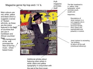
- 1. Magazine genre hip hop and r ‘n’ b. The title /masthead is in yellow / bold typography which connotes youth, wealth and happiness . Denotations of Janet Jackson in a suit suggests she is a independent , dominant female . she's classy and sophisticated and powerful, in control. Main colours use red, white ,yellow and black which a suggests a sense of Nubian ethnicity, as these are the colors featured in the flags of countries that are use in Caribbean and African countries’ flags. The background of the wall promotes the idea of hip-hop music . Urban based music. Janet Jackson is recreating her brothers hit album off the wall (intertexual reference) Additional articles about featuring other artists in white ,black and yellow typography in conjunction with the rest of the front cover . Puff-magazine promotes itself
- 2. Hip hop/r&b sub genre Masthead/title in red-denoting love and passion. Clothing on janet jackson makle her sexually appealing –attracting male audience,hip hop/high street fashion appealing to working/middle class readers (16-35). Holding the camera denotes her status a s a star always in the ‘limelight’. Additional articles appealing to readers who enjoy r&b music Sell line-making this issue seem superior to other issues Barcode and price Sell line Background and camera in models hand both suggest professionalism/studio like qualities e.g. the background at a photo shoot.
- 3. barcode Title/masthead in bold blue typography in italic font suggesting relaxation and freshness Amy winehouse artists from the jazz/indie category caters to the genre of the magazine alluring readers . Main feature ‘Amy Wine house’ in bold blue typography Additional articles on the side of magazine in red and black typography. Magazine rock, soul and indie genre with features of reggae jazz. The connotations of Amy’s beehive fashion links to her retro music and her tattoos and casual black top denotes her subverted attitude towards being famous-she sees herself as an average girl which would appeal to working and middle class readers (16-40).
- 4. Connotations of the red typography denotes passion barcode Rock/pop/indie sub- genre Title/masthead in bold ,red typography in background of magazine suggests fire,desire/passion Additional articles featuring other artists on the side of magazine Sell line. Bold typography of main article on magazine Sell lines Artist Madonna being the ‘pop queen’ reinforces the type of music the magazine features .she appeals to the audience who enjoy pop. Barcode Sell line
- 5. Genre -soul jazz reggae sub-genre Sell line Mastehead/title in background-colour of gold with white frame suggests a vintage quality about the magazine. Additional artists which appeal to the genre of the magazine are listed at the edges of the magazine. Bob marley symbolises the urban reggae ‘scene’ The guitar represents string based music The white background helps the image stand out more/resembles a professional photo shoot The artists fashion symbolizes the 70’s fashion suggesting the time period his music is set in, which appeals to older readers.
- 6. Magazine genre -Soul,jazz,motown sub genre Tie-in/sell line barcode Additional artists conventionally at the side of magazine. Title/masthead in the background of image in white so it stands out more Idea of indian god appeals to ethnic minorities Cartoon image promotes youthfullness and light-hearted entertainment/humour. The slogan ‘the music magazine’ sums up the product and is easy to remember (easy to retain a jingle) Subverted technique of additional artists all around the edge of magazine.
- 7. Genre-rock, heavy metal sub-genre. Main feature in bold ,white typography which stands out more barcode Slogan-easy to retain-sums up the purpose of the product. Additional artists feature conventionally at the edge of magazine Main image background looks like a concert setting –drawing the reader in making them feel like they are there Title/mastehaed in the background of image in fragmented black writing symbolising corruption/destruction/broken glass. Yellow ,white, red colours suggest passion and enthusiasm ,energy/youthfulness. Promoting the genre of the magazine.
- 8. Black coloured typography represents a Gothic theme to the magazine Women sexually attractive in a see through top and dark make up-appeals to male audience, reinforces rock chick genre. Rock /heavy metal sub-genre. Main featured article in bold typography Orange typography denotes passion/death/lust/desire/electricity/ power and energy. Additional topics on the side of magazine in associated colours. Bold title /masthead in background Background ghostly and shadowy links to dark genre of music Tie-ins /sell line-barcode Blood on hand Makes the model look powerful and dominant.
- 9. Soul Jazz :Reader profile Our readers are predominantly individualists but can differ from mainstreamersto achievers of the pre 1980’s era. Our readers are willing to pay for quality and are dedicated to monthly editions. Like to keep up to date with the latest in soul and jazz and have a broad collection of Motown , Soul and Jazz pre 1990’s. Favourite Radio Stations : Smooth Radio , Magic FM and 1 Xtra. Favourite music genres: 48%-jazz 16%-indie 36%-soul Readers are about the earth and have hippy like qualities, into the indie fashion trend (average spend): £140-weekly cost of living on average. Aged 20-35. £134-to theatre productions and yoga sessions per year £280-on scented candles/ incense sticks and independent artists artwork per year £130-on shisha visits and uses per year. £430-on vintage clothing and indie fashion per year
- 11. Planning : Screen grab of organising a photo shoot with my main model ‘Mr. Pink. Picking a specific day and place to take pictures and accessories to bring as apart of my models costume .
- 12. Screen grab of my model (Hamzah) accepting my proposal of being my main model.
Hinweis der Redaktion
- Explain what this screen dump shows e.g. is this part of your planning?
- Again, explain what this shows.
- Explain why each prop etc. is important e.g. Trench Coat to add an air of enigma?