
Empfohlen
Weitere ähnliche Inhalte
Mehr von greenie101
Mehr von greenie101 (19)
Kürzlich hochgeladen
Kürzlich hochgeladen (20)
Question 7
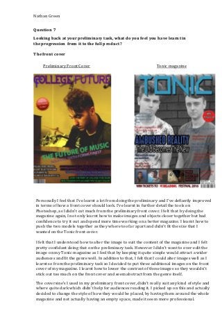
- 1. Nathan Green Question 7 Looking back at your preliminary task, what do you feel you have learnt in the progression from it to the full product? The front cover Preliminary Front Cover Tonic magazine Personally I feel that I’ve learnt a lot from doing the preliminary and I’ve defiantly improved in terms of how a front cover should look. I’ve learnt in further detail the tools on Photoshop, as I didn’t cut much from the preliminary front cover. I felt that by doing the magazine again, I not only learnt how to make images and objects closer together but had confidence to try it out and spend more time working on a better magazine. I learnt how to push the two models together as they where too far apart and didn’t fit the size that I wanted on the Tonic front cover. I felt that I understood how to alter the image to suit the content of the magazine and I felt pretty confidant doing that on the preliminary task. However I didn’t want to over edit the image on my Tonic magazine as I feel that by keeping it quite simple would attract a wider audiences and fit the genre well. In addition to that, I felt that I could alter images well as I learnt so from the preliminary task so I decided to put three additional images on the front cover of my magazine. I learnt how to lower the contrast of these images so they wouldn’t stick out too much on the front cover and seem abstract from the genre itself. The coversine’s I used in my preliminary front cover, didn’t really suit any kind of style and where quite dark which didn’t help for audiences reading it. I picked up on this and actually decided to change the style of how they would be placed, by having them around the whole magazine and not actually having an empty space, made it seem more professional.
- 2. Nathan Green Also I feel that the coverlines didn’t suit the colour scheme and actually broke the trend that they should’ve had in the preliminary front cover. Furthermore there wasn’t one certain shade of a colour that wasn’t consistent. What I learnt from this was to stick to one colour and actually have clear coverlines that people can read as well as them clearing up empty space upon the front cover. In terms of the masthead, I feel that the preliminary masthead wasn’t big enough for people to read from a distance and actually read clearly. This being said, I changed this in my magazine and had the masthead the biggest text on their purely to lure in my target audiences whilst making it clear and easy for them to read it. That being said as I said previously I feel that the preliminary magazine really lacked in clear colours purely due to the image being quite dark as well as the text. So I made sure that despite the fact the image was black and white, I would increase the contrast and brightness, which would bring out the shades and colours in the image making it seem much brighter. Furthermore by doing this made it easy to read the text and masthead on the front cover. Finally I made sure that other smaller areas such as the barcode, issue number, price, the puff and the strap-lines are much more crisp and easier to see/ read. For the price, barcode and the issue number, I made them all on a separate bold stand, which helped it, stand out and fit into one section at the bottom of the magazine. The strap-line on the bottom was also on its on little bold section which a clear white backdrop. I learnt that this is more appealing and easier for passers by/ audiences to quickly read it. Preliminary Contents Page Tonic Contents Page
- 3. Nathan Green Overall I feel that I’ve learnt a lot in terms of what’s the best for the contents page and how to make it laid out easy as well as it fitting the content for that magazine. I feel that for both magazines I didn’t want to include a background as the text would be harder to read as well as people losing focus on the content involved in this page. Firstly I feel in terms of laying out the contents page which makes it easy and clear for readers, has improved dramatically as the preliminary contents page was very scattered and unclear on what page is where. Furthermore I feel that by actually putting three different columns onto my magazine, sections it out quite well alas making it easy for the reader. I’ve learnt that by putting a darker background on something like the page numbers, lifts out the numbers from the page and catches the readers eye very quickly. The images I used on the preliminary contents page really lacked in positioning for luring people into reading on. It’s easy to say that I’ve learnt simple is better for the contents page and by keeping the pictures sectioned out across a separate column, makes it easy for the readers to visually see the articles before even reading the grab quotes or the text underneath. That being said, by adding in grab quotes make the audiences interest rates increase so therefore it has to be easy and clear to read. That is something that the preliminary contents page didn’t have so that was defiantly something I needed to improve for my actual magazine. Furthermore I feel that I made it much easier for audiences to read the grab quotes whilst luring them into the sheer article underneath. Overall I’ve learnt from doing the preliminary tasks, how to use Photoshop in further more professional ways whilst increasing my confidence along the way. In addition to that I also feel that by working on my magazine with the knowledge of what a magazine should and shouldn’t include whilst experimenting for myself.