Adaptive images with DNN Mobile-friendly, "responsive" websites are a trend in web development. If you are creating a new web site, it often makes sense to include a mobile strategy. Designers and developers will need to learn about media queries, and how to manipulate HTML for various screen sizes (resizing images to download smaller images for an often slower-bandwidth context). In the session we will explore strategies for adaptive images within DNN.
Beginners Guide to TikTok for Search - Rachel Pearson - We are Tilt __ Bright...
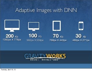
Adaptive images
1. Adaptive Images with DNN
200 Kb 100 Kb 70 Kb 30 Kb
1382px X 778px 992px X 559px 768px X 443px 480px X 271px
Tuesday, April 16, 13
2. Thanks to all our Generous Sponsors!
Text
Tuesday, April 16, 13
3. What We’ll Cover
• What is Responsive Design
• What are Adaptive Images
• The state of Adaptive Images
• Adaptive Images within DNN
• The future of Adaptive Images
Tuesday, April 16, 13
6. The Current State
Filament Group Solution
http://filamentgroup.com/lab/responsive_images_experimenting_with_context_aware_image_sizing/
Matt Wilcox Solution
http://adaptive-images.com/
Dave McDermid .net Port
https://github.com/davemcdermid/AdaptiveImages
retina.js
http://retinajs.com/
Tuesday, April 16, 13
7. Matt Wilcox Solution
1 2 3 4
Download the Upload the Add this line of Configure the
latest version of included .htaccess JavaScript: $resolutions
Adaptive Images. and adaptive- variable to match
images.php files to the breakpoints
the server document- you are using for
root. your designs.
<script>document.cookie='resolution='+Math.max(screen.width,screen.height)+'; path=/';</script>
Tuesday, April 16, 13
8. Adaptive Images in DNN
• Open source module
• Settings set on Host menu
• Have not used in production
• Have not load tested
https://github.com/gravityworks/GravityWorks.DNN.AdaptiveImages
Tuesday, April 16, 13
9. Future of Adaptive Images
<picture
width="100%"
height="100%">
<!-‐-‐
Mobile
Layout
-‐-‐>
<source
media="(max-‐width:
30em)"
src="img/race@mobile.jpg">
<!-‐-‐
Tablet
Layout
-‐-‐>
<source
media="(min-‐width:
48em)
and
(max-‐width:
60em)"
src="img/race@tablet.jpg">
<!-‐-‐
start:
Stationary
Devices
-‐-‐>
<source
media="(min-‐width:
60em)
and
(max-‐width:
80em)"
src="img/race@desktop.jpg">
<!-‐-‐
Source
intended
for:
Notebooks
and
normal
Desktop
Layouts
-‐-‐>
<source
media="(min-‐width:
80em)"
src="img/race@hires.jpg">
<!-‐-‐
fallback
img
if
picture
is
not
supported
-‐-‐>
<img
src="img/race@fallback.jpg"
alt="A
very
exciting
yacht
race.">
<!-‐-‐
alternate
text
-‐-‐>
<p>A
very
exciting
yacht
race.</p>
</picture>
Tuesday, April 16, 13
10. Thanks! Any
Questions?
Jeff McWherter
jeff@gravityworksdesign.com
@jmcw
www.gravityworksdesign.com
Tuesday, April 16, 13