
Empfohlen
Empfohlen
Weitere ähnliche Inhalte
Was ist angesagt?
Was ist angesagt? (20)
Andere mochten auch
Andere mochten auch (7)
Ähnlich wie Improving Online Course Quality Strategies
Ähnlich wie Improving Online Course Quality Strategies (20)
Kürzlich hochgeladen
Kürzlich hochgeladen (20)
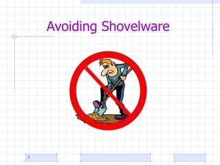
Improving Online Course Quality Strategies
- 2. Innovative Strategies toward Improving Online Course Quality Instructional Designer, Susan J. Clark, PhD Designing for Quality
- 6. Biggest factor in design quality
- 7. Typical Time Allotment Activity Time Meet with the Instructional Designer to plan the design of the course or project and to discuss training needs. 2 hrs Develop course objectives, syllabus, and introduction 5 hrs Locate and obtain permission to use resources 5 hrs Plan media production 1 hr Develop content 8 hrs Create Course Shell 1 hr Assemble and organize content into CMS 4 hrs Test course 2 hrs Revise as needed. 2 hrs Additional Activities 0 Total 30 hrs
- 12. How do you design for alignment?
- 14. Alignment Worksheet Example http://docs.google.com/Doc?id=dggvhhw6_80g6n54chk Learning Objectives Learning Activities Assessment Materials Media Where are students going? What will the students do to get there? How will you know when they get there? What will help the students get there?
- 15. Design for Learner Engagement
- 19. Design for Accessibility (Universal Usability) Universal Design is the "design of products and environments to be usable by all people, to the greatest extent possible, without the need for adaptation or specialized design" (Center for Universal Design, North Carolina State University). Universal Design for Instruction (UDI) is the application of this construct to college teaching.
- 21. Rules of Thumb
- 22. Use contrast.
- 24. Use a clean font style. This is plain text.
- 27. Use white space.
- 28. Use alt tags. <img src="filename.gif" alt="Alternative description goes here" >
- 29. No-no’s
- 31. Innovative Strategies toward Improving Online Course Quality Learning Technologies Facilitator Beth Hale Reviewing for Course Readiness
- 36. SECTION #1 :: COURSE ORIENTATION & DESIGN The overall design of the course, navigational information, as well as course, instructor and student information are made transparent to the student at the beginning of the course Criteria Y / N Comments
- 37. SECTION #2 :: COMMUNICATION The effective design of instructor-learner interaction, meaningful learner cooperation, and learner-content interaction is essential to learner motivation, intellectual commitment and personal development. Criteria Y / N Comments
- 38. SECTION #3 :: ASSESSMENT Assessment strategies use established ways to measure effective learning, assess learner progress by reference to stated learning objectives, and are designed as essential to the learning process. Criteria Y / N Comments
- 39. SECTION #4 :: CONTENT PRESENTATION Instructional materials are designed to be sufficiently comprehensive to achieve announced objectives and learning outcomes and are prepared by qualified persons competent in their fields (Materials, other than standard textbooks produced by recognized publishers, are prepared by the instructor or distance educators skilled in preparing materials for distance learning.) Criteria Y / N Comments
- 40. Innovative Strategies toward Improving Online Course Quality Instructional Computing Facilitator Greg Kaminski Mentoring for Quality
- 51. Questions
- 52. Have Fun!
- 53. Slideshow URL
Hinweis der Redaktion
- Give handouts. Ask why are you taking this workshop? Ask someone to use SmartPen for notes.
- How do you recognize it when you see it? Brainstorm quality construction in home-building and liken to online course-building. Does it look appealing? Is it sound, safe, with a usable layout? (Is it instructionally sound , intuitive, organized, accessible, etc.) Important to be on the same page! My definition of quality in an online course is: The degree of alignment , engagemen t, and accessibility it possesses.
- There are many factors that affect the quality of an online course. Among these factors are: the course design (the forethought and planning that goes into an online course, the course delivery (i.e. the way the course is taught, also known as faculty performance), the course content, the course management system and its functionality; technical support the institutional infrastructure (help desk, online library access, online tutoring access, etc), a faculty member ’ s training and readiness for online teaching, and the students ’ role with respect to engagement and readiness for an online course. QM reviews just one aspect of online course quality – Course Design .
- That’s an extremely long definition, but the best I’ve seen that encompasses all of what ID is. Let’s pick it apart…
- Time! How can we give faculty the time they need?
- With our (now defunked) ITEC grants faculty-developers are limited to 30 hours of curriculum development or released time for a 3-credit course. It’s simply not enough time for quality!
- Even though I can’t give faculty more time, generally this is what I do. (Explain each briefly) None of these sound particularly innovative, do they?
- (Clip is the “Building planes in the sky” commercial). Some people think it should be just as easy as stepping into the classroom. Flying by the seat of our pants is doing something difficult without the necessary experience or ability. Developing eLearning while delivering eLearning really isn’t a feasible approach, but it’s what usually happens, at least first in higher education because development time is so short. Students may also be under the notion that eLearning is easier than f2f. (video clip at http://www.youtube.com/watch?v=t39EAeE8ehc )
- Design Specifications for 3 basic qualities of online course. Make sure Pedagogy drives technology (not visa versa)!
- Quality Matters Peer Reviewer Training © MarylandOnline, Inc. Alignment is also a central theme of the Quality Matters program. The QM rubric Highlights the General Review Standards that must work together. Use Alignment Worksheet
- Questions: Where are the students going? What should students be able to do, know, or even feel as a result of the instruction? How can they get there? (teaching strategy) What will the students do? (interaction & activity) Who/What can help them get there? (resources, etc.) How will they/you know when they get there?
- http://docs.google.com/Doc?id=dggvhhw6_80g6n54chk Felicia’s Alignment worksheet (Once this is complete, you have a blueprint for the course!)
- This is NOT our idea of Learner Engagement! Designing for engagement is something I always recommend.
- Physics Instructor, learning to use BlackBoard, “What I really wish was that there was some easy way to capture what I write and draw and present it to the students online. Not everyone has a smart board.” –David Reil, Physical Science Instructor.
- Another example http://tinyurl.com/PencastPhysFluids2
- 1st we need to put ourselves in the learners’ shoes! We need to consider the purpose of the text and how the learner will use it. Is the text a multipage document that requires deep reading or is it information or instructions that can be briefly written and understood? Will the learner want to print it for review? What other questions should we ask?
- See handout.
- Use contrasting colors . Text is easiest to read when the font text color and the background color are in high contrast. Low contrast irritates the reader and causes eye fatigue. Viewers with impaired vision may not be able to read low contrast text at all. You can check this with the Vischeck 1 , http://www.vischeck.com/vischeck/vischeckURL.php which shows you how your website looks to color blind people. Bold important points
- That's technical talk for make your page more scan-friendly. Large blocks of dense text intimidate the reader and causes &quot;information overload&quot;. Look at the two pages. Which one would you rather read? Use bullets and subheadings . They help get the readers attention and say &quot;Hey you - this is important!&quot; Colored bullets are an easy way to add color and visual interest to a text heavy page. Subheadings should be brief and convey a summary of the section. Too often we're tempted to use clever titles whose meaning is lost on the reader. Keep your paragraphs short . Breaking a long paragraph into several smaller sections invites the viewer in to read. A little white space between the paragraphs gives the site a clean look. Impatient visitors want to be able to glance at your page and hit the important points. You can help them by bolding important points or highlighting the text in a different color to draw their eye. Use columns to control text width . Your goal here is to avoid running your text all the way across the page. Pick up any newspaper. Notice how they place the text in columns. The shorter width makes the text easier to read. Did the Online Biology Text use chunking?
- Strive for a clean font style for maximum readability . Imagine trying to read a web page in the decorative style below. Compare that with the sans-serif font next to it. 6 Want more font style tips? Keep these principles in mind. Plain text is easier to read than italicised text . Mixed case is easier to read than all upper case. Studies have demonstrated that it takes people longer to read upper case than mixed case. Besides, upper case has become synonymous with screaming on the web - and I'm sure you don't want to scream at anyone. A sans-serif font is easier to read than a serif font. If you were wondering, serifs are the little marks at the end of letters. Sans serif fonts do not have serifs. Examples of serif fonts are Times New Roman and Courier New. Popular … Did the Online Biology Book use a clean font syle? Why do we usually use a serif font for printed text?
- Ideally it's recommended that you leave the font size scalable so users can control the size they want. [Demonstrate changing text size in browser– view/text size/largest]
- Make your links look like links. If you just can't bring yourself to color your links blue (the Internet convention for links) at least underline them. And don't underline anything that isn't a link. That faux pas makes readers mad, fast. Embedded links (links within the body of the text) work well and according to a Wichita State usability study 7 they are preferred by readers. Why did I use words instead of the URL?
- Ahhhh, white space! This is perhaps one of the most misunderstood elements of web design. Yet, when used properly, it can be one of the most effective! White space, or negative space, are the blank areas between the graphics and text on your web page. Most web designers focus solely on the graphics and text. However, white space is also an essential design element. Think about the best ads you have seen in glossy magazines that promote luxury items. Usually, the best of those advertisements have a common feature - an uncluttered layout. Cluttered layouts tire the eye quickly and hinder clarity.
- For accessibility, Alt tags are added so that screen readers can read aloud the alternative text given to images. What alternative description would you insert for this image?
- Don't use all caps. Don’t use busy backgrounds. Don’t use itsy-bitsy font size. Don’t use fully justified or centered text. Don’t use flashing or moving text. Don’t underline text that isn’t a link. Why not?
- AOF is at http://www.humboldt.edu/~aof/AssessingOnlineFacilitationInstrument.pdf used to
- Give handouts. Ask why are you taking this workshop? Ask someone to use SmartPen for notes.
- Take questions then have them look at pretest and see if their answers would be different after the workshop.
- Please complete the feedback survey in your email. Thank you!