
Empfohlen
Weitere ähnliche Inhalte
Mehr von freddy1football
Kürzlich hochgeladen
Kürzlich hochgeladen (20)
Album analysis
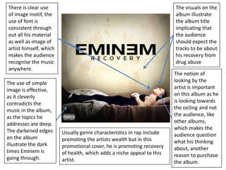
- 1. There is clear use of image motif, the use of font is consistent through out all his material as well as image of artist himself, which makes the audience recognise the music anywhere. The visuals on the album illustrate the album title implicating that the audience should expect the tracks to be about his recovery from drug abuse The notion of looking by the artist is important on this album as he is looking towards the ceiling and not the audience, like other albums, which makes the audience question what his thinking about, another reason to purchase the album. The use of simple image is effective, as it cleverly contradicts the music in the album, as the topics he addresses are deep. The darkened edges on the album illustrate the dark times Eminem is going through. Usually genre characteristics in rap include promoting the artists wealth but in this promotional cover, he is promoting recovery of health, which adds a niche appeal to this artist.
- 2. The Colour scheme used in this album is consistent through out all his albums. The colour red is used a lot giving the assumption to the audience that he is vibrant character and this is shown through his music. This Logo shown is Bow Wow’s image motif, which is essential, as it is a form of promoting his material, if the audience saw this logo, they would know it represents Bow Wow. Genre characteristics in Rap and Hip hop include ‘flashing’ wealth, this is visual seen in this album cover with the jewellery Bow Wow is wearing. Bow Wows notion of looking on this album where he is covering his eyes , make the audience curious and intrigued to why he is covering his eyes, this body language links with the title of the album ‘outta my system’ as if he has something to explain. On this Album cover, Bow Wows name is in bright red and bold font so that this album stands out so it catches the audiences eye.
- 3. The image motif on this album is the use of font with Snoops name, this font is consistent throughout all his material and when the audience see this they know it relates to Snoop Dogg, giving him extra promotion. The image on this album is in black and white, this is effective as it makes the album title stand out, also the font used is elegant which contradicts the artists material and the name of the title which intrigues the attention of audience, luring them into having a second look at the album. Genre characteristics are clearly shown on this album with a expensive vehicle and designer clothing showing wealth of Snoop Dogg.
- 4. Lil Wayne's name is in small font this shows that the artist believes that he has enough publicity for people to recognise his face without his name. The close up image of Lil Wayne is essential as it draws attention of the audience, as it gives the feel that the artist is right in front. This cover is in black and white, also could be classed as darkness, so to the audience it could symbolise Lil Wayne's mood and what type of music to expect in the album. The notion of looking on this album intrigues the audience, as they question why Lil Wayne has closed eyes, therefore making them assume that the answer is in the album. The title of the album is also in small font, this suggests that Lil Wayne believes that if the audience see an image of him on an album, they will buy his music, without the need to know the album title. The tear drops on his face, shows emotion of Lil Wayne, even though he shows no facial expressions. This leads to the assumption there is depth behind this album for the audience explore and that the close up is a form of promoting himself.