Responsive Design & the Business Analyst
•
4 gefällt mir•2,523 views

The document discusses responsive web design, which involves developing websites that automatically adapt their layout to different screen sizes and devices. It notes the problems of supporting multiple devices and browsers with different capabilities. The key aspects of responsive design are fluid grids that adjust content width, flexible images that resize or swap based on screen size, and media queries that determine device/browser capabilities. The document provides examples of responsive e-commerce sites and discusses considerations for implementing responsive design within agile development, design, testing, and data analysis processes.

Empfohlen
Empfohlen
Weitere ähnliche Inhalte
Was ist angesagt?
Was ist angesagt? (9)
Andere mochten auch
Andere mochten auch (17)
Ähnlich wie Responsive Design & the Business Analyst
Ähnlich wie Responsive Design & the Business Analyst (20)
Kürzlich hochgeladen
Kürzlich hochgeladen (20)
Responsive Design & the Business Analyst
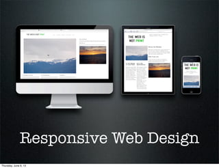
- 1. Responsive Web Design Thursday, June 6, 13
- 2. Who is this Ted guy? • 12 years doing BA work • High Tech, Financial, Manufacturing, Food Services • 3.5 years writing about BA work & technology • HighGravityConsulting.com • BetterProjects.net Thursday, June 6, 13
- 3. Remember this? Thursday, June 6, 13
- 4. It became these Thursday, June 6, 13
- 5. Seeing is Believing Thursday, June 6, 13
- 6. What’s The Problem? • More devices & more browsers, all with different capabilities, being released more frequently. • Supporting different content and development across desktop, tablet & phone channels. • Supporting future channels (TV, game consoles, etc) in formats that fit those channels without a major development effort. Thursday, June 6, 13
- 7. Responsive Goals • Don’t rely on physical dimensions; rely on context and device capabilities. • Develop based on how your consumers will experience and interact with your company. • Provide rich media in an experience tailored to the consumer’s goals. • Never limit a consumer’s capabilities based on their device. Thursday, June 6, 13
- 8. But Its Not... • Scaling down your desktop site. • Using images that are so large they take forever to download. • Use small buttons to fit on all functionality on a mobile screen. • Adding too much text to a tiny screen. Thursday, June 6, 13
- 9. With Great Power... • Use it if your customers are using many different devices, especially in a BYOD environment. • May have some gains in a corporate environment, but if you control the devices, it may be overkill. • If your site is extremely data intensive... • Consider reengineering it to show what data is really needed. • If that won’t work, Responsive probably isn’t the answer. Thursday, June 6, 13
- 10. This sounds familiar... Thursday, June 6, 13
- 11. Graceful Degradation • Starting with your full website and removing enough elements that it fits on a less capable device • Limited by what you can do on your full website • Doesn’t always provide all needed functions for less capable devices • Can produce an overly complex design that is difficult to ‘trim down’ • Isn’t always ‘graceful’ Thursday, June 6, 13
- 12. Progressive Enhancement • Start with the most basic device and add to it for more capable devices • Keeps your site working for all devices and those with older or less capable just don’t get all the ‘bells and whistles’ • Can result in larger than necessary sites if it pre-loads the wrong assets Thursday, June 6, 13
- 13. Isn’t this just HTML 5? (with CSS 3 & Javascript) Thursday, June 6, 13
- 14. HTML 5 Structure APIs Thursday, June 6, 13
- 17. What about mobile apps? Thursday, June 6, 13
- 18. What Responsive Is • Three Components • Fluid Grids • Flexible Images • Media Queries Thursday, June 6, 13
- 19. Fluid Grids • Most sites use a fixed grid. Content width is 720px and the side-bar is 180px. • Responsive says the Content is 70% of the screen with a minimum of 200px width. • Allows content to shrink and expand to fill the screen. Thursday, June 6, 13
- 20. Flexible Images • Images automatically resize and/or swap-out as the screen size changes. • Lower-quality placeholder images load first to allow the consumer to use the site prior to the best image loading. • Supports high-res images (retina) in 1x, 1.5x, 2x and any future pixel depths needed. Thursday, June 6, 13
- 21. Media Queries • Used to determine device/browser capabilities. • Many queries, but width, height & device-pixel-ratio are the most important ones. • Not all browsers/devices support media queries, but there are fallback methods (polyfill solutions) for older devices & browsers. Thursday, June 6, 13
- 22. Is Anyone Doing This Yet? Thursday, June 6, 13
- 23. Responsive eCommerce Sites • Starbucks • United Pixel Workers • King of Nothing • Mogotix • Tattly • Attika • Puplife • Lot 18 • Nuts.com • Skinnyties.com • Sugru • Thomson Sport Thursday, June 6, 13
- 24. Responsive & the BA Thursday, June 6, 13
- 25. Enterprise Analysis • What parts of your business are most likely impacted by users with many different devices? What do you not control? • Consumer facing sites = YES!! • ERP Systems = Probably not • What systems have realized their capital investment? • What teams are mature enough to handle the transition? • What customer bases require modern experiences? Thursday, June 6, 13
- 26. Requirements Planning • Engage the design team immediately • Think about what content you will need • Where and how will you store the site assets? • Who will create all those site assets? How will you report on asset creation status? Thursday, June 6, 13
- 27. Requirements Elicitation • Define your profiles, with characteristics • Operating Systems • Screen Sizes • Capabilities • “Just like the old site, but responsive!” • Wifi v/s Cellular • Traffic, page size, load times, loading order, fonts, etc Thursday, June 6, 13
- 28. Requirements Analysis • Wireframes • Prototypes • Content needs • Links • Text • Layouts • Images Thursday, June 6, 13
- 29. Solution Validation • Validating the design • Validating on actual hardware • Iterative reviews • Information Architecture Hierarchy Thursday, June 6, 13
- 31. Other Considerations Thursday, June 6, 13
- 32. Impacts to Agile • Iterate. Iterate. Iterate. • Mobile stories first. • Information architecture is important to get right in the first sprint. • Prototype in HTML, not Photoshop. Thursday, June 6, 13
- 33. Impacts to Designers • Can decrease their work if they are currently creating assets for different experiences. • Will require changes to their workflow and possibly to their tools (if you automate final image processing). • Consider getting help if they come from a print background or have never done responsive before. Thursday, June 6, 13
- 34. Impacts to Development • Can shorten development time if you’re coding separate desktop & mobile sites today. • Requires a retraining for UI developers. • Requires a different workflow for integrating assets from the designers. Thursday, June 6, 13
- 35. Impacts to QA • Test ideas on real devices; avoid simulators. • Expands testing time if you only test on desktop today. • Shrinks testing (maybe) if you test multiple channels today. • Expands testing budget if you only test on desktop today. • Visual defects are more difficult to catch when screens scale. Thursday, June 6, 13
- 36. Analyze Your Data • Multi-site versus Single-site • Event tracking • Screen tracking • Page load times • Device/OS/Browser tracking • Site flow analysis Thursday, June 6, 13
- 37. Roadblocks to Being Responsive • The investment required to rewrite the front-end. • Rearchitecting content management to support many pixel densities, image sizes and text. • Requires a C-level champion. Thursday, June 6, 13
- 38. How Do We Get Started? • Start with setting goals for user interaction. • Mobile First! • Study our customers to better understand the context in which they use their devices. • Target specific device classes. Use analytics to discover which classes matter most. • Find best practices, both within your industry and the market at large. Thursday, June 6, 13
- 39. Some (obvious) advice • Always consider your users • Make it future proof • Keep improving your processes • Iterate! Thursday, June 6, 13
- 40. Don’t forget... Thursday, June 6, 13
- 41. Remember... • Simplify tasks, don’t limit features. • Remove barriers & distractions. • Move the smaller screen experience to the big screen. • Engage designers and engineers up front. • Define flexible workflows & methodologies to be flexible for the future. Thursday, June 6, 13
- 42. Selected Resources • There are lots of toolkits that exist to help us move more quickly in the development process. • Mobify, FitTextJs, FitVidsJs, RetinaJs, adaptive-images.com • LessCss.org, Sass-lang.com, Compass-style.org • html5boilerplate.com, getskeleton.com, lessframework.com • cssgrid.net, gridpak.com, gridsetapp.com • Many more options as well... Thursday, June 6, 13
- 43. Additional Information • https://speakerdeck.com/u/ brendanfalkowski/p/ responsive-ecommerce- design-once-sell- everywhere • http:// coding.smashingmagazine.c om/2011/01/12/guidelines- for-responsive-web-design/ • http:// www.mayfielddigital.co.uk/ blog/web-round-up/best- responsive-web-design- examples-and-resources/ • http:// www.cxpartners.co.uk/ cxblog/responsive-e- commerce-design/ • http://www.youtube.com/ watch?v=FXvUvN_U2pg • http://en.wikipedia.org/ wiki/ Responsive_web_design • http://www.lukew.com/ff/ entry.asp?1514 Thursday, June 6, 13
- 44. Questions? Thursday, June 6, 13
- 45. Thank You! Thursday, June 6, 13