
Empfohlen
Weitere ähnliche Inhalte
Was ist angesagt?
Was ist angesagt? (18)
Andere mochten auch
Ähnlich wie Ancillary products
Ähnlich wie Ancillary products (20)
Kürzlich hochgeladen
Kürzlich hochgeladen (20)
Ancillary products
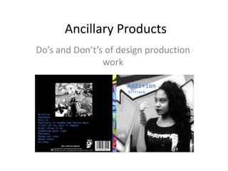
- 1. Ancillary Products Do’s and Don’t’s of design production work
- 2. DO - Stick to 2 clear fonts as a maximum. Make sure they compliment each other and are genre appropriate. Watch the sizing of your fonts carefully In the first sketch of my digipak I have made sure that I will only be using one font to make it clear, simple and genre appropriate. The sizing will be that the artist’s name is in the biggest size, then the album title second biggest. • Also - Include bar code, date, copyright information, title of the album, artist name, record company logo, website and artist website
- 3. DO - Stick to 3 colours as a maximum. Make sure they go well together, fit the genre correctly and suit the colours in the photos The colours I will be using will be blue text as blue is one of the main colours on the graffiti wall in my music video, and this will be on top of a black and white image so that it is quite in keeping with the mood of my genre. Also as the graffiti wall is so colourful it will look more visually effective in black and white as there would be too much going on if I were to keep the colour. In order to bring some vibrant colour to my ancillary products however I may keep the coloured image on the spine of my digipak and perhaps the inside will be colourful also. But firstly I will check to see if the colour is too busy.
- 4. DO - Make sure you are using clear photos that are in focus. Appropriate shot size, generically appropriate. Rule of thirds for composition When my group and I were out filming for our music video we also took some pictures that we can use for our ancillary products. However it is challenging to find a picture that still looks good quality when it has been cropped or stretched. I will also be using a close up/ mid shot image of Reanne so that the audience will recognise her from the music video as a new artist. The image of Reanne I have chosen is in keeping with the rule of thirds for composition as her face is on the far right two thirds, looking left.
- 5. Don’t • Don’t use unnecessary effects. Any text or image effect must suit the genre • Don’t stretch image to fit the panel – if the image isn’t the right size to start with then don’t use it • Don’t place text across the face of the artist - (The focus will be on the face of the artist, the text will be in the top left corner of the front cover, whereas her face will be on the right hand side) • Don’t use fonts simply because you like them - (1 clear font will be used) • Research carefully and follow the conventions of your genre closely. Too many photos will lose marks – (One stand out image on front cover, possibly another image on the back but not a close up shot, more an establishing shot from the music video locations)