

Empfohlen
Weitere ähnliche Inhalte
Was ist angesagt?
Was ist angesagt? (17)
Ähnlich wie Caldecott illustration analysis
Ähnlich wie Caldecott illustration analysis (20)
Kürzlich hochgeladen
Kürzlich hochgeladen (20)
Caldecott illustration analysis
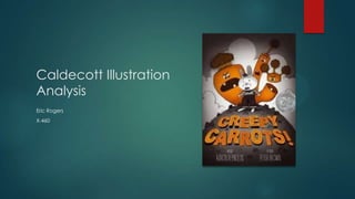
- 2. Creepy Carrots! Written By: Aaron Reynolds Illustrated By: Peter Brown (picture left) Published By: Simon & Schuster Books For Young Readers Caldecott Award: 2013
- 3. Style & Media Expressionism– Shown by the orange carrots that pop out of the page through the black and white background. Surrealism– Shown by the facial features of the carrots as they taunt jasper the bunny.
- 4. Style & Media Impressionism– Creates drama by the dark colors of the pictures and emphasizing only one color, making a dramatic story just by the illustrations. Cartoon Art– Shown by the simplistic forms of the background in each illustration.
- 5. Line Both curved and straight lines are used in the illustrations. First, the curved lines are used to create the curved landscape. For instance: in the picture (top right) you can see Jasper on a hill, picking carrots and the other “mean” carrots on a higher hill overlooking Jasper, taunting him.
- 6. Line Second, vertical lines are used in one illustration to create a “scary” look to the carrot on the left by making it appear tall, following Jasper.
- 7. Shape The general shape used in this book are round shapes. The round shape can be seen in Jasper, the rolling hills, and even the different sizes of the carrots that are following poor Jasper.
- 8. Color Color is probably the most influential piece of this book. The use of one bold color in this black and white book makes a dramatic statement and sets the mood for this book.
- 9. Texture The texture used in this book, in my opinion, is smooth and soft. However, at the beginning of the book that has the title, the texture is hard, to create the hard lines and create depth.
- 10. Composition There is a good balance of the elements, unifying the illustrations in the book. The use of larger pictures with landscape are balanced by the use of smaller pictures depicting Jasper’s search for the Creepy Carrots!