
Empfohlen
Weitere ähnliche Inhalte
Andere mochten auch
Andere mochten auch (12)
Ähnlich wie Font Types
Ähnlich wie Font Types (20)
Kürzlich hochgeladen
Kürzlich hochgeladen (20)
Font Types
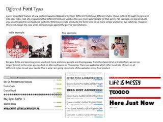
- 1. Different Font Types A very important feature of any poster/magazine/digipak is the font. Different fonts have different styles. I have noticed through my research into pop, indie, rock etc. magazines that different fonts are used as they are more appropriate for that genre. For example, on pop products you would expect to see bold and big fonts. Whereas on indie products, the fonts tend to be more simple and not as eye catching. However this is not always the case when companies go against the genres’ connotations. Indie example: Pop example: Because fonts are becoming more used and more and more people are straying away from the classic Ariel or Calibri font, we are no longer limited to the ones you can find on Microsoft word or Photoshop. There are websites which offer hundreds of fonts in all different styles to suit your needs. This is why I am going to use one of the websites in my final product.
- 2. How we portray different fonts Continuity is very important on any type of media product. This often includes the font type aswell. If the masthead is one type of font, another part of the product would often have a similar looking or the same font. Big fonts are used to draw attention to the writing. Usually if a masthead on a magazine would be written in a bold font as it is eye catching. Fonts like this would be seen in the main text of a product. It is easy to read and is the default font on most computers. A font like this is very dated and would often be seen on products years back in the old English period.