
Empfohlen
Weitere ähnliche Inhalte
Was ist angesagt?
Was ist angesagt? (20)
Andere mochten auch
Ähnlich wie Karl Lagerfeld Photographer Research
Ähnlich wie Karl Lagerfeld Photographer Research (20)
Mehr von emilyaldredd
Mehr von emilyaldredd (20)
Kürzlich hochgeladen
Kürzlich hochgeladen (20)
Karl Lagerfeld Photographer Research
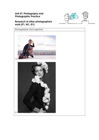
- 1. Unit 57: Photography and Photographic Practice Research of other photographers work (P1, M1, D1) Photographer: Karl Lagerfeld 1// 2//
- 2. 3// 4// 5//
- 3. 6// Theme or focus of images 1// this first image if of model Cara Delevingne for Chanel, shot by photographer Karl Lagerfeld in 2013 for Chanel advertisements. Cara is posing by being crouched down, her right hand draping over a Chanel bag besides her, and her left arm supporting her resting head, towards the left side of the image. In the background appears to be a city, suggesting she is very high up on a building ledge. The photographer could’ve took the photo a bit further back, which would reveal more of the city, but that might be too much and wouldn’t balance out well with Cara. There is suggestion of natural lighting due to the sky being prominent in the background, and it is hitting Cara from the back right side, highlighting her pong tail and side of legs. This image appears to have been taken at lower than eye-level, due to how the model is posing, and the camera is eye-level to the model then. 2// This 2nd image, is of a model, shot by Karl Lagerfeld, I think for Chanel quite some time ago. The model is posing by standing facing the right and looking down over her right shoulder, with her right arm bent and positioned resting on her hip, with flowers draping over her torso and in her hair. In the background is a plain black background. The photographer could’ve stood further away, allowing us to see more of the model, but it would also give us more background, which could out balance the model. If we zoomed in a little bit more, we wouldn’t be able to see the flowers and how she is wearing them properly. There is light hitting the model from face onwards. This image appears to have been taken at eye level. This image also has been edited to be black and white, which makes the flowers stand out more, almost making them look like they were edited into the picture.. 3// This 3rd image is of, again, model Cara Delevingne, for Chanel shot by Karl Lagerfeld. The model is posing by standing right in front of a mirror, with both hands on the mirror, her right hand placed above her head holding Chanel jewellery, and her left hand is placed at the bottom of the mirror. The model is looking directly into the camera via her mirror reflection. The photographer could’ve of stood further away to take this shot as the background would be clearer of what it is and the theme of the image would come across more. There is what appears to be natural lighting from the windows in the top right corner which hits the models face via the mirror. This image appears to have been taken at eye level and it is suggested that the model is stood up. 4// this 4th image, is of again, Cara Delevingne for Chanel shot by Karl Lagerfeld. With this image, it has a Georgian era theme to it with a modern twist. The model is posing by lying down on a couch on her left side, with her right hand holding onto her hat, and her left hand holding onto a jacket draped over the side of the couch, whilst looking directly into the camera, The photographer could’ve stood further away than the original position, but then we wouldn’t have the focus on the detail as we do now. This image would’ve been taken at a level lower than eye-level due to the model being lay down. 5// This 5th image is of again, Cara Delevingne with another model shot by Karl Lagerfeld for a magazine. The two models are posing by lying down on a large white bed, resting their heads on their hands and both looking into the camera. The photographer could’ve taken this shot further away than the original distance as then we would get a better sense of a background as the two models take up the frame. This image appears to have been taken at a level higher than eye level due to the two models looking slightly up towards the camera. 6// This 6th image is of two models posing for a Chanel advertisement shot by Karl Lagerfeld. The two models are posing by walking towards the camera in an empty field. The two models are wearing full length couture gowns by Chanel. They also have a Victorian feel to these image as well. If this image was
- 4. taken further away, we would only see the two models in a field and not much detail on their outfits, the background would overshadow them. This image appears as if its been taken at eye-level as the models are walking towards them so they’re would’ve been some distance from the camera to the models. This image has been edited in black and white which makes the models stand out more as the background is quite greyish/whitish plain. Composition 1// This first image, was stood a distance away as it appears she is on a ledge on a high building, and her whole body, including some of the ledge is in it, suggesting the distance away. I don’t think the image was zoomed in at all, as we wouldn’t be able to see what we see now and how much we see, where as if it was zoomed out a little, we would see more of the model’s surroundings, which might take up too much room and not be able to focus on the model. By only photographing what Karl has done, it makes the background a tad blurry, which makes the model stand out more and in focus. 2// This second image, I think was stood a close distance as the image cuts of at the torso. I don’t think the image was zoomed in at all, as the image cuts of just above her head and if it were zoomed in more, we wouldn’t be able to see this. If the image was in colour, we wouldn’t be able to concentrate on the flowers which are the main features, because we would focus more on the contrast of the clothing and the flowers. 3// This 3rd image, I think was taken at a close distance because the image cuts of just below the models shoulders. If we zoomed out a little bit, we would see a bit more of the background and get a better sense of what the theme is for this particular shoot. If it were more zoomed in, we wouldn’t see the feature in the background and we would see more of the model’s clothing or tattoo on the back of her neck. 4// This 4th image , I think was taken at a far distance due to the model being lay down, and her full body is included in the picture. If we zoomed out a little more, we would be able to see more of the model’s surrounding’s, but then we wouldn’t be able to see the detail as we do now. If we zoomed in a little bit, we wouldn’t be able to see the full body of the model or the outfit. The model would then take up most of the frame, leaving hardly any room for the background. 5// This 5th image, I think was taken at a far distance due to most of the two models body’s being in the shot. If we zoomed out a little more, we would be able to see the models full body’s and their outfits, but if we zoomed in a little, we would only see what we do now, but on a bigger ‘zoomed in scale. The two models take up a majority of the frame due to their outfits. 6// This 6th image, I think was taken with some distance as the models appear that they’re walking towards the camera so they would of needed distance to make this possible. If we zoomed out, then we would see more of the field and the models will appear smaller and wont appeal in much detail. If we zoomed in, we wouldn’t get much of a sense of the background. Techniques used 1// For this 1st image, I think the shutter speed was quite a fast, low exposure as there is lots of natural lighting and a high exposure might blur out the image altogether. With depth of field, in the background we can see a view of overlooking a city, with the sky taking main dominance. The city is a bit blurred out, which makes the model look HD. In the foreground is the model herself, who is positioned to the left side of the image, and who is in complete focus, which makes her main point as she stands out. If we apply a 3 X 3 grid on top of this image, in the central square would be the models right elbow, and knees because of her posing position, but with her overlapping the conjoining lines on the grid, and because she is in focus, she makes herself the main point. 2// For this 2nd image, I think the shutter speed was quite a fast exposure as the lightness colour of the flowers are quite bright. With depth of field, in the background is a plain black background which reflects the white flowers on black background. In the foreground is the model who is in full focus and centre of the shot. If we apply a 3 X 3 grid on top of this image, in the central square would be the model’s shoulder and mainly, the flowers, making them focus point. 3// For this 3rd image, I think the shutter speed was a fast exposure as there is a lot of natural lighting, and could easily be over exposed. With depth of field, in the background is what appears to be a boxing ring
- 5. out of focus, suggesting this is an athletic shoot. In the foreground is the model posing against the mirror. If we apply a 3 X 3 grid on top of this image, in the central square would be the out of focus boxing ring and the left side of the models face, which would mean she would take the central point due to being in focus. 4// For this 4th image, I think the shutter speed was a fast exposure due to there being bright, rich colours in the frame for the camera to focus on. In the depth of field, in the background we can see what appears to be a rich gold wallpaper, which suggests that the theme of the shoot is based around a posh environment. If we lay a 3 X 3 grid on top of this image, in the central square would be the models arm, the gold wallpaper and some of the lettering. With the models arm being in the central square, it is the only item in that square that would be in focus, therefore it makes the viewer want to see what else there is, making her focus point. 5// For this 5th image, I think the shutter speed would’ve been exposed for a little while but not too long as the bed that the models are lying on is bright white, and the models outfits are black, two opposites tones that could easily wash each other out. With the depth of field, in the background is a plain black backdrop. In the foreground is the two models with the black dresses on that have texture and volume to them as they fill up the right hand bottom corner. The two models and their outfits are all in focus. 6// For this 6th image, I think the shutter speed would have been a quick exposure as it appears to be an image that before editing, it was a light coloured one. With depth of field, in the background is a plain hay field with only trees in the distant, and in the foreground are the two models who are in focus compared to the blurred trees. If we applied a 3 X 3 grid on top of this image, in the central grid would be half of the models body’s as they are on either side of the image. Most of the background in the central square would be the field, and since its plain, the two models take the main focus. Strengths & Weaknesses 1// Two strengths for this 1st image, include liking the background and the height of the photograph (how high they were), and how in focus the model is in comparison. Two weakness’ would include not being able to see more height of the image, if the model was stood up, we would get a better sense of how high the image was taken, and the light not hitting her face more. I would use this image in my own work as inspiration by the height of the image, taking a risk. 2// Two strengths for this 2nd image include liking the flowers and positioning of them, and the editing of making the image black and white. Two weakness’ include the flowers looking like they’ve been edited on rather than them actually being in the image, and not being able to see the models full body. I would use this image as inspiration for my own work by using the flowers as props or clothing to make the image interesting. 3// Two strengths for this 3rd image include liking the pose of the model, and the use of the mirror. Two weakness’ include not being able to see more of the background to get a better sense of the photo shoot, and not being able to see more of the models clothing. I would this image as inspiration for my own work by the use of mirrors as a prop. 4// Two strengths for this 4th image include liking the rich golden colours in the background, and the contrast between the models clothing compared to it. Two weakness’ include the size of the font, it could be a little bit bigger, and the shot not being bigger, such as the models right foot being in the frame etc.. I would use this image as inspiration for my own work by using the rich tones and contrasting colours. 5// Two strengths for this 5th image include liking the modes dresses and their posing positions, also the contrast of the black on white. Two weakness’ include not being able to see the models full body’s and the models not posing differently to show off their dresses. I would use this image as inspiration for my own work by the outfits. 6// with this 6th image, two strengths for me would be the outfits and the Victorian theme, and the setting because it contrasts the models. Two weakness’ would be the walking pose of the models, staying still and posing would’ve fitted the theme better, also the positioning of the text, having it central might make it noticeable a bit more of what product is being advertised. I would this image as inspiration for my work by
- 6. the two different tones of colours.
- 7. the two different tones of colours.