
Empfohlen
Weitere ähnliche Inhalte
Was ist angesagt?
Was ist angesagt? (20)
Andere mochten auch
Andere mochten auch (15)
Ähnlich wie Annie Leibovitz // Task 1
Ähnlich wie Annie Leibovitz // Task 1 (20)
Mehr von emilyaldredd
Mehr von emilyaldredd (20)
Kürzlich hochgeladen
Kürzlich hochgeladen (20)
Annie Leibovitz // Task 1
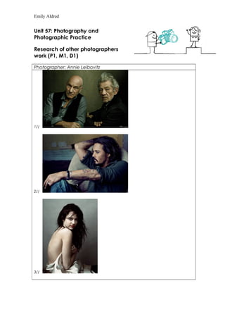
- 1. Emily Aldred Unit 57: Photography and Photographic Practice Research of other photographers work (P1, M1, D1) Photographer: Annie Leibovitz 1// 2// 3//
- 2. Emily Aldred 4// Theme or focus of images 1// The 1st image if of Sir Patrick Stewart and Sir Ian McKellen taken October 1st 2013. It was taken for Vanity Fair Magazine during then promotional shoot for their then up and coming Broadway show. Patrick and Ian are posing by simply crossed arms and looking into the camera while sitting next to each other. The photo is in colour with a warm feel to the image but the colours have been darkened a little bit such as the clothes which make the skin tones stand out a little bit more. The photographer could’ve took the shot to include their bottom torso’s but it would of taken the focus away from the two actors faces and facial expressions. Also the background is quite a dull colour, which again, makes the two actors stand out. This image was taken at eye-level. The photographer simply photographed their personality’s as Patrick (right) has a slight smile while Ian (left) has a serious look which mirrors there personality as Ian has a serious sense of humour with Patrick being less serious. The photograph shows the friendship of the two with the way they are both slightly leaning into each other. 2// The 2nd image is of Johnny Depp shot sometime in 2011 for again, Vanity Fair Magazine. He is posing by sitting laid back slightly to the right, on a chair with his right hand behind his head and his left arm resting on his right knee while looking into the distance. He also has what appears to be a cigarette or cigar of some type in his left hand. The way he is sat is suggesting that he is relaxed and feels comfortable around the photographer. The photographer could’ve took the shot further away to show the rest of how he is sat and the rest of his surroundings. The photo is in warm/neutral colours such as natural skin tones and natural lighting highlighting his neutral coloured clothing. With this natural lighting hitting him from the left, this suggests there is window of some sort .In the background is a wall which appears to be damaged with a hole in the wall and three plug sockets lining the yellow/white paintjob which has been cracked. With this plain background unfocused, it allows the eye and camera to easily focus on Johnny Depp. This image appears to have been taken at a higher level than eye level as it appears to be looking down towards the actor, who is slouched a little bit which can improve the height of the camera. This image shows the actor to be a relaxed person, which represents his personality. 3// The 3rd image is of teen pop-sensation Miley Cyrus during her Vanity Fair Magazine interview from the June issue in 2008, from when she was 15. She is posing by sitting faced to the right with only a satin sheet covering her up. She has minimal make-up on with her hair suggested natural and wild draped over her left shoulder while staring into the camera lens. The photo is in cold neutral colours, which highlights her minimal make-up such as showing off the natural coloured lipstick she has on. The image appears to have been edited to give Miley a ‘ghost’ look to her, sort of her being in her natural state as a teenager. This shot could’ve been taken at a further away distance but then the viewer wouldn’t of been able to see her face in as much detail as we can now. The background is a plain dull colour which mirrors Miley as she is draped in a white sheet which is the opposite colour of the background, so it makes her stand out. The shot was also taken at a lower angle as she is obviously sat down on something therefore the photographer would of have to have been bent down to get this shot. This image shows Miley to be relaxed and mysterious. 4// The 4th image is the English singer-songwriter Adele for Vogue for the February edition in 2012. This photo is in warm colours as her soft facial features and hair are defined in the natural lighting. The image has been edited to focus mainly on Adele’s face as well as highlight her hair. The image was taken at a higher level than eye level as its looking down on her, which again catches the lighting to define her features such as her cheek bones and lips. The image could’ve been shot at a wider angle to show off her outfit but then we wouldn’t be able to see the definition on her face. The background is a plain black background which fades to a lighter colour the more towards Adele it gets, which makes her the main focus point. Adele is quite known for her 60’s type style hair and her defined make-up, which makes it that main focus point and shows it off quite well. She is also known for being very presentable all the time which shows this off as well.
- 3. Emily Aldred Composition 1// I think the photographer for this 1st image, has stood fairly close to the actors to take this image as the two actors fill up the shot with hardly any focus on the background. I don’t think the photographer has zoomed in at all as it shows the two actors arms folded which wouldn’t be as detailed as they would if it was zoomed in. I think the photographer may have cropped the original image, as there might have been extra room at the sides of the plain background which wouldn’t of been necessary for the finished image. I think the image is great the way is it already due to the viewer being able to see the two actors being as close as they are in real life as best friends which comes across in the image. 2// I think the photographer for this 2nd image was stood further away that the image looks. I think Annie Leibovitz had the original image larger than it looks with the background filling the rest of the image and how Johnny Depp was sat slouched on the seat. I think the photographer cropped the image to how it Is now, so the picture solely focus’ on Johnny Depp and not the background which is quite an urban setting. I think by only cropping It to how is it now, it’s better for the audience to focus on the actor in detail. 3// I think the photographer for this 3rd image was stood at a distance which the image shows, at a height to which the camera would capture Miley from her waist up. I think this image has been cropped a little bit, maybe from the waist downwards. I think the photographer may have cropped it to only show the satin sheet and not how she is sat with her legs, by doing this its adding a little bit of mystery to the overall effect. If the photographer did stand further away, without cropping the photo, we would be able to see how Miley was sat and what she is sat on. 4// I think the photographer for this 4th image was stood at a bit of a distance as the way Adele has her head resting, suggests that she is lay down on something, therefore the original image might of included a bit more of her body. By cropping this image from a full body shot to how is was finalised, it show’s off Adele’s facial features with her face then being central in the image, also it shows off her facial features again by it being the only colour which isn’t dull therefore making her standout more. 1// For this 1st image, the light appears to be only hitting the faces, from front onwards. I think for the shutter speed, it was a fast capture because there is light being let into the camera lense. With the depth of field, in the background is just a plain dull background, and in the foreground is the two actors there selves. If we lay a 3 X 3 grid on top of this image, we could be able to tell that the two actors defiantly cross over joining lines on the grid, therefore it makes them the focus. In the centre grid would be Sir Patrick Stewarts right shoulder, which would mean he would be the main focus but since there’s two of them, and their positioning at either side of the frame, they both become the main focus. 2// For this 2nd image, the shutter speed appears to been have open a short while as the background has light hitting it but is out of focus, where as the actor has light hitting him the same way as the background, but is focus in the foreground. The background is just a plain yellow wrecked wall, with a hole and two plug sockets. If we lay a 3 X 3 grid on top of this image, the actor does layer on top of where the lines would cross over, and his elbow of his right arm does enter the middle square, therefore it makes him the main focus and his positioning which is more to the left, which again makes him the main focus because he is closer to the camera, leaving not much room for the background. 3// For this 3rd image, the shutter speed appears as if its been shot with a long exposure, as the lighting exposure is quite dark and therefore the camera would need to be open a while to focus and pick up the lighting correctly. With the depth of field, in the background is a plain grey back drop, gradually fading into a lighter colour towards the middle, towards Miley Cyrus. If we apply the 3 X 3 grid on top of this image, the actress/singer, would overlap the lines crossing each other. With her positioning in the centre of the frame, it makes her the centre of focus as her face and upper torso would be in the centre grid. 4// For this 4th image, the shutter speed, looks Asif would’ve been set at a mid speed, as the image has dark spaces mirrored by the light towards the left of the image. With the depth of field, the background is of dark colours that cant really be made out due to the colour being so dark, with Adele being in the foreground, she is hit by the light which cancels out the background colour, making it harder to work out what colour is specifically is. If we lay a 3 X 3 grid on top of this image, Adele herself would overlap the interlocking lines. Her face is one of the main feature besides her hair, as her face is centre of the squares, she automatically becomes the main focus. Strengths & Weaknesses
- 4. Emily Aldred 1// with the first image, two of my own strengths for it include liking the tones of the clothing and skin. They look warm which makes the audience feel warm looking at the image. I also like the placement of the two actors and how they are mirroring each other. I think two weakness include not showing more of the actors body’s and . I would like to use this image for inspiration for my own work by using similar colours tones. 2// with the second image, two strengths are the way the natural light hits his body, and the second would be the background as its an urban feel which makes the audience feel like he’s a grounded celebrity, not with a fancy expensive background. Two weakness would be again, not showing the whole body and not showing the cigarette or cigar prop in his left hand, I would like to see more of it or of the smoke that would come off it. I would use this image as inspiration by using the urban feel to the image such as the background. 3// With the third image, two strengths would be the way she is sat with her hair over her shoulder, all natural as well as her makeup, and the length of the image such as where the image stops at her waist. Two weakness would be to have her face not be as white as it is, to have it the same skin tone as her body and to have a prop such as a detailed necklace or such to just add a bit more detail and theme to the vintage shot. I would this image as inspiration to my own work by using the satin sheet as a prop as the light hits it in a shimmery way to make it look expensive and wedding gown alike. 4// With this fourth image, two strengths would be the way Adele is posing, lay down and looking down which shows off her makeup and facial features. Another would be the rich, warm colours of her hair and the material which she is laying her head on. Two weakness would be not showing more of her fuller body in the image, which would show off her dress more and her not facing the camera a little more which would elongate her neck and make her hair look better with the light. I would use this image for inspiration on my own work by the way she is posing, because the light hits her perfectly.