SlideShare ist ein Scribd-Unternehmen logo
1 von 3
Colour Scheme – The general colour scheme that is here is red, white and black, this has
become a very stereotypical colour scheme on Eminem’s products. This one especially as it is
marking his recovery back to music, the red significantly represents danger and death, this
links to Eminem’s past and that he is back on track. The white signifies clean and that he is no
longer using drugs, the colour scheme is very basic and easy for the viewer to understand and
identify with the whole digipak.

Rule of thirds –The rule of thirds is
successfully applied on this album as
both the images on it front and back are
placed in the centre. The area where the
viewer is most likely to look at first, it is
the optical area of any type of media so
the rule of thirds is successfully applied
on this album and is quite strong in the
albums regards. The important parts of
text are in the lines where the viewer is
most likely to look so it is successful
there as it shows the important parts of
this design will be seen.

Photography lighting –The photography lighting on this album is a contrast
between light and dark, almost a conflict as one side of the album is light and
the other side is dark, it is mainly through Eminem’s perspective. It is significant
to the actual album as it suggests that Eminem has a past that has influenced
him to do this album and is making him find his way in the dark and that he is
halfway there to the light. This is all significant as it benefits the whole album, it
almost influences the viewer to buy it as it suggests the album has a hidden
meaning that they have to listen to it to actually find out what that meaning is
so it is very important to the whole design of the digipak.

Position of Text – The position of text is on the back cover the only sight of text on the
front is the actual title of the album. On the back the placement of the text is quite
conventional of an album as it is below the image and the colour of it makes it stand out
underneath a darker image. This is successful as the position makes it easy to read and is
very clear to the audience so is therefore a very successful piece of positioning.

Typography design – The typography design on this album is very
important and successfully used and developed. This is clearly seen through
the albums name ‘Recovery’ as the ‘O’ is the same image that is used on
the CD itself so has direct reference to the whole album. Also the
backwards ‘E’ is a direct intertextual reference and trademark of Eminem
himself; it is a way of him marking his Cd’s with his own sort of brand. The
design of this is all important to the album as it makes it complete and
much alike Eminems

Position of Images –The position of
imagery on this album is very
useful, on the front and back of the
album the images are positioned in
the optical area of the album, they
are images from his first music
video from this album which is ‘Not
Afraid’ so it has intertextually with
his actual music video as anyone
who recognises images from that
will automatically have audience
recognition. Also on the actual CD
itself the image is very important as
it looks like the symbol you would
see at a hospital yet in a different
colour, this suggesting to have
reference to Eminem’s past.

Guttenberg principle – On the
front and back covers of this album
the principle is well established as
the images are both in the primary
optical areas of the audience, they
are generally in the centre of both
the front and the back. It is
significant and important as they
stand out and if they weren’t in the
optical area they wouldn’t make
such a strong effect on the actual
album itself. The text is also in the
primary optical area on the back
but on the front the title of the
album isn’t so this marks a question
as the album name is in the top
right which usually isn’t the area
we look at soon so it is different
than most albums.
Colour Scheme – The unusual thing about this digipak is that it actually has no complete
colour scheme as it is fully multi-coloured and uses a wide range of bright colours but this is in
fact significant of the band Coldplay as they are known to be bright, adventurous and colourful
so really the colour symbolises the band and makes the album almost be a piece of them and
it looks like a piece of art because of the colour scheme so this actually makes the whole
digipak much more interesting.

Position of Text – The positioning of text on this album is successfully placed, although the
text is hard to read because of the font, the positioning of it is quite useful and
unconventional of an album. Firstly the actual name of the album is smack bang in the
centre of the front cover which is generally the same as most albums, then on the back
cover the name of the songs on the album are presented in order, the placement of the
text on this digipak is very strong and unusual of a digipak.

Position of Images – The position
of images on this digipak is that it is
completely covered with art, it is a
type of graffiti art that is
representing the album, almost
representing how Coldplay are as a
band. Who are colourful and
adventurous, the position of these
images on the front and back is
very successful, then on the CD
itself there is a spiral like image
that is positioned on it to take the
whole space of the CD this is a
strange unusual image that can
almost confuse the audience but is
also a very strong image.

Rule of thirds –The rule of thirds is
successfully applied to this digipak
as all the text is in the main optical
area on the digipak, front and back,
it is successfully applied as the
focus of the audiences sight is on
the main key aspects of the actual
digipak. It is conventional in the
form of how it applies this rule as it
is only the text that the audience
needs to focus on as the
background is mainly art so despite
it covering the whole digipak does
not need to have the rule applied
to it.

Photography lighting –The lighting on the photography on this
image is very vibrant and light, this is useful as it symbolises the
band, it shows how Coldplay are it is art that is a part of them and
what they are known for. It is very strong on the images because
the colour has the key effect and it is reflected by the lighting that
is used to actually show it.

Typography design – The typography design is very strong on this digipak,
despite it being hard to read it is very unusual and different, much alike the
rest of this album. The use of a different text makes it stand out from all
any other digipak as it gives off its own theme and style. It creates its own
rhythm even with just the covers because the typography design is so
strong and so different from others. It’s like a sign that Coldplay are being
fun and exciting with their music and designs of their album. In this aspect
It creates a very strong digipak.

Guttenberg principle – The Guttenberg principle is applied very strongly
on this digipak as all the important text that is in the layout and design of
this digipak is in the primary optical areas of the whole front, back and CD
itself so on this aspect creates a very strong application of the principle.
The way the digipak is set out creates audience familiarity of Coldplay’s
albums as they set out all their digipak designs much alike this and it is
useful as it shows that they are a consistent band.
Colour Scheme – The colour scheme of Justin Bieber’s digipak design is a consistent use of the
colours yellow, white and black, from the start of the artist’s career this is how he actually set
out the colour scheme of his other albums using bright colours and more feminine like. As his
last albums had the exact same colour schemes except it was purple rather than yellow, this is
the suggestion that Justin Bieber aims at a more feminine audience and is trying to target his
albums at the female gender.

Rule of thirds –The rule of thirds is
successfully applied to this digipak as the
main image and the title of the CD are in the
centre of the front cover then on the back
the image and the song listings are near
enough placed into the centre of the back,
this is successful as it applies the rule and it
is used strongly onto the digipak so it has a
greater impact on the viewers as the main
aspects of the digipak are where they
should be so it is a conventional appliance
of the rule of thirds for a digipak.

Photography lighting –The photography lighting on this digipak is
used very successfully and strongly, this is done because it makes
Justin stand out and it attracts a feminine audience which is what
the colour scheme suggested too, so in my own opinion the album
is very successful in doing so as he is known to attract a vast
female audience, the images used and the lighting used on them
have a greater effect on how much the album sells as he stands
out, also it is stereotypical for girls to be ‘attracted’ to boys that
play guitar and sing which on the back cover image is exactly what
he is doing so he is going along with the stereotype and the
conventional ways of being a star. Therefore the photography
lighting is very useful and strongly successful on this digipak.

Position of Text – The position of text on this digipak is very strong as it is
able to stand out to the coloured backgrounds it is applied to. This is a
successful use of the placement of the text as it is always placed into a
strong conventional position on the digipak where it is highly visible and
easy for the viewer to read and see so therefore the position of text on
this digipak is strong.

Position of Images – The position of images
on this digipak is used very strongly and the
images are placed into a good position on
the album so that they are visible very
clearly. They are positioned into strong
positions where they create a stronger
impact on the album as the two images that
are used are quit large and it is
conventional of digipak’s to use larger
images that take up a larger area of the
covers and CD so that it has a stronger
impact and make the digipak stand out
when in stores or online etc.

Typography design – The typography design on this digipak is much more
conventional of a digipak, this is useful as it is more recognisable and easy
to spot, it also makes any text on the digipak much more easy to read and
much more understandable, so therefore the use of the typography on this
design is very successfully applied to it and used well and strongly by the
designed. It has a significant impact on the whole album, this is a much
more conventional style of a typography design as it is simple and easy.

Guttenberg principle – The Guttenberg principle is applied very
successfully on this digipak as all the key aspects and features of it are
placed within the primary optical areas so that the viewer see’s the bits
that are the most important. For example the name of the album, the
main image of the artist which will have a massive impact on the amount
the album sells as people will see the image and have audience familiarity
of him and be persuaded to purchase the album. Also the back of the
cover is important as the songs on the album are listed in the optical area
and the secondary image of the star as well so these are both important
then on the actual CD itself the name of the album is once again in the
primary viewing area.

Weitere ähnliche Inhalte

Mehr von domhayes03

Devlin feat ed sheeran
Devlin feat ed sheeranDevlin feat ed sheeran
Devlin feat ed sheerandomhayes03
 
Power point of analysis
Power point of analysisPower point of analysis
Power point of analysisdomhayes03
 
Power point of the analysis
Power point of the analysisPower point of the analysis
Power point of the analysisdomhayes03
 
Question 5 evaluation power point
Question 5 evaluation power pointQuestion 5 evaluation power point
Question 5 evaluation power pointdomhayes03
 
Question 6 evaluation powerpoint
Question 6 evaluation powerpointQuestion 6 evaluation powerpoint
Question 6 evaluation powerpointdomhayes03
 
Image manipulation analysis
Image manipulation analysisImage manipulation analysis
Image manipulation analysisdomhayes03
 
Produce raw images
Produce raw imagesProduce raw images
Produce raw imagesdomhayes03
 
Questionnaires results
Questionnaires resultsQuestionnaires results
Questionnaires resultsdomhayes03
 
Music magazine questionnaire
Music magazine questionnaireMusic magazine questionnaire
Music magazine questionnairedomhayes03
 
Band and artist analysis's 2
Band and artist analysis's 2Band and artist analysis's 2
Band and artist analysis's 2domhayes03
 
Lily allen double page spread
Lily allen double page spreadLily allen double page spread
Lily allen double page spreaddomhayes03
 
Florence double page spread
Florence double page spreadFlorence double page spread
Florence double page spreaddomhayes03
 
Florence double page spread
Florence double page spreadFlorence double page spread
Florence double page spreaddomhayes03
 
Magazine contents page comparison of nme + q
Magazine contents page comparison of nme + qMagazine contents page comparison of nme + q
Magazine contents page comparison of nme + qdomhayes03
 
Magazine cover analysis of q by dominic hayes
Magazine cover analysis of q by dominic hayesMagazine cover analysis of q by dominic hayes
Magazine cover analysis of q by dominic hayesdomhayes03
 

Mehr von domhayes03 (18)

Devlin feat ed sheeran
Devlin feat ed sheeranDevlin feat ed sheeran
Devlin feat ed sheeran
 
Power point of analysis
Power point of analysisPower point of analysis
Power point of analysis
 
Power point of the analysis
Power point of the analysisPower point of the analysis
Power point of the analysis
 
Test pp
Test ppTest pp
Test pp
 
Question 2
Question 2Question 2
Question 2
 
Question 2
Question 2Question 2
Question 2
 
Question 5 evaluation power point
Question 5 evaluation power pointQuestion 5 evaluation power point
Question 5 evaluation power point
 
Question 6 evaluation powerpoint
Question 6 evaluation powerpointQuestion 6 evaluation powerpoint
Question 6 evaluation powerpoint
 
Image manipulation analysis
Image manipulation analysisImage manipulation analysis
Image manipulation analysis
 
Produce raw images
Produce raw imagesProduce raw images
Produce raw images
 
Questionnaires results
Questionnaires resultsQuestionnaires results
Questionnaires results
 
Music magazine questionnaire
Music magazine questionnaireMusic magazine questionnaire
Music magazine questionnaire
 
Band and artist analysis's 2
Band and artist analysis's 2Band and artist analysis's 2
Band and artist analysis's 2
 
Lily allen double page spread
Lily allen double page spreadLily allen double page spread
Lily allen double page spread
 
Florence double page spread
Florence double page spreadFlorence double page spread
Florence double page spread
 
Florence double page spread
Florence double page spreadFlorence double page spread
Florence double page spread
 
Magazine contents page comparison of nme + q
Magazine contents page comparison of nme + qMagazine contents page comparison of nme + q
Magazine contents page comparison of nme + q
 
Magazine cover analysis of q by dominic hayes
Magazine cover analysis of q by dominic hayesMagazine cover analysis of q by dominic hayes
Magazine cover analysis of q by dominic hayes
 

Music cd digipak research

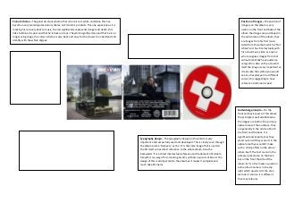
  • 1. Colour Scheme – The general colour scheme that is here is red, white and black, this has become a very stereotypical colour scheme on Eminem’s products. This one especially as it is marking his recovery back to music, the red significantly represents danger and death, this links to Eminem’s past and that he is back on track. The white signifies clean and that he is no longer using drugs, the colour scheme is very basic and easy for the viewer to understand and identify with the whole digipak. Rule of thirds –The rule of thirds is successfully applied on this album as both the images on it front and back are placed in the centre. The area where the viewer is most likely to look at first, it is the optical area of any type of media so the rule of thirds is successfully applied on this album and is quite strong in the albums regards. The important parts of text are in the lines where the viewer is most likely to look so it is successful there as it shows the important parts of this design will be seen. Photography lighting –The photography lighting on this album is a contrast between light and dark, almost a conflict as one side of the album is light and the other side is dark, it is mainly through Eminem’s perspective. It is significant to the actual album as it suggests that Eminem has a past that has influenced him to do this album and is making him find his way in the dark and that he is halfway there to the light. This is all significant as it benefits the whole album, it almost influences the viewer to buy it as it suggests the album has a hidden meaning that they have to listen to it to actually find out what that meaning is so it is very important to the whole design of the digipak. Position of Text – The position of text is on the back cover the only sight of text on the front is the actual title of the album. On the back the placement of the text is quite conventional of an album as it is below the image and the colour of it makes it stand out underneath a darker image. This is successful as the position makes it easy to read and is very clear to the audience so is therefore a very successful piece of positioning. Typography design – The typography design on this album is very important and successfully used and developed. This is clearly seen through the albums name ‘Recovery’ as the ‘O’ is the same image that is used on the CD itself so has direct reference to the whole album. Also the backwards ‘E’ is a direct intertextual reference and trademark of Eminem himself; it is a way of him marking his Cd’s with his own sort of brand. The design of this is all important to the album as it makes it complete and much alike Eminems Position of Images –The position of imagery on this album is very useful, on the front and back of the album the images are positioned in the optical area of the album, they are images from his first music video from this album which is ‘Not Afraid’ so it has intertextually with his actual music video as anyone who recognises images from that will automatically have audience recognition. Also on the actual CD itself the image is very important as it looks like the symbol you would see at a hospital yet in a different colour, this suggesting to have reference to Eminem’s past. Guttenberg principle – On the front and back covers of this album the principle is well established as the images are both in the primary optical areas of the audience, they are generally in the centre of both the front and the back. It is significant and important as they stand out and if they weren’t in the optical area they wouldn’t make such a strong effect on the actual album itself. The text is also in the primary optical area on the back but on the front the title of the album isn’t so this marks a question as the album name is in the top right which usually isn’t the area we look at soon so it is different than most albums.
  • 2. Colour Scheme – The unusual thing about this digipak is that it actually has no complete colour scheme as it is fully multi-coloured and uses a wide range of bright colours but this is in fact significant of the band Coldplay as they are known to be bright, adventurous and colourful so really the colour symbolises the band and makes the album almost be a piece of them and it looks like a piece of art because of the colour scheme so this actually makes the whole digipak much more interesting. Position of Text – The positioning of text on this album is successfully placed, although the text is hard to read because of the font, the positioning of it is quite useful and unconventional of an album. Firstly the actual name of the album is smack bang in the centre of the front cover which is generally the same as most albums, then on the back cover the name of the songs on the album are presented in order, the placement of the text on this digipak is very strong and unusual of a digipak. Position of Images – The position of images on this digipak is that it is completely covered with art, it is a type of graffiti art that is representing the album, almost representing how Coldplay are as a band. Who are colourful and adventurous, the position of these images on the front and back is very successful, then on the CD itself there is a spiral like image that is positioned on it to take the whole space of the CD this is a strange unusual image that can almost confuse the audience but is also a very strong image. Rule of thirds –The rule of thirds is successfully applied to this digipak as all the text is in the main optical area on the digipak, front and back, it is successfully applied as the focus of the audiences sight is on the main key aspects of the actual digipak. It is conventional in the form of how it applies this rule as it is only the text that the audience needs to focus on as the background is mainly art so despite it covering the whole digipak does not need to have the rule applied to it. Photography lighting –The lighting on the photography on this image is very vibrant and light, this is useful as it symbolises the band, it shows how Coldplay are it is art that is a part of them and what they are known for. It is very strong on the images because the colour has the key effect and it is reflected by the lighting that is used to actually show it. Typography design – The typography design is very strong on this digipak, despite it being hard to read it is very unusual and different, much alike the rest of this album. The use of a different text makes it stand out from all any other digipak as it gives off its own theme and style. It creates its own rhythm even with just the covers because the typography design is so strong and so different from others. It’s like a sign that Coldplay are being fun and exciting with their music and designs of their album. In this aspect It creates a very strong digipak. Guttenberg principle – The Guttenberg principle is applied very strongly on this digipak as all the important text that is in the layout and design of this digipak is in the primary optical areas of the whole front, back and CD itself so on this aspect creates a very strong application of the principle. The way the digipak is set out creates audience familiarity of Coldplay’s albums as they set out all their digipak designs much alike this and it is useful as it shows that they are a consistent band.
  • 3. Colour Scheme – The colour scheme of Justin Bieber’s digipak design is a consistent use of the colours yellow, white and black, from the start of the artist’s career this is how he actually set out the colour scheme of his other albums using bright colours and more feminine like. As his last albums had the exact same colour schemes except it was purple rather than yellow, this is the suggestion that Justin Bieber aims at a more feminine audience and is trying to target his albums at the female gender. Rule of thirds –The rule of thirds is successfully applied to this digipak as the main image and the title of the CD are in the centre of the front cover then on the back the image and the song listings are near enough placed into the centre of the back, this is successful as it applies the rule and it is used strongly onto the digipak so it has a greater impact on the viewers as the main aspects of the digipak are where they should be so it is a conventional appliance of the rule of thirds for a digipak. Photography lighting –The photography lighting on this digipak is used very successfully and strongly, this is done because it makes Justin stand out and it attracts a feminine audience which is what the colour scheme suggested too, so in my own opinion the album is very successful in doing so as he is known to attract a vast female audience, the images used and the lighting used on them have a greater effect on how much the album sells as he stands out, also it is stereotypical for girls to be ‘attracted’ to boys that play guitar and sing which on the back cover image is exactly what he is doing so he is going along with the stereotype and the conventional ways of being a star. Therefore the photography lighting is very useful and strongly successful on this digipak. Position of Text – The position of text on this digipak is very strong as it is able to stand out to the coloured backgrounds it is applied to. This is a successful use of the placement of the text as it is always placed into a strong conventional position on the digipak where it is highly visible and easy for the viewer to read and see so therefore the position of text on this digipak is strong. Position of Images – The position of images on this digipak is used very strongly and the images are placed into a good position on the album so that they are visible very clearly. They are positioned into strong positions where they create a stronger impact on the album as the two images that are used are quit large and it is conventional of digipak’s to use larger images that take up a larger area of the covers and CD so that it has a stronger impact and make the digipak stand out when in stores or online etc. Typography design – The typography design on this digipak is much more conventional of a digipak, this is useful as it is more recognisable and easy to spot, it also makes any text on the digipak much more easy to read and much more understandable, so therefore the use of the typography on this design is very successfully applied to it and used well and strongly by the designed. It has a significant impact on the whole album, this is a much more conventional style of a typography design as it is simple and easy. Guttenberg principle – The Guttenberg principle is applied very successfully on this digipak as all the key aspects and features of it are placed within the primary optical areas so that the viewer see’s the bits that are the most important. For example the name of the album, the main image of the artist which will have a massive impact on the amount the album sells as people will see the image and have audience familiarity of him and be persuaded to purchase the album. Also the back of the cover is important as the songs on the album are listed in the optical area and the secondary image of the star as well so these are both important then on the actual CD itself the name of the album is once again in the primary viewing area.