
Empfohlen
Weitere ähnliche Inhalte
Was ist angesagt?
Was ist angesagt? (20)
Andere mochten auch
Ähnlich wie Evaluation 5
Ähnlich wie Evaluation 5 (20)
Mehr von Dawid Tomczuk
Kürzlich hochgeladen
Kürzlich hochgeladen (20)
Evaluation 5
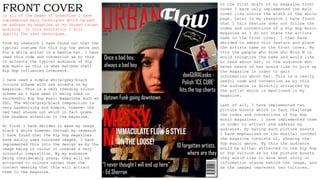
- 1. FRONT COVERIn all of the pages of UrbanFlow I have implemented many techniques which helped me address my magazine at my chosen target audience. In this annotation I will specify the used techniques. From my research I have found out that the typical costume for this hip hop genre and for a white artist is a beanie hat. I have used this code and convention as by this it attracts the typical audience of Hip Hop music as this is what matches their Hip Hop influenced interests. I have used a simple white/grey/black colours scheme with red accents in my magazine. This is a very trending colour scheme as I have seen it being used in successful Hip Hop music magazines such as XXL. The white/grey/black composition is very harmonizing and simple, however the red text stands out which in fact grabs the readers attention to the magazine. At first I have decided to make my image black & white however through my research I have found that the Hip Hop magazines have mainly used coloured images. I have implemented this into the design as by the image being in colour it creates a very colourful composition. By my audience being considerably young, they will be attracted to colours rather than the content meaning that this will attract them to the magazine. In the first draft of my magazine front cover I have only implemented the main cover line across the width of the whole page. Later in my research I have found that I this feature does not follow the codes and conventions of a Hip Hop music magazine as I do not state the artists name on the front cover. I then have decided to amend this feature and place the artists name on the front cover. By this the people who know who Miss M is would recognize the name and would like to read about her, or the audience who never heard of her would like to pick up the magazine in order to gain information about her. This is a really useful code and convention as by this the audience is directly attracted by the artist which is mentioned in my magazine. Last of all, I have implemented two picture boosts which in fact challenge the codes and conventions of Hip Hop music magazines. I have implemented them in order to attract and address my audience. By having such picture boosts I have emphasised on the musical content the magazine consists of, showing the Pop music genre. By this the audience would be either attracted to the Hip Hop or Pop culture as by the picture boosts they would like to know what story or information stands behind the image, and as the images represent two cultures.
- 2. CONTENTS PAGE The first code and convention which I have used to attract the Hip Hop music genre audience was to use a simple, grey background. In my research I have found that this is a code & convention the magazines have used therefore I have chosen to implement this into my design. On the other hand I found having a simple grey background not match my design therefore I have implemented a slight gradient to it ( lighter at the top, darker at the bottom ). By having such background to the page, I have emphasised the content and images as they are easily seen against it, automatically drawing the audiences attention. Next of all, as an inspiration from the XXL magazine I have chosen to implement a creative heading design. By this I have made the heading more attractive as it is not simple, which makes it stand out against other text and images on the page. This creative heading design draws the audiences attention as it bulkier than the simple, one lined heading causing the audience to pay attention to it, and acknowledge what it states. Another code and convention which I have found largely used throughout Hip Hop magazines is a specific typography composition. This typography composition mainly relates to the “FEATURES” list. It consists of a bolder, sharper font being used for the feature title and a softer, and thinner font used for the features description. I have implemented this into my design for the “FEATURES” list as we can see on the image. This attracts the audiences attention to the page as their attention is firstly caught with the bold text and leading them onto the thinner explanation text. The last technique which I have used to attract my audience to the magazine was to implement pull quotes. The idea of having pull quotes on this page was to emphasise the articles the magazine contains, as the quotes have been retrieved from the various articles. Pull quotes are a useful technique to use as by this the audience is only provided with a small amount of information, not giving away the plot. By this the audience then wants to acknowledge what the rest of the article states, therefore attracting them to the magazine.
- 3. DPS The main code and convention which I have followed for the DPS is the sorting of the facing pages. I have sorted the DPS into having one page dedicated to the image, and the other to the article. This attracts the audience to the magazine as the large image draws their attention to the page, making them interested what it represents. This then leads them onto the article on the opposite side. The audience is mainly attracted to the image as of their young age. Secondly, in my DPS I have used the technique of using red as a attention grabber. As we can see in the DPS above I have used the colour red to emphasise the pull quote as well as the quotes in the article. By this I have shown the areas the audience has to focus on in on the DPS. As a result of this, red really stands out against the darker background and the white text which attracts the audiences attention, playing the role of the attention grabber. I have mainly done this in order to make sure the audience focuses on the vital areas of the article, gaining the best information out of the text. Furthermore, in my DPS I have included a medium shot of the model which follows the codes and conventions. I have attracted the audience by this shot as by it being a medium shot, it has portrayed a relatively large amount of the models silhouette. The image additionally shows the model in a very questionable body positioning which follows the Hip Hop style. By this the audience is questioning themselves what it does mean and would like to know more which would lead them to reading the article. I believe that this is a very useful technique to attract the audience. The last code and convention which I have used in my DPS is the sorting of the article into columns. By this the text looks less text- heavy, persuading the audience to read it as they see it as less tiring. This addresses the magazine at the audience as by the columns, the text is aesthetically pleasing for the audiences eye. This is a very useful technique, as by this the probability of the audience reading my magazine is higher than if the text was placed in just a block of writing.