
Empfohlen
Weitere ähnliche Inhalte
Mehr von danielleisbritish
Kürzlich hochgeladen
Kürzlich hochgeladen (20)
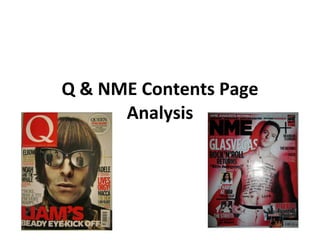
Q & NME Contents Page Analysis
- 1. Q & NME Contents Page Analysis
- 2. Q Colour The main colours on this page are red, black and white which continues on from the front cover. The colour scheme is aimed at the genre of music this magazine is aimed at as red, black and white is usually associated with rock and indie music. The page numbers also stand out against the white background. They also match the logo which stands out against the red background at the top of the contents page. Text The font for the word ‘CONTENTS’ at the top of the page is the same as the magazine logo on the front cover. The text in black immediately tell the reader what page each artist or article is on which makes it clearer. The titles of the articles have been put in bold to show their significance in the magazine. The number ‘46’ has been written in white writing to show the importance of the interview with Liam Gallagher showing he’s the centre of the issue. Layout The contents list is aligned to the left in a single column which makes the contents page a lot more clearer for their target audience. The main titles for their articles are underlined in red to show the difference between the title and the description making it easier for their audience to understand what the articles and interviews are about. Image The main image of Liam Gallagher takes up two thirds of the magazine. Judging by the size of the image, we presume that Liam Gallagher is being interviewed in the magazine. There’s a small image of Queen beside the image of Gallagher which has continued on from the button on the front cover. The contents page has very few images as they want to focus on the main image of Liam Gallagher as he is the centre of this issue.
- 3. NME Colour The main colours on this page are black and white which doesn’t really continue on from the front cover as the colour red was the main colour on the cover. They’ve made their contents page look more like a newspaper which might not appeal to their specific audience. Text The font for ‘INSIDE THIS WEEK’ doesn’t correspond with the font for ‘NME’ on the front cover so, this looks like a completely different magazine. The article ‘Shockwaves NME Awards 2011 – nominations revealed’ has been given a different font to possibly show the importance of this article. Some of the text has also be italicised to show quotes for example on page 12 ‘I haven’t played it to The Horrors yet’ which could reflect the artists voice. Layout The layout for this contents page is very unconventional compared to other magazines. The page numbers have been scattered all over the page which could make it hard for readers to find the page they want to read. The contents page itself doesn’t correspond with the front cover showing that this could actually be a different magazine. The date of this issue has been place under ‘INSIDE THIS WEEK’ to show that it isn’t as important as the articles and interviews featured. Image There are many images on this contents page which could confuse the target audience. The main feature of this issue is Glasvegas however, on the contents page, there is one small image on the top left of the band which doesn’t show it’s importance in the magazine. The main feature on the contents page (NME Awards) takes up most of the centre of the page showing its importance for the company as well as the magazine.