Goa Call "Girls Service 9316020077 Call "Girls in Goa
Double Page Spread Analysis
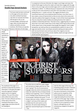
1. In comparison to the size of the text, the image is much larger and covers the
Daniella Johnston whole of both pages to attract the reader and make them engage with the page.
There is only one image used across both pages and it is a wide shot of the band
Double Page Spread Analysis ‘Motionless in White’. It is effective because it represents the unity of the band
as they are all in close proximity to each other and it also allows us to see the
The house style has been continued setting they are in – a quiet rural area. This suggests the band is not a
on this page as the same colours – mainstream band and is not as bothered about the fame, more their music. It
red, white and black have been also creates a sense of imprisonment as they are very close to the camera and
used. We can associate all of these make the audience feel trapped on the page. In terms of their facial expressions,
with the genre rock, as red they are using direct mode of address by looking directly at the reader to
connotes danger, excitement and establish a relationship with them. They look serious, suggesting they are serious
anger, black connotes death and about their music which relates them to the readers of Kerrang! as they are also
violence and white connotes serious about music or they wouldn’t have bought the magazine. From a wider
loneliness. All of these are typically perspective, we could say they are manipulating the audience to stay on the
focuses in the lyrics of rock songs. page and read the article. Use of black and white clothing and make up fits in
The page has
with not only the band name and house style of the magazine, but also
design
representing rock music as they connote rebellion, death and anger which we
balance and
would associate with the genre.
symmetry as
there is an
even
distribution
of text with
the large
image as
well as
gutters to
space it out
equally to
make the
page look
professional.
The pull
quote gives
the reader
a taste of
the article
and reveals
the content
of it making
them
tempted to
read on.
The article aims to make the reader engage
The masthead of the page is in a with the band as it begins with the line ‘Hey, Like the other pages of Kerrang!, the
serif font to show that the article is how’s it going?’ The use of conversational Guttenberg design principle is followed
informative. It also gives the page a language makes the article more personal and and rule of thirds have been used as
masculine approach making it makes the reader feel they are being involved, the name of the band is in the primary
appeal more to its targeted making it more appealing. Use of a colloquial optical area for recognition of the
audience. The use of the colour such as ‘Dickbag’ shows the band are just like band, followed by the main large
white reflects the name of the normal people, relating to the quote “I’m not image dominating the terminal area
band. The text is effective and has a trying to take your money. I believe in music as and centre of the page. Page numbers
similar style to that of the a religion” and many of the readers will have been placed in the dead corners
masthead of Kerrang! as it has probably have the same opinion as this. as they are not as important as these
rugged edges and some of the fill Moreover, the word creates feelings of features, although they are for
has faded/gone. aggression representing the genre of the band allowing easy navigation through the
– rock. magazine.
2. The page follows the Guttenberg design principle and uses the rule of thirds as the The house style has been continued
masthead of the page and logo of the magazine are in the primary optical area so the to be used throughout the magazine
Daniella Johnston
first thing the reader will tend to see if what the article is about. Moreover, the Q logo as all the pages follow the same
in the corner allows brand recognition with the reader. The article is in the terminal colour scheme which is very
area followed by page numbers in the dead corners which aren’t as important but are minimalistic. The only colours which
for easy navigation through the magazine for the reader. have been used are red, black and
white. However, they are bold and
dominant colours which create a
In contrast to Kerrang! this page doesn’t have a bold masthead that dominates the page to strong contrast on one another
entice the readers to read the article. There is only two images of the band along with their which empathises the confidence of
name in the top corner therefore it doesn’t give any information about the articles main the magazine. Moreover, red
focus. This is effective as it intrigues the reader to read on to find out what the article connotes excitement, anger, danger
contains. In terms of the style of text a serif font has been used to show that it is and love which we can’t associate
informative and aimed at an older, more mature audience. The large vibrant T overlapping with just one genre of music. The
the majority of the text has been used to empathise the importance of the band, Take That colours represent Q being a
whose initials are T’s. The colour and font of it also anchors Q magazine and the house magazine of all genres.
style. The same text has been used on every page to create brand identity as readers will
begin to associate that particular text with this particular magazine.
The page
has design
balance
and
symmetry
as there is
an even
distributio
n of text
and
images.
This makes
the
magazine
look
organised
and
profession
al, making
it appeal
to its older
target
audience.
The images take up just as much space on this double page as the text showing
that they are equally significant. Two images have been taken, in the same place As Q aims at an older generation of music lovers,
and the same time just seconds after each other. The wide shots feature the the language is not very conversational and
band Take That jumping off a brick wall in front of the Thames in London. Firstly, doesn’t contain as many colloquials a part from
the use of a wide shot is effective considering the band are reforming as it the couple the band members have quoted. It is
represents the unity of the band. The images create a personal feel to the page more sophisticated, formal and detailed.
as we see Take That as normal people in the street with people walking past,
getting in the way of the photograph. The use of black and white images is also
effective as it represents the history the band have together and suggests the The pull quote is the only insight into what the article
last time they were a five piece was such a long time ago. The shots are low angle contains. “There aren’t enough events in music any
so Take That are positioned higher than the reader to show that they are more – and this is an event” is an effective quote to
dominant again, which could also reflect how this may help them dominate the enlarge from the text for the reader to see first as it
charts. The fact that they are stood on the brick wall rather than in front of it doesn’t give too much away yet it describes ‘this’ as
creates a sense of freedom representing their genre of music (pop/mainstream) an event which doesn’t happen on a regular basis,
opposed to some images from Kerrang! in which bands are stood in front of a making it exclusive. It makes the reader want to read
brick wall, representing more of the rock genre. on and engage further in the magazine.