
Empfohlen
Weitere ähnliche Inhalte
Was ist angesagt?
Was ist angesagt? (20)
Ähnlich wie Project 2 Review: Graphic Design
Ähnlich wie Project 2 Review: Graphic Design (20)
Kürzlich hochgeladen
Kürzlich hochgeladen (20)
Project 2 Review: Graphic Design
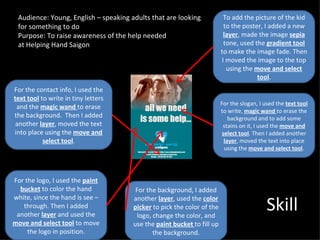
- 1. Audience: Young, English – speaking adults that are looking To add the picture of the kid for something to do to the poster, I added a new Purpose: To raise awareness of the help needed layer, made the image sepia at Helping Hand Saigon tone, used the gradient tool to make the image fade. Then I moved the image to the top using the move and select tool. For the contact info, I used the text tool to write in tiny letters For the slogan, I used the text tool and the magic wand to erase to write, magic wand to erase the the background. Then I added background and to add some another layer, moved the text stains on it, I used the move and into place using the move and select tool. Then I added another select tool. layer, moved the text into place using the move and select tool. For the logo, I used the paint bucket to color the hand For the background, I added Skill white, since the hand is see – another layer, used the color through. Then I added picker to pick the color of the another layer and used the logo, change the color, and move and select tool to move use the paint bucket to fill up the logo in position. the background.
- 2. I made the poster as simple as possible by having little text and more images instead. It isn’t too colorful so it is simple. I chose the color blue for the The focal point of my poster is the image of the poor kid. I got background because it stands the image from Google images. I for peace, trust, loyalty, chose this as the focal point cleanliness, and because it is big and the first understanding. This gives the thing that people will notice. audience a message that these They will feel sorry for that kid are peaceful and just need and look at the rest of the some help. poster. I made my poster balanced by making my focal point, the I used the “Impact” font for the image, the biggest. The second slogan. I used this because I biggest thing is the slogan so rarely use it and I also added that people would actually read some stains to it to make the it. The third biggest thing is the letters look old and dirty. That logo so that people would way people realize the children know what organization is this. are also poor and dirty. Lastly, the smallest thing is the contact info because it’s the least important. Graphic Design