
Empfohlen
Weitere ähnliche Inhalte
Kürzlich hochgeladen
Kürzlich hochgeladen (20)
Empfohlen
Empfohlen (20)
Missing The Point
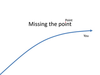
- 1. Point Missing the point You
- 2. So much has been written about presenting That it feels they all end up saying the same thing
- 3. Presentations make extensive use of stock photography “Nice to meet you” iStockphoto if you have more money than time, Flickr otherwise.
- 4. Sometimes combined with statistics 100% of kids in the Children’s Palace in Pyongyang have talent Numbers and cuteness out-power graphics