
Empfohlen
Weitere ähnliche Inhalte
Ähnlich wie Evaluation of images
Ähnlich wie Evaluation of images (20)
Kürzlich hochgeladen
Kürzlich hochgeladen (20)
Evaluation of images
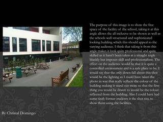
- 1. The purpose of this image is to show the free space of the facility of the school, taking it at this angle allows the all inclusive to be shown as well as the schools well structured and sophisticated looking building which this should appeal to the varying audience. I think that taking it from this angle makes it look quite professional and quite skilled as it hasn’t been taken at a straight angle blankly but imposes skill and professionalism. The effect on the audience would be that it is quite a controlled environment and is a safe place to be. I would say that the only down fall about this shot would be the lighting as I could have taken the photo in way that really reflects the colour of the building making it stand out more so that the first thing you would be drawn to would be the colour reflected from the building. Also I could have had some sixth former students it the shot too, to show them using the facilities. By Christal Domingo
- 2. This picture was taken to manifest the determination of students whilst enduring private study to show what sixth form requires and how it resolves in success. The purpose of this image is to motivate young students to working harder in there subjects and using free periods wisely. What is good about this image is that its is a medium close up of a student with some indication of what they are doing. But however the angle to this shot wasn’t quite so good because its not at a good angle therefore moving round to the right hand side would have given me a better shot of the students face and in more detail of what they are doing, as the light from the window reflects on to the page of the students work this doesn’t allow us to see her written work as it relates to the idea of student determination. The effect on the audience would be to motivate other students to consider working harder out side lessons.
- 3. This image could be recognised as a medium close up as it if from the top of her head and to the waist of her body this image again represents student determination in utilising there time well. The purpose of this is to show how important studying is and how it helps. What is good about this image is that its been taken from the front view of the student and has been zoomed in to really isolate the main subject (the student) in showing what it is she is doing. This shot could have been improved in terms of lighting perhaps and really capturing the students face to display their facial expressions. Another thing would be the amount of cleavage shown as this could be seen as inappropriate or informal for the purpose of representing the school. In cropping this image it focuses on the precise detail of what I want to be represented which is her concentrating going there work.
- 4. As much as this is quite a nice picture the main points of improvement would be the positioning of the two students in the shot, the person on the right is at quite an awkward angle of which not much of there face which illustrates facial expressions are shown, the angle from them to the nose of the camera is quite off and in some way makes the image look weak and less effective. The lighting would be another issue as there isn’t much light reflecting on then and if there was it would bring the image to life a bit more and not just look so dull coloured.
- 5. The purpose of this image is to show ownership of the sixth form building and to also promote the facilities it comes with: open space, table tennis and the balcony. I really like this image as it does truly look quite professional. The angle in which the image had been taken allowed the entire building to fit in one shot and is still able to obtain professionalism with the blue sky which is in contrast with the colour of the building in contrast the darker colours surrounding it. The reflection of the light on the building is just about right, but with the use of changing the brightness of the image (when using Photoshop) it would help with making it look a little bit brighter. The white coloured building of Lerner has really made itself standout in this shot, therefore it must capture the attention of the audience as its white solid structure is enough to influence opinion about the new sixth form building as it conveys a controlled and safer environment.
- 6. This image was taken out of interest of involving the younger school in the magazine, but later found that this was irrelevant to appealing to my target audience as it is a sixth form magazine. However one of the reasons this image was taken was to show the involvement of younger students and determined teachers as in this image a teachers is holding a bag which says ‘I love books’ this connotes that teachers are as equally determined as students in helping them achieve the best. This promotes the schools great interest in education. The audience would be able to look at this an consider the schools interest in helping students achieve good results.
- 7. I feel that the main problem with this shot would be the fact that it is a mise-n-scene camera shot therefore to many things are going on in this shot and it is not clear in showing the purpose. I would say that the angle is just about perfect its just that the image could have been zoomed in a bit to gain more focus on the three students in the middle instead of being distracted by what is going on around them. This image is to generally show that there is more to sixth form than hard work but there is the social experience of getting to know new people. By zooming and cropping this image it really focuses on the main essence of the image which is the students interacting, displaying the image in greater detail in what I’m trying to put across.