2. Typography – The typography in the contents page is mainly serif, but with some bits in san
serif. The headline for the magazine is the largest text on the whole cover, this is to make it
distinctive and stand out from all of the others. The subheadings down the left side of the
page are also in a larger font size than the rest of the text but not as big as the masthead
and are bold. This would be so that people could easily scan the page and find what they are
looking for so they can flick to the right page. The rest of the text is in a small font size and is
san-serif, this is because it is not as relevant to the rest, it is just extra information.
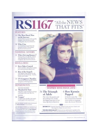
Layout – The contents page follows the route of the eye. In the primary optical area is the
masthead, you would notice this first. In the centre of the contents page is an image, this
would be a focal point, something for people to look at rather than read. In the terminal
area is the exclusives box, it includes the extras which are in the magazine. They would have
put these last so that the audience are still pleased with the stories right until the end. The
layout is very organised, it is separated by columns and lists, these break the page up so that
the writing isn’t in one large chunk, this would be boring for the audience. This makes the
contents page orderly and clean appealing more to the older generation as it is clear to
read.
Colour – The colours used on the contents page are faded blacks and reds. These colours
were probably used as they are all in good contrast and look good together. The red colour
draw attention to the masthead and the subheadings making them distinctive and
memorable. The dark colours worn by the model in the image makes her look mysterious
and appealing.
Image – The image is a close up of the woman Amy Heidermann, they probably used a close
up so you could see the details of her make-up and how appealing she is. She isn’t looking
directly at the camera which creates a sense of mystery and attitude. She has her hair and
make-up done so it shows she takes care of her appearance and would probably appeal to
young females as they want to be like her.
Language – The language used in the magazine cover is very in depth, and is ‘proper’ English
as such, there is no slang, this would be because the magazine is designed for the older
generation, they wouldn’t want to be reading an article designed for teens. They use
capturing subheadings, they use words which entice the readers to ask questions, which
makes them interested and want to read the full story.
Conventions - There are many conventions featured on the contents page; one being that
the masthead and subheadings are in a larger font that the rest of the plain text. Another
convention is that the page is split up by columns, this is commonly used as its an easy buy
effective way of breaking up the text.