
Empfohlen
Weitere ähnliche Inhalte
Was ist angesagt?
Was ist angesagt? (20)
Andere mochten auch
Andere mochten auch (20)
Ähnlich wie Ancillary product- Poster analysis task
Ähnlich wie Ancillary product- Poster analysis task (20)
Mehr von chhaynes16
Mehr von chhaynes16 (18)
Kürzlich hochgeladen
Kürzlich hochgeladen (20)
Ancillary product- Poster analysis task
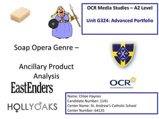
- 1. Soap Opera Genre – Ancillary Product Analysis Name: Chloe Haynes Candidate Number: 1141 Center Name: St. Andrew’s Catholic School Center Number: 64135 OCR Media Studies – A2 Level Unit G324: Advanced Portfolio
- 2. Tagline-The verbal code of the tagline on this poster ‘signifies’ that something is going to happen and will make Walford different the letters go from white to darky grey as it gets nearer to the black background which connotes it is going to be a bad change. The full stops used after the words emphasizes the shock of what is going to happen. Image – The non-verbal code main image within this poster looks very mysterious and shows Lucy looking back at a shot of Walford and its surrounding area in London this signifies to the audience that she is leaving the square and may not be returning. The background colour of the poster is black which symbolizes death and misery and the picture of Lucy and Walford has a hint of red in it which connotes blood anger and danger which are all involved with the death. Synergy with social media - Synergy is used to promote the program on twitter and it can also attract a younger audience as they regularly go on social media sites. On a poster you could also have a face book symbol or the official Eastenders site to see the latest news about Eastenders. Institution Logo-the intuition logo is beneficial for the audience because it tells them what channel Eastenders will be aired on and it is also beneficial for BBC one because It can make the viewing numbers increase. Brand Identity-There is no brand identity for Eastenders on this poster however the hash tag Eastenders lets the audience know what the poster is actually for.
- 3. Image – There are males and females in the picture looking away from the viewers which will appeal to both a male and female audience. The way the characters are looking away connotes they may be hiding something from someone. They have also been made to look like fire flames so these characters could be dangerous or in danger in the upcoming episodes .Within this image there is a lot of emotion such as anger jealousy danger, from this the audience can tell upcoming soaps will be very dramatic. Institution Logo-The institution ident is very visible on the poster because it is a white logo against a dark fiery background. This promotes channel 4 because it is being advertised and tells the audience what channel it can be viewed on. Tagline The verbal code of the tagline ‘informs’ (Katz) the audience what soap opera this poster is advertising and the word ‘forever’ tells the audience that the soap is going to change and wont go back to normal which makes people want to watch it more to see what major event is going happen. The tagline stands out a lot and is very eye-catching because in a simple font in a white box with black writing against a contrasting coloured background so draws your attention to look at the writing. Date The Date makes the audience aware of when Hollyoaks will be on and what week so they make sure that they are watching it or for existing viewers to count down till the day things start to change in Hollyoaks. Brand Identity- There is no brand identity on this poster as it would draw the attention away from what is already shown own the poster and the poster would look too busy.
- 4. Student Exemplar Work – Textual Analysis Day and Time- The day and time (Point of call) captivates interested viewers when the TV program will be aired to watch so they can watch it. Institution Ident - The Institution logo Makes viewers aware on watch channel it will be aired on and increases viewing numbers for BBC Two. Tagline-The verbal code ‘everyone's watching’ cleverly links because it connotes that everyone is watching on the soap which connotes mystery but also connotes that the audience are watching as well. The ellipsis leaves the audience wanting to know what they are going to watch or who is being watched. Reviews-The 5 star reviews give an insight to the viewers what the soap opera is about and how good people think it is so it encourages them to watch it. Brand Identity- The brand identity promotes Surrey Downs it also stands out because it written in white text against a dark background. It also tells the audience what this poster is advertising. Synergy-Synergy encourages the audience to interact with the soap online and people go onto social media to find out what happens in upcoming episodes. It can also attract a younger audience as they are regularly on social media. Image The image has 3 pairs of peoples eyes facing directly at the audience which feels intimidating .It also connotes that everyone is watching, which links to the tagline. The crime scene tape across the image the bloody knife and the black surrounding the image signifies that this soap will be about death violence and mystery and makes people want to watch to find out what happens.
- 5. Analysis - On my own Ancillary I intend to ‘repeat’ (Steve Neale - 1980) to have a well edited image that gives an insight to the audience of what is going to feature in upcoming episodes of my Soap Opera. -I also intend to ‘repeat’ (Steve Neale - 1980) Brand identity and the institution logo so people know what soap opera the poster is actually about and what channel they can watch it on. -I think I will also ‘repeat’ (Steve Neale - 1980) the tagline so it draws the readers attention and wants them to start watching my Soap opera. -Finally I intend to ‘repeat’ (Steve Neale - 1980) social media links for synergy if there is enough available space on my poster.