
Empfohlen
Weitere ähnliche Inhalte
Was ist angesagt?
Was ist angesagt? (20)
Ähnlich wie Ancillary Task 2 - Research
Ähnlich wie Ancillary Task 2 - Research (20)
Kürzlich hochgeladen
Kürzlich hochgeladen (20)
Ancillary Task 2 - Research
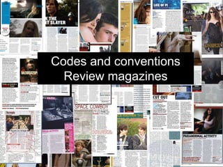
- 1. Codes and conventions Review magazines
- 2. Photo A common convention of film review magazines is to have a still of the film involving one of more characters (that doesn’t give away the plot) which takes up a third to a half of the total review space. This is done primarily to grab the viewers attention and draw them in when looking through the magazine. The picture is always situated at the top of the page. This photo stereotypically uses Mulvey’s ‘Male Gaze’ where by the audience are forced to see the world as men see the world. The women are seen as objects and violence is a everyday thing.
- 3. Examples
- 4. Title Another convention is to have the film title on the picture itself, usually in white text. We saw before white text was used in the posters as it stands out. The title may also help to aid drawing the viewer in as the title is normally intriguing and is placed there to emphasise the importance of the title and film itself.
- 5. Examples
- 6. Quotes and lines Another convention is that within the block of text there is a quote. It is usually larger than the rest of the text in a different colour and is interesting. Therefore this sudden dose of large colour draws the viewers eye straight to it when turning to the page, so this piece of text is crucial to enticing the audience and to encourage them to read the whole article. (red) As well as quotes to break up the main body of text, the magazines also use coloured lines to make the overall aesthetic of the page more appealing instead of just having a monochromatic presentation. (blue)
- 7. Examples
- 8. Star Rating And Branding Two things we have found almost mandatory within the film review pages of a magazine is; the star rating, out of five, as well as the magazine branding. The star rating can be used for a quick check to see if the film is worth watching without needing to read the whole review and to see the critics final opinion. This makes the page worth looking at to anyone possibly interested with the film. (red) The magazine branding is, practically always, found in the top left or right of the page in a small block of colour. A piece of the magazine style on every page, a consistent marking to keep the magazine together. (blue)
- 9. Examples
- 10. Content We found that the review should describe the story, characters and some of the action - without spoiling the plot or giving too much away (otherwise there would be not point in seeing the film). It should, however, give the writers own opinion of the film and whether they recommend for the audience to watch.
- 11. Language The language of a film review magazine is based upon the magazine itself. If the magazine is targeted at film buffs, it will use more formal language and terminology associated with the film industry. Where as if the magazine is targeted more towards the general public to inform; the language will be less formal and written to create a rapport with the reader. Usually the reviewer adds their own style and wit to make the read more fun and make their review stand out more.
- 12. Examples (Taken from the internet for easier reading) It's a rare moment of visual imagination in a film that generates most of its humour from sex and bathroom jokes. -Slant Magazine Where that film positioned Poehler as the goofball to Fey’s more tightly wound protagonist, “Sisters” puts its leading ladies on a more equal footing, with several narrative reversals cannily shifting the script’s zanier comic demands between them. -Variety Magazine Its most colourful trappings are its two stars: long time comedy collaborators, friends, awards co- hosts and book buddies, Amy Poehler and Tina Fey. The first ladies of US sketch comedy have established a finely-calibrated chemistry that causes quibbles with the architectural strength of Sisters to shrink in significance -Little White Lies Tina Fey and Amy Poehler have almost definitely had stronger showcases on Saturday Night Live, not to mention their respective brilliance on 30 Rock and Parks and Recreation. And we’ve seen the Watch-this- party-get-out-of-control! plotline at the mulitplex many times before -Entertainment Weekly Sisters is the kind of broad feelgood comedy that’s made to look easy by Poehler and Fey, who breeze through the funny test and the Bechdel test and show that the female-female dynamic, so recently considered almost gravitationally impossible in comedy, works very well. -The Guardian Much of the humour here (ornaments stuck up rectums, jokes about defecation and masturbation) is very base, indeed. What makes Sisters seem so fresh and funny, in spite of its recycling of old gross-out gags, is the sly wit of Paula Pell’s screenplay. -The Independent All reviews are for the film, ‘Sisters’ (Hyperlink to Wikipedia)
- 13. Columns The number of columns used in the review page of the magazine depends on the rest of the magazine; and will follow that conventions. It seems the most common conventions of columns is 4. This allows one column for information of the film; such as actors, a synopsis and other basic information. This leaves three other columns for the review.
- 14. Examples