
Empfohlen
Weitere ähnliche Inhalte
Was ist angesagt?
Was ist angesagt? (16)
Andere mochten auch
Ähnlich wie Poster research
Ähnlich wie Poster research (20)
Mehr von Catriona Schulkes
Mehr von Catriona Schulkes (20)
Kürzlich hochgeladen
Kürzlich hochgeladen (20)
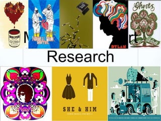
Poster research
- 2. Questions 1. Does the artist/band feature in the advertisement? Why or why not? 2. Analyse the mise-en-scene. How does it meet the needs/desires of the target audience? 3. How is the band/artist identity established through the fonts used? 4. Is there any connection between the music videos and the album covers? How is this connection established? 5. Is there a connection between the album covers and the magazine advertisement? How is the connection established?
- 3. BonIver The band do not feature in the The mise-en-scene in the poster, as it tends to be more poster meets the desires of important to the artists to focus on the of the target audience as the music rather than the type of art fits with the themselves, so they usually don’t kind of music. Bon Iver’s lyrics feature in the album covers or tent to be quite dark and posters. sexual, the combination of the black sky and red flowers The font is large and greatly mirrors this. simplistic, reflecting the straight forward and uncompromising nature of the folk genre There is a connection between the album cover and poster in the way that they both focus heavily on nature. The album cover appears to be a forest, or have a forest in the background. And everything in the poster is natural (except the colouring).
- 4. Laura Marling The artists does not feature in the poster, as it tends to be more important to the artists to focus on the music rather than themselves, so they usually don’t feature in the album covers or posters. The mise en scene meets the target audience as the picture is very artistic which is common in the folk music genre, it also involves nature and naturalistic imagery which is used widely across the genre. The font is elegant which reflects Marling’s style of music and the way she uses her voice in her songs, but whist being elegant the font is still simple which fits into the genre conventions. The poster and album cover do relate quite closely. The style of drawing is the same and the drawing themselves are similar. Both images are predominately about nature, and have the same crowded, winding pattern for the surrounding images, with lots of plants/natural objects. Both images use orange. In the poster the text is orange and the in the album cover orange is the predominant colour for the images
- 5. Bruce Springsteen The font is simple and Yet again the band does not looks as if its hand drawn feature in the poster as is which relates to the common in this genre. The mise simplicity of the music en scene meets the target and the artist. audiences' desires as the art is is unusual and artistic, which is common. The art on the poster in the folk genre is usually alternative or unusual and not always directly or obviously related to the song/music. The poster and the album cover barely relate. Both images use relatively simple fonts and colours, (black, white and yellow/orange) other wise they don’t have any similarities.