How to Design a Killer Deck - 8 Essential Tips in Presentation Design
•
26 gefällt mir•6,452 views

Comprehensive presentation on how to design a killer deck, including 8 essential tips in presentation design, and plenty of freebies to keep for reference. Enjoy! To see more of our presentations, visit <a href="https://www.exaltus.ca">https://www.exaltus.ca</a> or sign up to our email list (https://www.exaltus.ca/email) to receive actionable marketing tips in your inbox a couple of times per month!

Empfohlen
Empfohlen
Weitere ähnliche Inhalte
Was ist angesagt?
Was ist angesagt? (20)
Andere mochten auch
Andere mochten auch (15)
Ähnlich wie How to Design a Killer Deck - 8 Essential Tips in Presentation Design
Ähnlich wie How to Design a Killer Deck - 8 Essential Tips in Presentation Design (20)
Kürzlich hochgeladen
Kürzlich hochgeladen (20)
How to Design a Killer Deck - 8 Essential Tips in Presentation Design
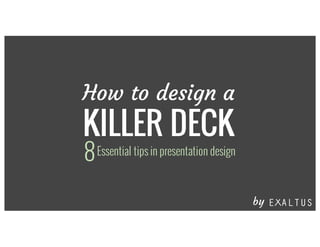
- 1. How to design a KILLER DECK Essential tips in presentation design8 by
- 2. 95% OF PRESENTATIONS make you feel like this
- 3. … OR this
- 5. Express yourself*Take your corporate templates with A GRAIN OF SALT
- 7. but HOW?
- 9. What do you want your audience to take home? What do you want them to take home?
- 11. messages Focus on THREE (That’s all most of us will retain.)
- 12. Keep it SIMPLE2
- 13. Less is MORE
- 14. Your audience will either READ YOUR SLIDES or LISTEN TO YOU
- 15. Which would you prefer? Your audience will either READ YOUR SLIDES or LISTEN TO YOU
- 16. Each slide is like a BILLBOARD
- 17. Each slide is like a BILLBOARD 3 It should take SECONDS to digest
- 19. • THIS IS A BULLET • THIS IS A BULLET • THIS IS A BULLET • THIS IS A BULLET • THIS IS A BULLET • THIS IS A BULLET • THIS IS A BULLET • THIS IS A BULLET This is a document • THIS IS A BULLET • THIS IS A BULLET • THIS IS A BULLET • THIS IS A BULLET • THIS IS A BULLET • THIS IS A BULLET • THIS IS A BULLET • THIS IS A BULLET
- 20. • THIS IS A BULLET • THIS IS A BULLET • THIS IS A BULLET • THIS IS A BULLET • THIS IS A BULLET • THIS IS A BULLET • THIS IS A BULLET • THIS IS A BULLET This is a document This is a slide Phew! I can BREATHE • THIS IS A BULLET • THIS IS A BULLET • THIS IS A BULLET • THIS IS A BULLET • THIS IS A BULLET • THIS IS A BULLET • THIS IS A BULLET • THIS IS A BULLET
- 21. • DON’T CRAM • EVERYTHING • INTO A • SINGLE SLIDE
- 22. • DON’T CRAM • EVERYTHING • INTO A • SINGLE SLIDE SPACE IT ACROSS MULTIPLE SLIDES
- 23. Make it VISUAL3
- 25. Take your audience on a journey
- 26. Images are powerful Create a mood with photos
- 27. BIGGER is better
- 29. BANClipart!
- 30. It’s child’s play with FREE photo sites unsplash.com isorepublic.com freeimages.com & more!
- 31. Take your own Or take your OWN PICS!
- 33. Sleeping manTables of data are BORING
- 34. Use CHART TYPES appropriately PIE CHARTS show percentages BAR or COLUMN CHARTS compare several items in a range LINE CHARTS show trends over time
- 35. 80% of what they see 20% of what they read 10% of what they hear INTEGRATE INFOGRAPHICS People remember:
- 37. Make the most of TYPOGRAPHY5
- 38. MAINSTREAM & BORING: Century Gothic Chunkfive Quicksand Fertigo Oswald Courgette Grand Hotel Courier Arial Times New Roman Comic Sans Impact Calibri Monotype Corsiva A FEW INTERESTING OPTIONS:
- 40. Not every match is made in heaven
- 41. EXPERIMENT with font combinations thick & slanted thin & straight CONTRAST is key!
- 43. Google Font Pairings that Work Playfair Display raleway light Pacifico josefin sans JOSEFIN SANS merriweather Sacramento spinnaker ADAMINA muli Rock Salt antic slab Merriweather quicksand Lato tienne OSWALD courgette 9
- 44. Make good use of COLOR6
- 47. Find INSPIRATION in PHOTOS you love
- 54. Adopt a consistent VISUAL THEME 21 3 4 65 7 8 Sharpen your MESSAGE Keep it SIMPLE Make it VISUAL Make your data INTERESTING Be judicious with MOVEMENT Adopt a clear STRUCTURE Make use of COLOR Make the most of TYPOGRAPHY
- 58. There’s no excuse for using the boomerang effecBOUNCING is for balls not for animations
- 59. Stick to SUBTLE animations that SUPPORT, rather than DISTRACT
- 60. CALL TO ACTION Do you need a pitch that ROCKS?
- 61. CALL TO ACTION Do you need a pitch that ROCKS? E-mail us! info2@exaltus.ca