
Empfohlen
Weitere ähnliche Inhalte
Ähnlich wie Graphics101
Ähnlich wie Graphics101 (20)
Mehr von bthat
Mehr von bthat (17)
Kürzlich hochgeladen
Kürzlich hochgeladen (20)
Graphics101
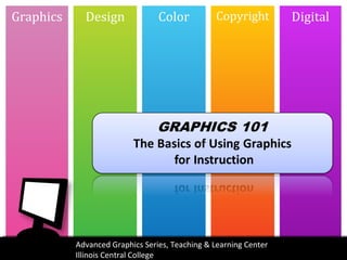
- 1. Graphics Design Color Copyright Digital Advanced Graphics Series, Teaching & Learning Center Illinois Central College
- 3. We Learn Visually “…we recall approximately 10% of that information 3 days later. By simply adding a visual image, we can increase that retention rate to 65%.” http ://ocio.osu.edu/elearning/toolbox/brief/visual-information/7-things-you-sho /
- 4. Graphics Visual Ideas • Photos • Graphics • Animations • Infographics • Diagrams • Charts • Audio • Video
- 5. Graphics Types of Graphics Clip Art Infographics Symbols/icons Diagrams Screen capture Graphs Illustration Maps Photos timelines
- 6. The supply-demand model is one of the fundamental concepts of economics. The price level of a good essentially is determined by the point at which quantity supplied equals quantity demand. This point is called equilibrium. If the quantity supplied is greater than the quantity demanded, then there is a surplus of goods. If the quantity supplied is less than the quantity demanded, the there is a shortage of goods.
- 8. Graphics Criteria of a Good Graphic Quality Can you read the text? Can you identify what it is? Purpose Why? Function –Decorative – careful may just become a distraction to your message –Representational – –Mnemonic – –Organizational –Relational –Transformational –Interpretive
- 9. Graphics Raster Images • Image made of pixels • Image size (bits) = pixel dimension X bit depth • Dependent on resolution (quality) • The more you scale the image the blurrier it becomes
- 10. Graphics Vector Images • Image made of mathematic algorithm • Points or nodes are plotted at exact points • Can be scaled to any size • Requires special software to edit and view
- 11. Graphics Raster vs. Vector Images
- 12. Graphics Scaling Graphics • Vector graphics can be used at any size and will be of great qaulity. – Vector images can be scaled in specific software and output to a raster format • Rastor graphics do not scale well, they become blurry • Scale proportionally • Copy or save the image as close to the size you intend to use it • Consider your final use of the image, print, display on a web page or Blackboard, projection for a presentation
- 13. Design Elements of Design • Alignment • Repetition • Unity • Contrast • Proximity • Balance • Space • Hierarchy
- 14. Color Dithering • Some digital formats can only contain 256 colors maximum. (GIF) • Process of reducing image to 256 or fewer colors
- 15. Color Color Combos to Avoid • Red & Green – Any version of it • Light colored graphics with light color text – Any color combos that cause the text on it to not be legible – Why use it, if it’s not legible?
- 16. Color • CMYK (PRINT) – images printed as series of dots – dots are Cyan, Magenta, Yellow, and blacK – dpi – dots per inch is the resolution • RGB (COMPUTER) – red, green, blue – color scheme digital displays use
- 17. Color Printer Basics • Images are printed as a series of dots. Your brain interprets the dots as continuous tones. • The dots are solid colors (Cyan, magenta, yellow, black ). • The resulting color on the page is a function of dot concentration and the ratio between the different colored dots. • The conversion of your image into the series of dots is halftoning.
- 18. Example of Halftones Enlargement illustrates what halftone would look like if this image was printed on the color laser writer or plotter.
- 19. Copyright FAIR USE • principle based on belief that public is entitled use portions of copyrighted materials for commentary, criticism and parody – Tricky – lots of “gray” when it comes to what is fair use and what is an infringement • also allows special guidelines for use of copyrighted material for educational purposes The 4 factors considered are: The 4 factors considered are: 1. 1. the purpose and character of your use the purpose and character of your use 2. 2. the nature of the copyrighted work the nature of the copyrighted work 3. 3. the amount and substantiality of the portion taken the amount and substantiality of the portion taken 4. 4. **the effect of the use upon the potential market. **the effect of the use upon the potential market.
- 20. Copyright Tips for Using Work Found Online • Consider the 4 factors of fair use. • Always drill down to the source of an image and investigate to find who actually created or owns the image. • Find out if the author of a work (e.g., text, video, audio, graphic, etc.) provides information on how to use his or her work. If the author provides explicit guidelines, follow them. Look for a “license, terms of use, permissions” link. • If the work has a watermark or logo on it, don’t use it without permission. • If the source of the image is a site or individual offering the image for sale? You don’t have the right to use it without purchasing it. • Always credit the source of your information. If nothing else list the url or organization. • ask the copyright holder for permission. Keep a copy of your request for permission and the permission received. • no copyright holder - do not assume that the material is in the public domain. Assume that the copyright holder is the author, whether it be an individual or an organization.
- 21. Copyright Public Domain • Works no longer protected by intellectual property laws. – Old stuff – Some works by U.S. Government • Always identify the source of the image, some websites will label an as public domain when it is not. • http://pixabay.com/ - not technically the public domain, but what they are calling it, more along the lines of creative commons – love this site – great images – give credit to these photographers – Photographers are willing to submit their own images and let anyone use them for anything. You are not required like attribution with creative commons to give credit, but do give attribution, please!
- 22. Copyright Creative Commons • A structured system for creators to share their works for free but still have some protections. • http://search.creativecommons.org/
- 23. Copyright Open Educational Resources learning materials that are freely available to use, remix, and redistribute. Lots of ways to find OER resources Many online repositories for education •http://www.oercommons.org/ •http://www.teachersdomain.org/ •http://wiki.creativecommons.org/OER •Educause PDF Series 7 Things You Should Know: http:// net.educause.edu/ir/library/pdf/ELi7061.pdf
- 24. Digital File Formats • Raw images • .bmp – bitmaps • .svg – vector graphics
- 25. Digital Infographics • Data visualizations that present complex information quickly and clearly. • Great way to present data during a presentation • Examples: – http://www.mint.com/blog/ trends/hamburger-10122010/ – http://visual.ly/can-social-media-predict-election-outcomes – http://googlemobile.blogspot.com/2010/06/google-voice-for
- 26. Digital 8 SOURCES FOR FINDING INFOGRAPHICS 1. http://visual.ly/ 2. http://infographixdirectory.com/ 3. http://www.mashable.com/follow/topi cs/mashable-infographics/ 4. http://www.infographicsarchive.com/ 5. http://www.thinkwithgoogle.com/insi ghts/library/infographics/ 6. http://pewinternet.org/Data- Tools/Get-the-Latest- Statistics/Infographics.aspx 7. http://www.educause.edu/library/info graphics 8. http://davidwarlick.com/graphicaday/
- 27. text Graphics Design Color Copyrigh t Digital Advanced Graphics Series, Teaching & Learning Center text Illinois Central College text text text text
Hinweis der Redaktion
- Images speak to us. How do you know that line and circle means something more than a line in a circle. Why does that string on the finger mean something more to you than a string on a finger. How do you know that there isn’t literally towns named success and failure? We are visual people? We understand and remember with visuals.
- Image from http://www.presentationmagazine.com/presentation-skills-1-use-visual-aids-7320.htm – great article on presentation skills and using visual aids
- The supply-demand model is one of the fundamental concepts of economics. The price level of a good essentially is determined by the point at which quantity supplied equals quantity demand. This point is called equilibrium. If the quantity supplied is greater than the quantity demanded, then there is a surplus of goods. If the quantity supplied is less than the quantity demanded, the there is a shortage of goods.
- Tool to vector a graphic http://www.vectorization.org/
- Keep these in mind when designing or choosing a graphic or designing a presentation. Alignment creates a sharper, more ordered design. Aligning elements allows them to create a visual connection with each other. Repetition strengthens a design by tying together individual elements. It helps to create association and consistency. Unity – using similar headers, color scheme etc… Contrast allows you to emphasize or highlight key elements within your design. Contrast is created when two elements are total opposites. Proximity helps creates organisation. By grouping similar elements together or in close proximity, you create a relationship between those elements. It also provides a focal point and can give the reader and idea of where they should start and finish reading. Balance provides stability and structure to a design. It’s the weight distributed in the design by the placement of your elements. Space is important in design – you need negative/empty space to make it legible and flow well and allow the eye to know what to take in Use color, unity and size to bring hierarchy to your graphic
- Used to be necessary when your standard monitor could only display 256 colors – not true anymore – nearly all digital devices/monitors display “true color” – meaning thousands of color http://webstyleguide.com/wsg3/11-graphics/5-web-graphics-formats.html Image http://en.wikipedia.org/wiki/File:Lenna_ordered_dither.png
- Want to learn even more about copyright and fair use, visit http://fairuse.stanford.edu/Copyright_and_Fair_Use_Overview/ and http://copyright.lib.utexas.edu/copypol2.html
- Based on http://www.umuc.edu/library/libhow/copyright.cfm#fairuse_tipsonline
- Note that there is a difference between free and royalty-free – be aware of this when searching for images. Royalty-free still has a cost of purchase, but you are not going to pay royalties to use it.
- Note that there is a difference between free and royalty-free – be aware of this when searching for images. Royalty-free still has a cost of purchase, but you are not going to pay royalties to use it.
- http://visual.ly/ http://infographixdirectory.com/ http://www.mashable.com/follow/topics/mashable-infographics/ http://www.infographicsarchive.com/ http://www.thinkwithgoogle.com/insights/library/infographics/ http://pewinternet.org/Data-Tools/Get-the-Latest-Statistics/Infographics.aspx http://www.educause.edu/library/infographics http://davidwarlick.com/graphicaday/