Webinar: How to Create Meaningful Mobile Experience with Responsive Design
•Als PPTX, PDF herunterladen•
1 gefällt mir•1,133 views

Think of the last time you used your smartphone or tablet to access a website. Were you able to find the information you were looking for? Did you have trouble navigating the page because of screen size limitations? Did you leave the website before making a purchase due to these problems? Responsive Design improves the customer experience and helps your customers find the product or service information they are looking for. Watch our webinar to learn: • The Importance of Mobile User Behavior Search Engine Optimization Considerations • How To Create a Consistent User Experience Across All Channels • Create Contextualized Interactions To Deliver the Right Experience to the Right Device

Empfohlen
Empfohlen
Weitere ähnliche Inhalte
Was ist angesagt?
Was ist angesagt? (19)
Ähnlich wie Webinar: How to Create Meaningful Mobile Experience with Responsive Design
Ähnlich wie Webinar: How to Create Meaningful Mobile Experience with Responsive Design (20)
Mehr von Bridgeline Digital
Mehr von Bridgeline Digital (20)
Kürzlich hochgeladen
Kürzlich hochgeladen (20)
Webinar: How to Create Meaningful Mobile Experience with Responsive Design
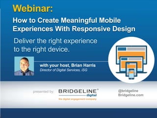
- 1. Webinar: How to Create Meaningful Mobile Experiences With Responsive Design Deliver the right experience to the right device. with your host, Brian Harris Director of Digital Services, iSG presented by: @bridgeline Bridgeline.com
- 2. Please engage with this presentation We welcome your questions… As the presentation is being given, we welcome your inquiries. Just open the questions pane and ask what you want to know!
- 3. About the presenters Visit us at: bridgeline.com Follow us: @bridgeline Brian Harris @brianart Director of Digital Services, iAPPS Success Group BFA Computer Graphics, Syracuse University bharris@bridgelinedigital.com Lauren Moore @bridgeline Vice President of Interface Design BFA Electronic Multimedia, University of Florida lmoore@bridgelinedigital.com Tom Lynch @bridgeline Vice President of Interface Design Bachelors degree in Graphic Design from the Fashion Institute of Technology tlynch@bridgelinedigital.com
- 4. Who is Bridgeline Digital
- 5. How We Build Customer Success We help our customers achieve their key initiatives by leveraging leading web based technologies “No other company in the web engagement marketplace can provide for its customers the integrated solutions Bridgeline provides.” - Scott Liewehr, DCG
- 6. Introduction: The Itinerary What we are talking about today … Mobile. It‟s not a technology. Or Strategy. It’s a connection.
- 7. Introduction: Why We‟re Here Bridgeline Digital’s Mobile Maturity Model: Stage #1 Stage #2: Stage #3: Stage #4: Awareness Planning Action Maturity CMOs & eCommerce Professionals Recognize Mobile as critical to business objectives, but 2/3 indicate they don't have a strong understanding of the mobile user experience. 72% of respondents expect to invest more in mobile channels. Vendor selection to implement the planned technology to deal with the Mobile Revolution. Your business has a meaningful & contextualized presence that seamlessly meets the needs of your customers.
- 8. Introduction: The Itinerary Why Embracing Mobile Matters: Brand Long-Term Opportunities Mobile Commerce/Conversion A Different Kind of Engagement
- 9. Introduction: Mobile & Brand Preservation Why Embracing Mobile Matters Brand Google found 72% of online shoppers expect businesses to have a mobile-friendly website 55% say a poor mobile experience will hurt their opinion of brand
- 10. Introduction: Long-term Mobile Considerations Why Embracing Mobile Matters Long-Term Opportunities 89% of customers do business with a competitor following a poor customer experience (IBM) 72% of companies said that mobile accounts for more than 10% of traffic, up from 52% in 2012 (Google) 67% of consumers said they‟re more likely to make a purchase if a website is mobile-friendly (Google)
- 11. Introduction: Email Still Wins the Day Why Embracing Mobile Matters Mobile Commerce & Conversion Success In 2013, Mobile Commerce grew to grow nearly 70%, reaching $41.7 billion Growth would exceed BoA pace, which projects Mobile Commerce to reach $67 billion by 2015 Monetate reported that Q1 of 2013 marked the first time conversion rates on tablets exceeded desktops.
- 12. Introduction: Mobile Customer Engagement Why Embracing Mobile Matters A Different Kind of Engagement 91% of smart phone users have their phone within arm‟s reach 24/7 31% of American Adults who have cell phones use it for the majority of their Internet use
- 13. What Is Responsive Design? Lauren Moore Vice President of Interface Design
- 14. What is Responsive Design? What is Responsive Design: “ Responsive Web design is the approach that suggests that design and development should respond to the user‟s behavior and environment based on screen size, platform and orientation. Kayla Knight, Smashing Magazine ”
- 15. Why Responsive is the answer: Breaking Down the Alternatives Marrying devices, instead of a concept, limits business presence The “App” Problem: To find an App In Marketplace and Download Is Active Experience. Must Develop Different Apps For Different Devices Quarantined content isn‟t shareable (prevents virality) Separate Mobile Website: Creating separate Mobile websites hurts SEO. Mobile Sites Appear Fragmented On Desktop/Laptops. Requires content updates in two separate locations.
- 16. Reasons Why Responsive Works Importance of User Behavior Smart Device Users Rely Heavily on Search In November 2013 alone: OVER 19 Billion Search Queries Occurred Across Five Major Search Engines. 26% of 19B = 4.94 Billion Inquiries On Mobile Devices
- 17. Reasons Why Responsive Works Importance of User Behavior (Continued) Customer Tendencies: Action, Not Volume, Is Critical 9 out of 10 smart phone searches result in customer action with over half leading in a purchase. 58% of Americans use their smart device on their way to the retail store or in store.
- 18. Reasons Why Responsive Works Search Engine Optimization Considerations From Google’s Developer Guide: Single URL creates easier user interaction and sharing opportunities Helps Google‟s algorithms assign the indexing properties for the content No redirection is needed for users to get to the device-optimized view & reduces loading time
- 19. Reasons Why Responsive Works Consistent User Experience Across All Channels Social Considerations: Example Twitter From Twitter Advertising Team: “ Think about content that‟s easy to interact with and consider the experience beyond the Tweet too – for example, link to sites that are optimized for mobile. – Twitter Mobile Users are More Engaged: 44% more likely to click on links 66% more likely to reTweet 76% more likely to favorite a Tweet. More than 60% of Twitter users log-on to via a mobile device ”
- 20. Reasons Why Responsive Works Consistent User Experience Across All Channels Don’t Submarine Email Marketing Campaigns with a Call-To-Action That Leads to a Fragmented Web Experience. Half of all unique opens occurred on a mobile device Desktop-only Webmail-only Mobile-combo Other Mobile-only Unique opens Source: Experian Marketing Services
- 21. Reasons Why Responsive Works Contextualized Interactions 2 out of 5 companies agree that 'delivering positive customer experiences is harder on a Mobile Device„ (IBM) Responsive Design empowers companies to best deliver the right experience to the right device
- 22. Creating a Responsive Web Design Tom Lynch Vice President of Interface Design
- 23. Creating a Responsive Web Design Discovery Phase 1. Interview End Users, Stakeholders 2. Conduct Competitive Analysis; Analytical Review For SEO 3. Establish Content Hierarchy 4. Develop Site Map 5. Create Wireframes 6. Usability Testing STEP 1 STEP 2 STEP 3 STEP 4 STEP 5 STEP 6 Interview End Users & Stakeholders Conduct Competitive Analysis; Analytic Review Establish Content Hierarchy Develop Site Map Create Wireframes Usability Testing
- 24. Creating a Responsive Web Design Discovery Phase: Develop Site Map
- 25. Creating a Responsive Web Design Discovery Phase: Homepage – Wireframes
- 26. Creating a Responsive Web Design Discovery Phase: Homepage – Screenshots
- 27. Creating a Responsive Web Design Discovery Phase: Product Details – Wireframes
- 28. Creating a Responsive Web Design Discovery Phase: Product Details – Screenshots
- 29. Final Thoughts … 1. You’re not late to the party, but the 13th hour is upon us 2. Responsive Design is the panacea to the mobile puzzle 3. Mobile Maturity starts at selecting the right technology, and ends with creating a seamless experience … regardless of device
- 30. Q&A Brian Harris Lauren Moore Tom Lynch Director of Digital Services Bridgeline Digital @brianart Vice President of Interface Design Bridgeline Digital @Bridgeline Vice President of Interface Design Bridgeline Digital @Bridgeline
- 31. Thank You for joining the Webinar! Follow us on twitter: @bridgeline Visit us at: www.bridgelinedigital.com
Hinweis der Redaktion
- UX and Design has a lot to do with how a customer will explore the site:Is it attractive? What nomenclature is used? Clear Call to ActionQuality Images – zoom, view from multiple anglesSeamless checkout – including mobile