Deira Call girl 0506129535 Independent Call girl in Deira
Initial Poster and Magazine Designs
1. Initial Poster/Magazine Designs
Here I will look further into the designs for poster and magazine I made which
were seen in my marketing branding and merchandising piece.
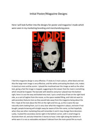
I feel this magazine design is very effective. IT sticks to 3 main colours, white black and red.
Also the large main image is very effective, and the white contrasting the black a lot, makes
it stand out more and be scarier. I placed the masthead over the image as well as the other
text, giving a feel the image is trapped, suggesting to the viewer that the mask is something
which should be trapped. The barcode with dateline and price I placed near the bottom
right, here it is out the way and looked very neat. I put a small strip of text on the right hand
side, as a sort of tagline from the movie, as the space needed filling, and I did not want to
add secondary features here as they would take away from the magazine being about the
film. I kept all the text about the film on the right and hire up, as this is were the eye
naturally starts looking from, so it is very clear what the magazine is about, and even if not
bought, people browsing will straight away be aware of the film name, so that hopefully
when they see other marketing they will remember it and it may change there descision.
Lastly, I tucked the secondary stories right in the bottom corner, with 1 small image to
illustrate them all, and also linked the 3 stories to have 1 title right along the bottom in
white were it is not as noticeable and doesn’t detract from the main portal film as much.
2. The poster has a very clear link with the magazine page. There is the large main image again,
with the text overlaying it, again suggesting it being trapped. IT uses the same 3 main
colours, again with black being the background. The title was placed at the top so much like
in the magazine it is the first thing that is noticed. The next large text is the coming soon, as
this is what people will see, and although they don’t know when the film is, they know it is
expected soon, and are likely to keep an eye out, and will recognise it when there is a date.
Lastly at the bottom I have all the actor details, and all production companies, this is very
much the same as most film posters, as it works very well, and it does not take away from
the image as it is far enough away. Also by the text being white, it ties in with the scheme
and does not look out of place on the poster.