
Empfohlen
Weitere ähnliche Inhalte
Was ist angesagt?
Was ist angesagt? (19)
Andere mochten auch
Andere mochten auch (10)
Ähnlich wie Question4
Ähnlich wie Question4 (20)
Question4
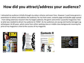
- 1. How did you attract/address your audience? I attracted my audience initially through my colour scheme and cover lines. However I used many generic c onventions to attract and address the audience; for my front cover, contents page and double page spread . From doing extensive research into my target audience, the genre and similar successful magazines I kne w what was needed to attract my audience to ‘EDGE’. As my audiences are young and mainly teenagers ag ed between 14-20 years, which come from either working-class or middle-class backgrounds meaning the price of my magazine is vital to the success of my magazine.
- 2. Front Cover On the front cover of my magazine I included a competition where you can win tickets to see a superstar but you have to read on to find out. My target audience love to listen to music and go to watch artists perform, so straight away b y having a flasher on the cover will make my m agazine appeal to them. By having this competi tion it also appeals to those readers who cann ot afford to go to a music festival. The colour sc heme I have used suits the young audience as , like them, the colours are bold and stand out. I also have Hip-Hop superstars featured in my magazine as they would easily be attracted int o opening the magazine and reading on.
- 3. Contents Page My contents page continues the hous e style and colour scheme that I start ed on my front cover. My target audi ence will be able to see the features and regulars inside so they could im mediately get reading. There is anoth er competition inside for the people who are into fashion. I have used sub -headings to organise my contents pa ge and used various size fonts to cert ain articles stand out. There is a flash er at the bottom of my image which t alks all about the cover story.
- 4. Double Page Spread My double page spread continues the house st yle and colour scheme that I started on my fro nt cover and contents page. The image I have u sed directly links to the article, as a large propo rtion of my audience are aspiring musicians thi s image will appeal to them. There are two pull quotes that stand out and draw the reader in t o reading the article. I have used a larger font a nd a different font style to achieve this. There i s a section on DPS where it shows all facts abo ut the artist just for the readers who may not k now about the young upcoming star. As well as the font style I have used yellow for the intervi ew questions and white for the artists answers which carries on the house style and colour sch eme.