
Empfohlen
Weitere ähnliche Inhalte
Was ist angesagt?
Was ist angesagt? (18)
Andere mochten auch
Andere mochten auch (6)
Ähnlich wie Task 3b
Ähnlich wie Task 3b (20)
Kürzlich hochgeladen
Kürzlich hochgeladen (20)
Task 3b
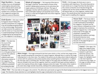
- 1. Page Numbers – The page numbers here are all displayed inside brightly coloured circles, which indicate which article will feature on what page. Page numbers are a common convention of all magazines and give the audience a sense of direction. Fonts – On this page, the fonts vary in size in accordance with importance. The artists featured on each article are in a larger font than the description- this is done so that the one of the first things the audience see are the variety of different artists that will feature later on in the magazine, relative to the genre. This would attract their attention and make them want to read/buy the magazine. Date – The date that this issue of the magazine was released, is located directly above the Masthead. This means it is in the general focal point for the audience. It provides the audience with more information relative to the magazine. The magazine is following common conventions by including the date. Mode of Language – The majority of the text on this page is informal. The description of some of the articles is deliberately humorous, to try and entice the target audience of 30-40 year old men. This type of language is familiar with the audience, so they would feel comfortable reading it and would be more inclined to buy it, as the text throughout the rest of the magazine would be similar. Grab Quotes – One way in which Q magazine doesn’t follow the common conventions of a magazine is by not including any grab quotes on the contents page. Grab quotes can help convince the audience to read the article as it may leave them in suspense/wanting to know what is happening but by leaving them out- this magazine is not doing so. House Style – The house style is continued on this page to help build a trade mark/enforce branding for this magazine. The black and red colour scheme is followed up on this page to emphasise the consistency that this magazine has. In the top left hand corner of the page, the masthead is repeated; this familiarises the audience and helps the brand to become more recognisable. It is in a much smaller text size on this page though as it isn't the main focus. Layout – Once again, this page of the magazine does not follow the rule of thirds, instead it is split into 4 distinctive columns. The column on the left is the largest, this highlights how it is the most important. Furthermore the images on this page are different sizes, to demonstrate the importance. Main Image – The image anchored to the front cover article is in fact, not the main image on this page- therefore breaking the conventions of a typical magazine. Although there is a puff on the image, indicating that it is the cover story. The models in this picture are all using a direct mode of address to connect with the audience as this article would be about something they’re interested in. In addition the shot type used is a full body shot. The other images on this page show the different rock artists that are included in this issue of the magazine- there are a variety of shot types and direct address is used in the majority of these other images, helping to entice the reader. The clothes of the models in the cover story image connote masculinity, relating to the audience/aspirations of the audience. Main Title – The main title on this page is the contents. The white text used stands out against the black background, and it is the biggest text on the page. This therefore draws attention to it and highlights that this page is dedicated to the contents