Responsive design overview 4 reasons why
•Als DOCX, PDF herunterladen•
0 gefällt mir•497 views

Responsive Web Design (commonly abbreviated to RWD) is the practice of creating a website appropriate to work with each device along with every screen resolutions, irrespective of how large or small, tablets and smartphones that allow for users watching websites on mobile phones to reach them in the user-friendly manner. The process includes a blend of flexible grids & layouts, images & CSS media queries.

Empfohlen
Empfohlen
Weitere ähnliche Inhalte
Kürzlich hochgeladen
Kürzlich hochgeladen (20)
Empfohlen
Empfohlen (20)
Responsive design overview 4 reasons why
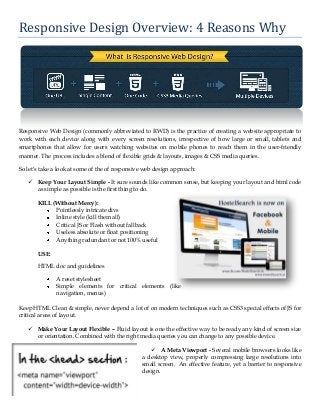
- 1. Responsive Design Overview: 4 Reasons Why Responsive Web Design (commonly abbreviated to RWD) is the practice of creating a website appropriate to work with each device along with every screen resolutions, irrespective of how large or small, tablets and smartphones that allow for users watching websites on mobile phones to reach them in the user-friendly manner. The process includes a blend of flexible grids & layouts, images & CSS media queries. So let’s take a look at some of the of responsive web design approach: Keep Your Layout Simple - It sure sounds like common sense, but keeping your layout and html code as simple as possible is the first thing to do. KILL (Without Mercy): Pointlessly intricate divs Inline style (kill them all) Critical JS or Flash without fallback Useless absolute or float positioning Anything redundant or not 100% useful USE: HTML doc and guidelines A reset stylesheet Simple elements for critical elements (like navigation, menus) Keep HTML Clean & simple, never depend a lot of on modern techniques such as CSS3 special effects of JS for critical areas of layout. Make Your Layout Flexible – Fluid layout is one the effective way to be ready any kind of screen size or orientation. Combined with the right media queries you can change to any possible device. A Meta Viewport - Several mobile browsers looks like a desktop view, properly compressing large resolutions into small screen. An effective feature, yet a barrier to responsive design.
- 2. Better Search Engine Optimization (SEO) –RWD is more effective for search engine optimization. Rather than optimizing content or building links for several websites, responsive design makes a solo model which is simple to update & much better for desktop, tablets and smartphones. Other than, the URL structure also remains identical for all devices. Some SEO advantages of responsive design, which we’ll talk about listed below: Improve Local Search Ranking You’re On-Page Optimization SEO Efforts Are Applicable Avoid Duplicate Content Penalty Google Loves Responsive Design The bottom line is here Responsive web design is among the most essential technology to show up strongly in the recent years. Responsive Web design makes a wonderful custom experience for all. As Web designers, we all try for that every single day on every task anyhow, right? Thanks for Reading!! Article Source - Responsive Design Overview: 4 Reasons Why