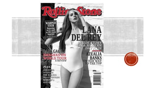
2. Main image- The main image of the magazine is a mid long shot of artist Lana Del Rey. She is positioned with one
hand over her face and the other holding her hair with a worried facial expression. This represents her as ‘damsel
in distress’ as she looks as if she’s about to paint and she’s wearing minimal clothing which is quite revealing. She
is wearing all white swimsuit/swimming costume looks very ‘1950’s’. This has been done to appeal to the male
audience, who are the target audience of Rolling Stone. By choosing the vintage style swimsuit it suggests that the
magazine appeals to audiences who enjoy old music as well as new music like Lana Del Rey’s as she’s a modern
and current artist. This also relates to the coverline ‘modern day icon’ which is what the image aims to achieve by
making her look like an icon from the 1950’s such as Marilyn Monroe with her wavy hair and white swimsuit. The
black and white image of the background also connotes a reflective theme to the magazine. This would appeal to
the audience as this style of fashion/beauty has been around during more recent years and rolling stone have
added a modern twist to it by using a new and upcoming artist, making the magazine still seem fresh and modern.
Masthead- The Rolling Stone masthead is very distinguished and bold – it is red with a white outline and a black
drop shadow. The font used is a serif font and looks similar to the “coca cola” font which usually has connotations
of American culture. The words rolling stone could be a reference to the rock band “The Rolling Stones” which
shows the audience that the magazine writes about music in the rock/pop genre. “Rolling Stone” is also used in
many rock songs such as Bob Dylan’s song “Like a rolling stone” which includes lyrics that talk about non-
comformity which could be telling the audience that the rolling stone magazine doesn’t conform to societies “top
music”. Unlike the black and white background of the magazine, the masthead is still in the iconic red font. This is
to appeal to the regular reader who would recognise the magazine from it’s iconic masthead. The colours red and
black also have connotations of a rock genre which represents the genre that the magazine originally started from
however today it is more of a hybrid genre.
3. The main cover line that relates to the photograph says: “Lana Del Rey: inside story on a modern day icon.” Rolling Stone
are trying to make it seem as though they have an “inside” story on Lana Del Rey and that it is exclusive to only them,
making clear to the audience that you are not going to get the story anywhere else making readers want to buy it. The
word ‘inside’ also connotes secrets which suggests to the audience that the magazine will have secrets of something
person about Lana Del Rey, which makes the story seem even more intriguing and makes the reader want to buy it to
find out what the ‘inside’ story is. The cover line also relates to the picture because as stated earlier, Lana is dressed up
like a 1950’s icon, and by calling her a “modern day icon” makes her seem like a combination of both old and new,
keeping Lana relating to the magazine as “rolling stone” has been around for a while but still covers new artists; like Lana
and others on the cover.
The plug- the plug ‘warped tour’ attracts the reader to the magazine as it shows the other exclusive information which
will be in the magazine. Warped tour is also a festival that many rock bands play it, this shows that rolling stone still has a
‘rock image’ and appeals to audiences who are fans of the rock genre. It’s in dark grey rectangle shape with white
writing which also helps it to stand out from the background.
The rectangle shape also looks like a festival/gig poster which relates to the text.
Sell lines- The sell lines of the magazine show that Rolling Stone magazine focuses on lots of different types of music
genre. This is shown in the sell line ‘Lady Gaga embarks on world tour a review’. Lady Gaga is a well known female pop
artist which allows the magazine to appeal to a wider audience. This also entices them to read the review to find out
what her world tour was really like.
4. The sell line ‘Azealia Banks on her way to the top’ also shows how the magazine targets a wide audience as it suggests that
Azaelia Banks is an upcoming artists who is not yet well known. This will appeal to the audience as they’d want to hear about
new music before anyone else.
Strip line- in the bottom corner of the magazine a list of well known mainstream artists are included to entice the audience
into reading the magazine. This is a stereotypical convention of a music magazine as a way of reaching out to its target
audience.
Font- All of the cover lines use the same font which is a serif font, which connotes tradition and respect. This suggests that
the magazine has been around for a long time making it seem well established and experienced in the music industry,
making the reader more likely trust their opinion on music. The consistent font also shows that the magazine appeals to the
regular reader as well as new readers, as the regular reader would be familiar and comfortable with the font and new
readers would feel that the magazine looks professional and consistent.
Price and barcode- The price of the magazine is barely readable as it is in a tiny font at the top of the page. This could show
that Rolling Stone is aimed at an older audience with stable jobs who don’t really need to worry about the price of the
magazine. The target audience is attracted to the magazine because of the content and not the price. The barcode is at the
bottom of the page which a stereotypical convention of a music magazine.