Project heartbeat student work
•Als DOCX, PDF herunterladen•
1 gefällt mir•197 views

Maths

Empfohlen
Weitere ähnliche Inhalte
Was ist angesagt?
Was ist angesagt? (15)
Ähnlich wie Project heartbeat student work
Ähnlich wie Project heartbeat student work (20)
Mehr von Angela Phillips
Mehr von Angela Phillips (20)
Kürzlich hochgeladen
Kürzlich hochgeladen (20)
Project heartbeat student work
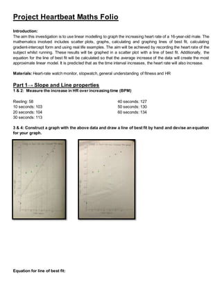
- 1. Project Heartbeat Maths Folio Introduction: The aim this investigation is to use linear modelling to graph the increasing heart rate of a 16-year-old male. The mathematics involved includes scatter plots, graphs, calculating and graphing lines of best fit, calculating gradient-intercept form and using real life examples. The aim will be achieved by recording the heart rate of the subject whilst running. These results will be graphed in a scatter plot with a line of best fit. Additionally, the equation for the line of best fit will be calculated so that the average increase of the data will create the most approximate linear model. It is predicted that as the time interval increases, the heart rate will also increase. Materials: Heart-rate watch monitor, stopwatch, general understanding of fitness and HR Part 1→ Slope and Line properties 1 & 2: Measure the increase in HR over increasing time (BPM) Resting: 58 10 seconds: 103 20 seconds: 104 30 seconds: 113 40 seconds: 127 50 seconds: 130 60 seconds: 134 3 & 4: Construct a graph with the above data and draw a line of best fit by hand and devise an equation for your graph. Equation for line of best fit:
- 2. Y (HR) 68 80 92 104 115 126 138 X (sec) 0 10 20 30 40 50 60 Gradient → (y2−y1)/(x2−x1) Coordinate A → (68,0) Coordinate B → (138, 60) (x1, y1) (x2, y2) (138-68)/(60-0) = 1.16666 y-intercept → 68 Therefore, y= 1.16x + 68 5: Construct a graph and draw a line of best fit using technology. Create an equation for line of best fit Y (BPM) 77.2 88.1 99 109.9 120.8 131.7 142.6 X (sec) 0 10 20 30 40 50 60 Gradient = (y2−y1)/(x2−x1) Coordinate A → (0,77.2) Coordinate B → (60,142.6) (x1, y1) (x2, y2) Gradient→ (142.6-77.2)/(60-0) = 1.09 Y-intercept → 77.2 Therefore, y = 1.09x + 77.2 6: Compare your results from the two different lines of best fit. Which is most likely to be accurate? The y-intercept of the hand-drawn graph has a lower heart rate than the excel graph; with the hand-drawn y- intercept 68 beats per minute (BPM) whilst the excel graph intercepted at 77.2 BPM. The gradient of the hand- drawn graph is steeper than the excel graph as can be seen by the gradients in each equation. In the hand- drawn graph, the 10-second intervals has an increase of 12 BPM (from 68 to 80). The excel graph had an increase of 10.9 BPM, showing the steeper increase in the hand-drawn graph. The excel graph is likely to be more accurate because it uses complex mathematics to determine the results with perfect accuracy. 7: Decide when a linear model is no longer applicable (re-graph is necessary).
- 3. The data collected shows that the linear model is applicable. If the exercise time period was repeated at 70 seconds the increase in heart rate would start to slow before plateauing. After this point, the linear model would become less effective at graphing the line of best fit. After several plateaued intervals the model's gradient would be affected, decreasing the gradient. By removing any heart rate readings after 60 seconds it is possible to calculate the increasing heart rate between these points. 8. Choose two points and calculate the distance between these two points. Does this calculation have any significance in the graph? Distance between two points → d=√(x2−x1)^2 + (y2−y1)^2 Coordinate A → (0,77.2) Coordinate B → (60, 142.6) d = √(60-0)^2 + (142.6-77.2)^2 d = √7877.16 = 88.75 units This calculation does not have any effect on the graph as the units on both axis’ have different unit values. 9: Calculate the midpoint between these two points. Does this calculation have any significance in the graph? Midpoint of two points → M = (x1+x2)/2 , (y1+y2)/2 Coordinate A → (0,77.2) Coordinate B → (60, 142.6) M = (0+60)/2 , (77.2+142.6)/2 M = 30, 109.9 Therefore the midpoint of (0,77.2) and (60, 142.6) is (30,109.9) These calculations give the coordinates of the midpoint which makes it is possible to see an individual’s heart rate at different time intervals. Due to the line of best fit, the coordinate shows the average heart rate and gives the appropriate time relevant to the heart rate. 10: Discuss the slope of the data and interpret its meaning: The gradient of the graph determines the increase in data as time increases. The larger the gradient the faster the heart rate increases as time passes. This gradient shows that as the time intervals increase there is also a steady increase in the heart rate. 11: Discuss the y-intercept and discuss its meaning: The y-intercept of a graph is the corresponding value when the x equals zero. In this investigation, the y-axis measured heart rate. Before any exercise was undertaken a heart rate was measured to find the resting heart rate as a control factor in this experiment, this was the y- intercept. The subject’s resting heart rate was 77.2 BPM, which is average for a subject aged 16 years. 12: Discuss the x-intercept and discuss its meaning: The x-intercept of a graph is the corresponding value when y equals zero. In this investigation, the x-intercept is when the heart rate on the y-axis is at 0 BPM. However, this is not possible because a living subject is being tested. If the heart rate is zero, the x-intercept would be -70.83 seconds. This is impossible. 13: Using your understanding of algebra, solve your equation to find the x and y intercept algebraically Since, y = 1.09x + 77.2 x-intercept → y=0
- 4. 0 = 1.09x + 77.2 -77.2 = 1.09x x = -77.2/1.09 = 70.83 y-intercept → x=0 y = (1.09 x 0) +77.2 y = 77.2 Therefore the x-intercept is 70.83 and y-intercept is 77.2 14: Using your understanding of weight/ fitness levels and the heart rate. Draw on the linear models for the following: a) An elite cyclist preparing for the Tour Down Under has a resting heart rate of 40 bpm.1 The slope of the graph is 0.4714 and the y-intercept is 39.286. b) Someone who has not done any exercise this year has a resting heart rate = 84 bpm The slope is 1.4971 and the y-intercept is 82.267. From the graphs above, the slope of the cyclist is less steep than the slope of the person in a sedentary lifestyle and the y-intercept of the cyclist is less than the person in a sedentary lifestyle. This shows that the healthier the lifestyle the less your heart rate will increase. 15: Draw on a perpendicular line. Create a scenario that matches this graph: 1 <http://news.nationalgeographic.com/news/2004/08/0820_040820_olympics_subjects_2.html>
- 5. The perpendicular intersection may occuras a set of data if the experiment was completed in the reversed order, starting at 60 seconds of exercise and working down to 10 seconds of exercise followed by a resting heart rate, starting at a higher level of exercise and decreasing to no exercise. 16. Draw on a parallel line. Create a scenario that matches this graph, what are the criteria for perpendicular and parallel lines. Due to the standard gradient each of the lines possesses, a scenario that may occur could include people of different sizes with the same fitness level. The smaller the person the higher their heart rate due the smaller volume of blood pumped around the body each time the heart pumps, but the same fitness level maintains the same gradient. Part 2 → Simultaneous Equations: 1. Using an internet tool/ approximate maximum heart rate for the person who did part 1: A very common way of determining the maximum heart rate is by taking the age of subject away from 220. In this case, the subject was 16 years old, making the maximum heart rate 204 beats per minute (220-16=204).
- 6. Although this formula is a very simple method of determining maximum heart rate, it may not always be the most accurate. The mostaccurateway to test maximum heart rate is to go to an exercisephysiologist, who will conduct the appropriate tests to find the most precise results. By using an online heart rate calculator, the same result was found2 . 2. Draw in the horizontal lines that represent at least 3 Heart Rate (HR) zones: Change in Heart Rates Over Increased Time Periods with Training zone (16 year old male) 3. Use simultaneous equation methods to solve for the intersection points in each of your graph. Very Light (95 - 114) Moderate (133 - 152) Very Hard (171 - 190) y = 1.09x + 77.2 y = 1.09x + 77.2 y = 1.09x + 77.2 y = 95 y = 133 y = 171 2 https://www.lifespanfitness.com/fitness/resources/target -heart-rate-calculator
- 7. 95 = 1.09x + 77.2 133 = 1.09x +77.2 171 = 1.09x + 77.2 17.8 = 1.09x 55.8 = 1.09x 93.8 = 1.09x 17.8/1.09 = 1.09x/1.09 55.8/1.09 = 1.09x/1.09 93.8/1.09 = 1.09x/1.09 16.33 = x 51.19 = x 86.06 = x Light (114 - 133) Hard (152 - 171) y = 1.09x + 77.2 y = 1.09x + 77.2 y = 114 y = 152 114 = 1.09x + 77.2 152 = 1.09x + 77.2 36.8 = 1.09x 74.8 = 1.09x 36.8/1.09 = 1.09x/1.09 74.8/1.09 = 1.09x/1.09 33.76 = x 68.62 = x 4. Interpret the meaning of each of these: Given that the subject’s heart rate follows the linear model the interpretation is as follows: Very Light: Using this set of data this athletic subject will enter the very light heart rate after 16.33 seconds. Light: Athletic subject will enter the light heart rate zone at 33.76 seconds. Moderate: After 51.19 seconds of consistent athletic effort the subject will enter this heart rate zone. Hard: After 68.62 second the subject will have entered this physical exercise zone. Very Hard: At 86.06 seconds the subject will have entered the very hard training zone given the heat rate follows the linear model. Part 3 → Scatter Plots and Linear Regression: 1. Discuss the r and r squared values for your data in part 1 and interpret their meaning. r = 0.90 r2 = 0.82 The r value correlates to a strong positive linear correlation, meaning that the data is highly accurate in terms of following a linear model. Using the r2 value: 82% of the variation in stopping time can be explained by variation in speed. 2. Was a linear model a good fit for this type of heart rate modelling? Why or why not? Although the linear model was a good method to look at averaged data, a curved model would be more accurate. As mentioned in Part 2, the increase in the heart rate gradually stabilises, leaving a plateau in the data. This plateau effects the linear model by decreasing the gradient making the linear model less accurate. A line that eventually levels out over the x-axis would give a more accurate representation of the result. An example of this line is pictured. 3. Overall why are graphs and modelling useful for measuring fitness? There are many different states of fitness that can be measured with graphs and models: VO2, strength, flexibility, muscle size, weight, body fat percentage etc. These data variations can easily be graphed because of the tendency to progress in fitness levels. With this progression, there is usually a linear model that shows the average increase in fitness levels. This allows for easier tracking of fitness progress.
- 8. Limitations and Assumptions: A large limitation in this practical is the accuracy of the heart rate monitor used to measure BPM. The Fitbit worn by the subject doesn’t record data every 10 seconds, meaning that some of the recorded heart rates may have been delayed. Another limitation is the subject’s inability to keep a steady pace. It is physically impossible for the subject to maintain the same pace throughout the whole experiment. This means that the results may not have been as accurate. Something that was assumed in this experiment is that the heart followed a linear model and did not plateau. Another assumption is that the heart rates were correctly recorded at 10-second intervals. The last assumption is that the amount of energy expended in each interval was equal. Conclusion: Through the calculations, it was possible to graph and calculate the linear modelling of a 16-year-old male heart rate when subjected to the same amount of physical exertion over increasing periods of time. Assuming the subject exerted the same amount of energy with each increased interval of exercise the result provided, allowed for an accurate linear model to be created before the subject’s heart rate plateaued. Working with results to create the mostaccurate linear model we were able to look at when and where the heart rate would enter different training zones as well as how different fitness levels would compare. These results were recorded on separate graphs showing the line of best fit and how heart rate changes over different time periods. Bibliography: Lifespan 2017, Target Heart Rate Calculator, PCE Fitness, accessed 20 August 2017, <https://www.lifespanfitness.com/fitness/resources/target-heart-rate-calculator>. Lovgren, S 2004, ‘Olympic Gold Begins With Good Genes, Experts Say’, National Geographic News, 20 August, accessed 22 August 2017, <http://news.nationalgeographic.com/news/2004/08/0820_040820_olympics_subjects_2.html>