
Empfohlen
Weitere ähnliche Inhalte
Was ist angesagt?
Was ist angesagt? (20)
Andere mochten auch
Andere mochten auch (20)
Ähnlich wie Proposal - Pop!
Ähnlich wie Proposal - Pop! (20)
Kürzlich hochgeladen
Kürzlich hochgeladen (20)
Proposal - Pop!
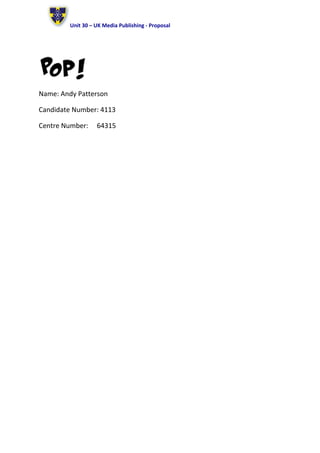
- 1. Unit 30 – UK Media Publishing - Proposal Name: Andy Patterson Candidate Number: 4113 Centre Number: 64315
- 2. Unit 30 – UK Media Publishing - ProposalFormat: Magazine I am going to produce a new music magazine under the title of ‘Pop!’ but I will only make the front cover and double page spread to promote the magazine. I am going to create a new music magazine which focuses on pop music. This will be demonstrated as a Front Cover and DPS (Double Page Spread) for Pop! I chose pop music because I think that it is mostly mainstream to teenage girls. Some big sellers in the music industry such as One Direction are really popular with teenage girls and have made some songs that appeal to their fans. Pop has attracted millions of female fans over many generations. This is what made me choose this genre to my music magazine so I can expand on it and let more people from different age groups to read about it as well. Working Title: e.g. My working title is ‘Pop!’ although this might change. This is to connote that it is aimed at teenage girls due to its nature. The colour scheme will be very changeable for every issue, which is exactly the same effect the Smash hits had at its peak. The masthead will be in the font Kraash from dafont.com and will be inside an explosion-style shape which will also be brightly-coloured. What I am trying to do is make the magazine appealing to a young female audience and have a very colourful appearance to it. Genre: The magazine focuses on pop music, as my magazine is based on Smash Hits Magazine, which features the same style. Content: ‘Pop!’ will feature interviews from artists, as well as artist posters, backstage events at concerts, and images of artists. This will be seen as part of Katz’ Uses and gratifications theory, where the reader is escaping reality to see their favourite artist. Style or Approach: The denotation of the colour scheme for the magazine front cover will be black, white and blue The colour scheme was chosen for name of convention because of a survey taken on SurveyMonkey to determine which colour scheme was popular and that emerged as a popular choice. The colour scheme connotes that the magazine is based Smash Hits which had many different colour schemes. The size of the magazine will also be 28cm tall and 21.5cm which will be roughly the size of Smash Hits. I am going to use Photoshop to construct the magazine pages (Front Cover and DPS) because it is most used when creating magazine covers Some of the tools in Photoshop that will be particularly beneficial in constructing front cover will be text, rulers, magnetic lasso, and paint bucket. Audience: • Age – 13-18 • Gender – Mostly Female • Socio-Economic Needs – Katz • Ethnicity - International • Stereotypes The audience will mostly be teenage girls with a few male fans as well. The age rate will also be aged 13-18. The magazine will appeal to fans of pop music because of the success some of the artists have. Any ethnicity can read it and there will be no stereotypes featured, such as only teenage girls can read it. Length: I intend to make 32 pages including the front and back cover. It will be A4 in size. Frequency: Fortnightly Why? Smash Hits was also a monthly so I thought I would recreate that. Cost? The cost will be 99p so I thought I would follow on from what Smash Hits had.