
Empfohlen
Weitere ähnliche Inhalte
Was ist angesagt?
Was ist angesagt? (18)
Andere mochten auch
Ähnlich wie Question 1 Front Cover Evaluation
Ähnlich wie Question 1 Front Cover Evaluation (20)
Kürzlich hochgeladen
Kürzlich hochgeladen (20)
Question 1 Front Cover Evaluation
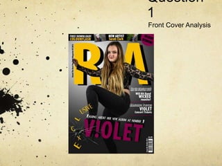
- 2. Conventions Adhered To The Model The model is wearing dark clothing with dark eye makeup. Mulvey said there is a ‘male gaze’ that females in magazines attempt to attract, which could be applied to the cover as she has quite voyeuristic high heels on. However there is a counterargument to this as it could be showing how powerful she is.
- 3. The Model The model is looking directly into camera, which follows conventions. It helps draws in the audience and catch their eye by creating a connection with the model.
- 4. The Model The model is holding a dynamic pose, breaking the glass around the headline, as well as the ‘Exclusive’, showing she is rebellious and strong, which goes against Mulvey’s theory of the ‘male gaze’.
- 5. The Colour Scheme The colour scheme I used is black and white with yellow and purple highlights. This is both a convention of rock, and a way to draw in a more female based audience.
- 6. The Masthead The masthead is in a large bold font so the magazine is easily recognizable on a shelf in a shop. It is also in a sans serif font, which adheres to the conventions of rock. Other rock magazines use a similar style, such as Kerrang.
- 7. The Masthead The masthead is in the same font and style as the headline, creating synergy. Having similarities between the masthead and the headline is a convention of rock which I am adhering to.
- 8. The Banner A convention of most rock magazines is to have a banner advertising the contents of the magazine. I have adhered to this convention, by including a banner advertising a freebie and a new artist.
- 9. The Barcode The convention for rock magazines is to have a barcode code with the issue number. I have followed this convention by having the barcode, the issue number, date and price together.
- 10. The Pug The convention of rock magazines is to have a pug advertising the contents of the magazine to encourage the audience to turn the pages and look inside, as well as to stand out of a shelf. I have included a pug, in a purple colour to help attract the female audience even if not much of the front cover can be seen on a shelf.
- 11. The Cover Stories The conventions of a rock magazine are that the front cover will contain multiple interesting stories to help draw in the audience. These will often be in another font to create more diversity on the page. I have followed this convention and have cover stories in a different font to my masthead and headline. They also contain a rhetorical question that means the audience would have to read the magazine to find the answer to.
- 12. The Strapline Convention of rock magazines say that the headline should have a strapline to help attract the audiences’ interest by telling them a little about the article. I have adhered to this convention by telling the audience a little about the article, so they know it is about V!olet and her new album.
- 13. The ‘Exclusive’ Conventions of the rock genre state that words such as ‘free’ and ‘exclusive’ should be used to help attract an audience by offering them downloads or making articles specific to that magazine so if the audience was interested they would have to buy that magazine. I have followed this convention by stating that the main article is an exclusive.
- 14. Conventions Manipulated The Background The rock genre has the convention of having a plain background, which is kept however I wanted to make the background more interesting for my audience so I added a gradient.
- 15. The Colour Scheme I have adhered to the convention of having a mainly black and white however I have included a purple colour when highlighting certain stories to bring in a more female audience.
- 16. Conventions Challenged The Model The model is overlapping the masthead, however this is to show that the magazine will have a distinct style that will be easily recognizable to its audience when it is on the shelf.
- 17. The Layout The convention for rock magazines is to have a busier front cover however the magazines published by TeamRock, who would be the distributers of my magazine have a clearer style, therefore I wanted to replicate that in my front cover. It also fits in with what my target audience said that they would prefer.