

Empfohlen
Weitere ähnliche Inhalte
Was ist angesagt?
Was ist angesagt? (19)
Ähnlich wie Slidehshare of Front Cover
Ähnlich wie Slidehshare of Front Cover (20)
Mehr von amy_adele22
Slidehshare of Front Cover
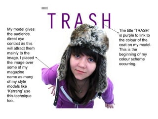
- 1. My model gives the audience direct eye contact as this will attract them mainly to the image. I placed the image over some of my magazine name as many of my style models like ‘Kerrang’ use this technique too. The title ‘TRASH’ is purple to link to the colour of the coat on my model. This is the beginning of my colour scheme occurring.
- 2. I added a skyline to front cover as I thought there was too much white on my page. Adding an image and subheadings gave my audience more information about the type of genre my magazine was. Give aways attract more people to buy my magazine as they have a chance of winning their favourite bands/ artist merchandise
- 3. I changed the give aways box as I wanted to see which looked suited my magazine and what fitted best on my front page.
- 4. I added my magazine’s website on to my front cover to advertise my magazine in a range of media ways. I added more information on to my front cover as this filled the page up more. A barcode and issue date/price was added to make my piece look more professional. My main headline was added, I used big, bold text to catch the readers eye however my text was still not good enough to make my magazine look professional for the magazine industry.
- 5. I decided to use shapes to make my subheadings more noticeable. Drop back shadows were put on texts and shapes to make my magazine professional. Undecided about using a circle or rectangle shape on my front cover I used both as they filled it up greatly as well as using common magazine features. Changing my headline colour to orange fitted in with the colour pallet I have chosen to keep throughout my magazine. I also edited my headline to make it fit in with the genre of my indie music magazine. Editing my second main image made my magazine more individual like my genre (indie). My text was changed and made bolder and big as it wasn’t very noticeable when I first added it to the page.