Social Media & Online tools for educators Presentation
Fort Christmas web site redesign
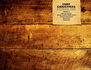
1. PROJECT A
Web site redesign
DIGITAL STUDIO 1 (GRDS-720-OL)
Professor Sarah Adams
Amanda Kern
Winter 2010
2. PROJECT A REDESIGN TABLE OF CONTENTS
REDESIGN CHOICE
Fort Christmas Park web site
REDESIGN CHOICE .........................................................................2
http://nbbd.com/godo/FortChristmas/
OVERVIEW OF ORIGINAL SITE
The site is a historical park located in central Florida (in USER PROFILE & USE CASE OF SITE ..........................................3-4
Christmas, FL). The name evolves around the historical
movement of soldiers on Christmas 1837 to the forts that COMPETITOR WEB SITES ...........................................................5-8
still are present from the Second Seminole Indian War. Now
restored, and containing replica material for the time period, the TYPOGRAPHY .................................................................................9
park serves as a historical site as well as a meeting place for a
variety of events. COLOR ..........................................................................................10
This is a county park and the web site establishes a poor online
presence for such a remarkable location in central Florida. I
PHOTOGRAPHY .......................................................................11-12
still consider it one of the best “hidden” locations that many in
central Florida never know about. ROUGH DRAFTS ......................................................................13-15
The park has a lot of history so they do have a store that has set DESIGN COMPS ......................................................................16-19
hours open to the public. The often times do tours and there are
a variety of events held there throughout the year.
The purpose of the site is the provide pertinent information to
those interested in visiting Fort Christmas park. Currently the
site is poorly designed and has no true navigation or branding.
I hope for a redesign of the site to establish the history and
uniqueness of the park to those interested in visiting. Visitors
of the site hopefully will take action by planning a trip to Fort
Christmas park.
3. USER PROFILE AND USE CASE SCENARIO
FORT CHRISTMAS PARK
DEMOGRAPHIC INFORMATION
A common user of the web site would be a caucasian
female ranging in age between 25-40 years of age. This
user is a mother, with children, located in central Florida.
RELEVANT ATTITUDES, BELIEFS, AND LIFESTYLE
INFORMATION
This user is likely busy as either a stay at home mother or a
working mother and keeps her children actively involved in
activities. It is not uncommon for her to attend local events
or go out with other families on “play dates”. She seeks to
find activities to keep the children entertained at a relatively
low cost. This user find that educational activities for the
kids are a plus.
INTERESTS, HOBBIES, AND FAVORITE WEB SITES
This user is active and uses the web as a tool to stay
informed and find special activities for her family to stay
involved in. She enjoys photography, especially when it
involves visiting outdoor locations or experiences with her
children. She visits a variety of news web sites to stay
informed but also uses social media to stay connected and
informed. She is a “fan” of many of her favorite web sites,
locations, and businesses - in doing so this offers her a
great source of information on local events and activities for
the kids.
EXPECTATIONS OF OUR SITE
This user would visit our site in order to learn more about
the park, park hours, costs, as well as for directions. She
would be interested in learning more about the history of
the park as well as learning about educational benefits
for her family. She would hope to see photos so she would
know what to expect of the park before visiting.
Project 2 - Part 2: Competitive Analysis & User Profile | DIGITAL STUDIO 1 (GRDS-720-OL) | Professor Sarah Adams | Amanda Kern | January 20, 2010
4. USER PROFILE AND USE CASE SCENARIO
FORT CHRISTMAS PARK
COMPUTER SKILLS
This user would be competent with the computer. She may
not be an expert, however, she has used a computer for
years and is well aware of how to navigate a web site. She
knows how to download files, navigate back in the browser,
and email links to family and friends.
TECHNICAL INFORMATION
This user could use a mac, pc, or mobile device such as
an iphone. Firefox is used most by this user. Generally she
accesses the web using a high speed connection.
USE CASE SCENARIO
This user will likely hear through word of mouth of the park
or an event being held at the park. She will search through
google or will be emailed a link from a friend or family
member to help her learn more about the park.
As she visits the park web site she will begin to search
for information and photos of the park. She will likely get
frustrated with the current web site due to it’s lack of
navigation and poor display of content. The current site
leaves the user with the impression that the park may not
be worth visiting, other than what she then reads about
the history of the park. After learning of it’s historical
significance she considers it as a location to visit with her
family. If she visits the park she’ll be left with a much more
positive experience than she had with the current web site.
Project 2 - Part 2: Competitive Analysis & User Profile | DIGITAL STUDIO 1 (GRDS-720-OL) | Professor Sarah Adams | Amanda Kern | January 20, 2010
5. COMPETITIVE ANALYSIS: CYPRESS GROVE PARK
http://www.cypressgrovepark.com/
FEATURES
Features of the Cypress Grove Park are minimal, however,
far more advanced than the Fort Christmas Park web site.
They offer information about the park, how to reserve the
estate house for events, and display imagery to help users
get an idea of what the park and estate house is like. The
web site is intended to publicize specifically the estate
house located within the park. The web site is built in flash
and could pose usability issues. It could definitely be done
just as effectively using xhtml & css.
NAVIGATION
Because the site is built in flash the site is within a confined
size that does fill only the top fold so though navigation on
the bottom of the page is typically an issue, it is acceptable
in this case. However, with how most users use the web,
it is easy to get bored with the top section of the web site.
The navigation is also in flash so an arrow blinks as it is
hovered. It is fairly easy to use despite being in flash.
USE OF TEXT & IMAGES
The imagery displays the location nicely and is at a
fair size within the flash web site. However, the text is
absolutely awful. First we’re greeted by the tag line, “where
contemporary elegance meets the charm of the old South”.
As I navigate through the web site the text turns neon green
against a dark green background. These color changes make
the text less legible.
USE OF COLOR
The color scheme consists of greens, yellow, and black.
I envision a less harsh scheme needed for this site. The
current colors are less inviting and pose issues with
legibility.
Project 2 - Part 2: Competitive Analysis & User Profile | DIGITAL STUDIO 1 (GRDS-720-OL) | Professor Sarah Adams | Amanda Kern | January 20, 2010
6. COMPETITIVE ANALYSIS: LEU GARDENS
http://www.leugardens.org/
FEATURES
The web site for Leu Gardens is primarily to offer
information to those interested in visiting Leu Gardens.
Leu Gardens is often used for wedding and events and so
information is available on how to reserve the location.
Additional information is available about tours, the
museum, the butterfly garden, and membership.
NAVIGATION
There are multiple navigational elements for this web
site. On the top there is an orange bar containing “city
of orlando” navigation. One the left there’s the main
navigation for the web site. It is a vertical navigation that
goes below the top fold. Sub navigational elements are
accessible under the facility rental section. There are no
rollover effects to help add an interactive element to the
page.
USE OF TEXT & IMAGES
Considering how impressive the location is, the photography
and use of imagery is poor and lacking where it could be.
Some imagery on pages have a bevel/emboss style applied
to the pictures which leaves a less than desirable look. Text
is formatted, but not well designed. Headings, paragraphs
and lists are formed, but they lack consistency in styling.
Some pages the text is center justified and they even use
default bright red at times to try to draw attention when
really this screams that an amateur web designer designed
and built this as I click through the pages.
USE OF COLOR
The color scheme is inconsistent. A primary green and
orange appear with the identity. Links are blue. Headings
are green. Some type is red. The body copy is black. The
color scheme needs a little more unity.
Project 2 - Part 2: Competitive Analysis & User Profile | DIGITAL STUDIO 1 (GRDS-720-OL) | Professor Sarah Adams | Amanda Kern | January 20, 2010
7. COMPETITIVE ANALYSIS: PEACE RIVER EXCURSION
http://www.swfwmd.state.fl.us/education/interactive/peaceriver/
FEATURES
Peace River is located in Southwest Florida and though
this is not the location’s web site it is intended as an
educational and informational tool for students to learn
more about Peace River. The design is certainly inspiring
and worth visiting as an example moving forward. The
features are primarily informational where photos and text
is shared online. A video about restoring the river is also
accessible.
NAVIGATION
The navigation is very straight forward. The home page is
more of a “splash” type of page where it is image heavy
with minimal information. Users choose to “begin”, must
like they’d do opening a book. As they move forward into
the web site the navigation remains consistent and easy to
use throughout the site. As you click through the pages they
remained “checked” so you know you’ve visited them.
USE OF TEXT & IMAGES
The imagery is impressive, not just of the location but also
the imagery used to create a style and look and feel for the
web site. The site has a tactile approach in it’s composition
so when viewing the site we feel almost as though we
could physically touch it.
USE OF COLOR
The colors are earth tones, which represent the nature
theme well.
Project 2 - Part 2: Competitive Analysis & User Profile | DIGITAL STUDIO 1 (GRDS-720-OL) | Professor Sarah Adams | Amanda Kern | January 20, 2010
8. COMPETITIVE ANALYSIS: BOK TOWER GARDENS
http://www.boktowergardens.org
FEATURES
Bok Tower is by far one of the most impressive locations to
visit in central Florida. The web site is equally as impressive
considering it is considered a national park. The site is
loaded with information about the park, the gardens,
and various events held throughout the year. Bok Tower
maintains a social media presence as well so throughout
the web site there are ways to keep updated. There are
easy ways to search and locate information at the top of the
page throughout the site as well.
NAVIGATION
The navigation is easy to find and easy to use. It remains
consistent on all pages, though on the splash page it is
slightly lower to compensate for the imagery differences. At
the top there are links to find out more information, search,
faq’s and access a site map.
USE OF TEXT & IMAGES
The imagery is incredibly amazing. Both the imagery of the
location and the imagery that sets the mood and style for
the web site are great. The only concern I see is on sub
pages I click to a section such as “the tower” and I really
envisioned seeing more of the tower in that header image.
Every page instead seems to focus more on floral imagery
from their gardens. Imagery is in the content sections,
however, it’s often cut off into the bottom fold of the page.
The typography is right on with appropriate use of type for
identity, navigation, headings and body copy. The type helps
the user flow seamlessly through the page.
USE OF COLOR
The colors are earth tones mixed with a blue and sienna
color. The colors offer an inviting atmosphere with just the
right amount of contrast to grab the user’s attention.
Project 2 - Part 2: Competitive Analysis & User Profile | DIGITAL STUDIO 1 (GRDS-720-OL) | Professor Sarah Adams | Amanda Kern | January 20, 2010
9. SITE IDENTITY
Fort Christmas Park
LOGO DESIGN
Currently no logo or form of identity is established for Fort
FORT
Christmas Park. A typographic identity will represent the CHRISTMAS
park and help emulate the style of the time period the park’s HISTORICAL PARK
history is known for.
TYPOGRAPHY
The logo uses the fonts Geometric slabserif 712 and Futura GEOMETIC SLABSERIF 712
Medium condensed. This font will be continued minimally FUTURA MEDIUM CONDENSED
in imagery graphics throughout the site. Heading and
subheading fonts of georgia and arial will be used. They
will be letterspaced and Georgia will be bold and italicized.
Body copy will be arial and set with appropriate line height Heading fonts - Georgia
to help with legibility. HEADING FONTS - ARIAL
Body copy - Arial
Long before the coming of the Spaniards, central Florida was occupied
by the Timucuan Indians, who numbered about 14,000 at the time of
contact with the white man. The Timucuans, along with the other Indians
which lived in Florida at the time of European contact, eventually died out
from diseases, warfare and slavery.
The Indians who later became know as Seminole began migrating into
Florida in the early 1700s. These were tribes which had broken away
from their own nations, made up of Creek, Hitchiti, Mikasuki, Muskogee
and Red Sticks, Oconee and others who moved into the sparsely
populated areas in northern Florida. The Seminoles raised crops and
cattle and had citrus groves. The Government wanted to move the
Indians south onto a reservation. This led to the Treaty of Moultrie Creek
in 1823. In less than 10 years, the settlers wanted that land, too.
Project 2 - Part 3: Identity, Sitemap & Rough Drafts | DIGITAL STUDIO 1 (GRDS-720-OL) | Professor Sarah Adams | Amanda Kern | January 27, 2010
10. SITE IDENTITY
Fort Christmas Park
COLOR
I’ve explored a few color schemes that may help give the
Fort Christmas park a strong vintage feel. The colors help
represent an authentic “old” feel that is representative of
a lot of the older styled design and artifacts from the time
period. The colors are also inspired by the wooden forts and
homes located in the park.
Project 2 - Part 3: Identity, Sitemap & Rough Drafts | DIGITAL STUDIO 1 (GRDS-720-OL) | Professor Sarah Adams | Amanda Kern | January 27, 2010
11. SITE IDENTITY
Fort Christmas Park
PHOTOGRAPHY
I took a trip to Fort Christmas park and took hundreds of
photos that could potentially be used throughout the web
site. The photos reflect the entire park as well as capturing
an upclose perspective of the historical nature of the park
Project 2 - Part 3: Identity, Sitemap & Rough Drafts | DIGITAL STUDIO 1 (GRDS-720-OL) | Professor Sarah Adams | Amanda Kern | January 27, 2010
12. SITE IDENTITY
Fort Christmas Park
PHOTOGRAPHY
Close up views of elements can add visual interest to the
park’s web site.
Project 2 - Part 3: Identity, Sitemap & Rough Drafts | DIGITAL STUDIO 1 (GRDS-720-OL) | Professor Sarah Adams | Amanda Kern | January 27, 2010
13. GOALS & SITEMAP
Fort Christmas Park
MESSAGING GOALS
The Fort Christmas Goals would benefit from messaging
that entices users to visit the park for it’s events and
historical signifigance. It can be considered one of the great
hidden treasures in central Florida and most would enjoy
the heritage found at the park.
FEATURES
The home page will contain the most recent upcoming
events listed, fast facts, and park hours. The home page
will act as a visual portal to help users go to useful parts of
the web page to learn more about the park and it’s history,
events, see photos, and get directions.
OVERALL VISUAL EFFECT
The overall visual effect will be organized and authentic.
It will professionally display information about the park.
Imagery will help give the user a good impression of the
park’s historical signifigance. The style of the site will excite
the user about the location’s history and interest the user to
visit the park.
NAVIGATION
Navigation will be clearly identifiable and highly usable.
It will be interactive and have useful rollover features for
users to sense the interactivity of the site. Some image
links may be used as navigation, however, textual links will
be included to ensure the site maintains a high sense of
usability for all users.
Project 2 - Part 3: Identity, Sitemap & Rough Drafts | DIGITAL STUDIO 1 (GRDS-720-OL) | Professor Sarah Adams | Amanda Kern | January 27, 2010
14. ROUGH SKETCHES
Fort Christmas Park
Project 2 - Part 3: Identity, Sitemap & Rough Drafts | DIGITAL STUDIO 1 (GRDS-720-OL) | Professor Sarah Adams | Amanda Kern | January 27, 2010
15. ROUGH SKETCHES
Fort Christmas Park
Project 2 - Part 3: Identity, Sitemap & Rough Drafts | DIGITAL STUDIO 1 (GRDS-720-OL) | Professor Sarah Adams | Amanda Kern | January 27, 2010
16. COMPUTER ROUGHS
Fort Christmas Park Home Page
Home page notes
The concept for the Fort Christmas web site is centered
around imagery and typography that helps convey some of
the style I experienced while visiting the park. The wood
background is reminicent of all the wood forts and homes
and helps set the mood for the web site. The old textured
paper helps give a three dimensional quality and a slight
amount of depth to the page.
The navigation is at the top and on hover will change color
and display a line above and below the text. The active
page will have only a line above and below in the same
color to help indicate which page the user is on.
The Fort Christmas home page contains the most relevant
information that users would be interested in including
quick information about the park, gift shop, the most
recent event, park hours, and letting users know the park
is handicap accessible. Headings, subheadings and copy
is formatted to help the user read through and find the
information they’re looking for.
Project A - Part 4: Computer Roughs | DIGITAL STUDIO 1 (GRDS-720-OL) | Professor Sarah Adams | Amanda Kern | February 13, 2010
17. COMPUTER ROUGHS
Fort Christmas Park Events Page
Events page notes
The events page lists the annual park events. Because
the park doesn’t have the funding to update the web site
constantly with each new event, only annual events are
listed. The park holds the events on specific weekends
of the month which in turn makes the web site easier to
update. Events are listed with their approximate time of
the year that they’re held and a brief description. The main
image and tag line were changed for the page to add a bit
of variety between pages.
Project A - Part 4: Computer Roughs | DIGITAL STUDIO 1 (GRDS-720-OL) | Professor Sarah Adams | Amanda Kern | February 13, 2010
18. COMPUTER ROUGHS
Fort Christmas Park Photos Page
Photos page notes
The photos page will feature some photos of the park that
I’ve taken to help give users a sense of what they could
expect to see visiting the park. Square thumbnails 100px
sized can be clicked on by the user to preview a larger
photo. I will likely use lightbox2 to display the photos. The
user can then click the “close” button to go back to look at
the rest of the page.
Project A - Part 4: Computer Roughs | DIGITAL STUDIO 1 (GRDS-720-OL) | Professor Sarah Adams | Amanda Kern | February 13, 2010
19. COMPUTER ROUGHS
Fort Christmas Park Contact Page
Contact page notes
The contact page will contain any contact information for
the park. If this were for a real client I would likely have a
google map included in the page, however, this requires use
of the actual URL to make it fully function so for now just
textual information is displayed.
Project A - Part 4: Computer Roughs | DIGITAL STUDIO 1 (GRDS-720-OL) | Professor Sarah Adams | Amanda Kern | February 13, 2010