Clarendon Type Speciman
•
2 gefällt mir•2,167 views

The Clarendon typeface originated in 1815 England during the Industrial Revolution. It was a bold, slab-serif style used prominently in advertising to stand out. By 1845, the Fann Street Foundry had registered the name "Clarendon." It was widely used through the 1800s and remained popular for titles, headlines, and signs through the 20th century. New interpretations of the Clarendon style continue to be made today.

Empfohlen
Weitere ähnliche Inhalte
Mehr von allisonvleach
Mehr von allisonvleach (12)
Clarendon Type Speciman
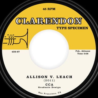
- 1. 45 RPM CLARENDON TYPE SPECIMEN 428-87 Pub., Advance Time: 0:08 A L L I S O N V. L E A C H ( 2 0 1 1) CCA Graduate Design San A Francisco, C
- 3. “ Wouldn't it be nice if we were older, then we wouldn't have to wait so long. History The name Clarendon is often used as a general term for all bracketed slab serif typefaces – a style that appeared at the start of the Industrialization Revolution of Britain around 1820. Innovations in printing technology at this time, such as the Steam Press, spawned a new wave of advertising that was marked by attention-grabbing display letterforms on nearly every billboard, pamphlet and poster. For the first time, typography design was independent from the influence of the book. Interestingly, the earliest Clarendon typeface was not solid; “Two-line pica in shade” by Vincent Figgins in 1815 was an outlined form. Some historians believe that the Clarendon model was used in Roman architectural relief in
- 4. the eighteenth century, and was preserved in copperplate engravings in shaded outlines in the nineteenth century. It was not until 1844 that a solid Clarendon version was made: “Ionic” Calson. In October of 1845, the Fann Street Foundry registered the name “Clarendon” under the new Ornamental Designs Act of 1842. Its design was a slightly condensed display typeface that functioned as the first related bold – it harmonized with the roman types it was set with in both design and alignment. Serifs were thinned with the x height at medium length to allow for legibility at smaller sizes. Because of its immediate popularity, however, Besley’s Clarendon was widely copied. When the three-year copyright expired, other type foundries caught on, producing “Piracies and Imitations,” as Besley complained. Use As the first related bold, Clarendon was especially relevant in the mid-1800s – a period of increased printed material which necessitated more structured texts. A bold typeface that stood out from the main text would “An allow the reader to pick out the most important pieces of information in normal linear reading. Prior to its wou
- 5. invention, italics were primarily used to emphasize more important parts of text. In the first half of the nineteenth century, Clarendon models were employed in newspaper printing. These were ideal printing typefaces because they reduced problems of illegibility that resulted from ink trapping. During World War I, Clarendon was widely used in proclamations by the German government. In the American Old West, Clarendon commonly appeared in wanted posters. The United States National Park Service embraced Clarendon in the design of its traffic signs, although the typeface has been phased out over the last half century. American designers also popularized Clarendon in the mid-twentieth century, particularly Bradbury Thompson and Lou Dorfsman. Evolution In 1951, a new “Clarendon” was created by Herman Eidenbenz for the Stempel foundry and published by Linotype. For many people today, this is the epitome of the Clarendon style. Newer interpretations of the nd Clarendon model include “Belizio” by the Font Bureau in 1987, and “Sentinel” by Hoefler & Frere-Jones in 2009. uldn't it be nice to live together, in the kind of world where we belong? ”
- 6. Clarendon Roman abcdefghijklmnopqrstuvwxyz ABCDEFGHIJKLMNOPQRSTUVWXYZ abcdefghijklmnopqrstuvwxyz 1234567890 £&@?!/+(.,:;) 2 Clarendon Light abcdefghijklmnopqrstuvwxyz ABCDEFGHIJKLMNOPQRSTUVWXYZ abcdefghijklmnopqrstuvwxyz 3 1234567890 £&@?!/+(.,:;) Clarendon Bold abcdefghijklmnopqrstuvwxyz ABCDEFGHIJKLMNOPQRSTUVWXYZ abcdefghijklmnopqrstuvwxyz 1234567890 £&@?!/+(.,:;)
- 8. If I fell in love would you prom and help me cause I’ve been Bold 19pt and I found that than just hol If I GAVE MY H I must from the v that you would love IF I TRUS Light 27pt oh pl don’t run IF I LOVE oh pl don’t hurt my cause I couldn’t and I woul our new love So I hope you would love Bold 25pt and that sh when she learn
- 9. Roman 15pt love with you mise to be true e understand n in love before t love was more lding hands. HEART TO you be sure very start e me more than her. Roman 31pt ST IN YOU lease and hide. E YOU TOO lease pride like her Light 9/11pt t stand the pain ld be sad if e was in vain. you see that I to love you he will cry ns we are two.
- 10. can hea 108pt 96pt so much 84pt your sighs 72pt and I can 60pt see so much
- 11. Style name: Roman Designer: Robert Besley Clarendon 48pt Foundry: Fann Street Date: 1845 your eyes, there 36pt are words we 30pt we both could 24pt 18pt 14pt put your head say, but don’t talk 12pt 10pt shoulder on my
- 12. Roman 12pt CALIFORNIA GIRLS Produced by the Beach Boys Light 8pt MONO: Time: 5464 2:37 CAPITOL RECORDS The Bold 65pt Beach Boys
- 13. ab * ** * * * *** * ** * * * * ** * * ** ** ** * * ** ** * ** * * ** * * *** * ** * * * ** * ** *
- 14. ({ } Light 120pt “happ Roman 58pt tim Bold 72pt toge
- 15. py mes ) ether ”
- 18. MPR 54 NODNERALC NEMICEPS EPYT ecnavdA ,.buP 78 - 824 80:0 :emiT H C A E L .V N O S I L L A )1 1 0 2 ( ACC ngiseD etaudarG AC ,ocsicnarF naS