SlideShare ist ein Scribd-Unternehmen logo
1 von 7
Evaluation Activity 1 In what ways does your media product use, develop or challenge forms and conventions of real media products? (i.e. of music magazines)
Title of Magazine. The respective magazine titles bear similarities. The existing 'Vibe' magazine is a single word title, portrayed as a large, bold masthead in red (dictating the colour palette).  It is a short, punchy title, as seems to be the typical scheme between magazine titles in the hip-hop genre (eg, 'XXL', 'The Source').  My magazine title 'Beatz' is also punchy, boldly displayed and dictates the cover's colour palette (red, black & white). As my magazine title is undoubtedly similar to that of other  hip-hop magazines, and therefore follows hip-hop magazine conventions and fits the genre.
Graphology/Page Layouts. The layouts of my magazine also match the conventions of typical hip-hop magazines.  Like the ‘Vibe’ cover pictured, my cover has the masthead spanning the width of the page at the top and is layered behind an image of the featured artist positioned centrally with a related puff in larger text. The image is also surrounded by other cover lines advertising other content of the magazine. However, unlike ‘Vibe’ , my magazine’s feature cover line is situated centrally layered on top of the image. On the most part though, my cover entertains the conventions of a hip-hop cover. My contents page bears many likenesses to that of ‘Vibe’ magazine also. Like ‘Vibe’ my image takes up the majority of the page on the left, with the contents text situated down the right. I took inspiration from the style of the contents title from ‘Vibe’ magazine, as it is a recurring original feature. However, I changed my image to black and white for my own unique touch and changed the pose. My model is also not smiling, which is a hip-hop convention (looking ‘hard’).
Costumes, Props & Iconography My model’s costume is a simple one, which doesn’t follow typical generic hip-hop dress. However, there is a reason for this. I wanted my artist to be relatable and identifiable with the target audience, and also not too extravagant in a way which would be perceived as fake (ie, Lady Gaga, Soulja Boy). If he would be perceived as fake, he would lose his credibility and the articled story would not be accessible for the audience. I believe when my artist does not look like a conventional rapper, it was vital for the article to compensate for it in terms of ‘realness’.  Despite his unconventional dress, I thought it was important for my artist to look presentable and stylish, in order for people to idolise him. This is the reason for the choice of clothign selected; though not typically hip-hop style, it is fashionable, individual and flattering for the model. This individuality, combined with the relatable article, created a good, believable role model and hip-hop artist. In addition, the simplicity of the props used (ie, the chair) draws more attention to the appearance of the model and the article as there is less distractions. However, the chair is neither stylish nor impressive. This reinforces the message of my artists roots being simple and not very privileged. This unprivileged background and climbing to the top is a feature of many generic hip-hop artists  stories.
Camerawork & Framing Images This Vibe cover bears similarities to my magazine cover, in the similar facial expressions used and type of shot. It is a close-up face shot so the expressions can be seen in full detail. The standard close-up is used on several magazine covers (not just hip-hop) and is therefore a convention present across several genres of magazine. This means it is more of a fundamental technique. Some of these are necessary in order for my own magazine to look credible. The second shot, on the contents page, is a mid-shot which shows the upper body of my artist. This kind of shot allows the face to be seen still, but also shows more of the artist and clothing/pose can take more of a part. In this shot for instance, it allows my artist’s folded arms to be visible, which shows authority and seriousness.It also builds on what is shown on the cover (by the close-up shot) by now revealing more of the artist. This revelation reaches a climax on the double page spread. This shot – similar to that of 50 cent adjacent – shows more dimensional depth than the others  and therefore more revelation of the artist.  This gradual increased showing of the character is done as a subtle technique of making the audience want to purchase the magazine after looking at the cover and contents so they can experience the full revelation of the artist in the DPS.  Another notable feature is that all my images have been edited to black and white. I thought this was more appropriate as it looks more fitting for the article inside and  keeps simplicity – no unnecessary colours are present.
Font Styles Unlike the more block font used for the lines on the cover, the font I utilised for the double page spread was more formal. I felt the cover font I used actually looked like a font suitable for a magazine cover, whereas the font for the DPS was also appropriate: by being suitable for their place magazine, they undoubtedly follow generic conventions.  The same font is used for the double page spread title as the text, which gives it unity and continuity. The formal font also reinforces the serious tones of the article, which I thought was important – a more casual font style would’ve been inappropriate. The fonts used, I feel, are also suitable for the target age group; as a mature audience a font like the one used would appeal more. The spread title and subtitles have also been made bold to attract attention.
Genre suggestion. As previously mentioned, my magazine’s genre is hip-hop. As a whole project, I feel my magazine is a good example of a hip-hop magazine. Through the way it bears similarities in many areas to several other existing hip-hop samples, I think it suggests its genre very well. For instance, the masthead on the cover is very typical of the hip-hop genre (block capitals/simple font style). The cover also says the magazine features existing hip-hop artists, and my own fictional artist has a believable rapper’s name. The contents carries with it many conventions that have been inspired by Vibe magazine – for example, the layout is similar, as is the title of the contents page. Whilst the first two pieces fit comfortably into the hip-hop genre, the double page spread doesn’t contain that many conventions from hip-hop. The article is written addressed to a targeted hip-hop audience, but aside from this, my DPS doesn’t explicitly look like a hip-hop spread – the image of my artist isn’t depicted (as said before) as a classic rapper due to his dress. However, the pose bares similarities to the picture of 50 cent which was shown earlier. The lack of fitting rigidly into the boundaries of the hip-hop genre isn’t a negative point though; I felt it was important to have some flexibility in my project and not play completely by the guidelines of the genre. This is why my artist isn’t dressed like a typical rapper – he has his own unique style in relation to the genre and therefore pushes it’s boundaries, which in itself could be seen as actually playing up to the generic conventions  (rebellion has often been present alongside hip-hop).  I feel my products strike a good balance between fitting in and playing up to the generic conventions, and having originality, uniqueness and playing against them.

Weitere ähnliche Inhalte

Was ist angesagt?

Evaluation of my music magazine production
Evaluation of my music magazine productionEvaluation of my music magazine production
Evaluation of my music magazine production
ZoeRadford
 
Evaluation for main task
Evaluation for main taskEvaluation for main task
Evaluation for main task
kenyaL
 
Evaluation of my music magazine
Evaluation of my music magazineEvaluation of my music magazine
Evaluation of my music magazine
ZoeRadford
 
Evaluation of my own music magazine production [autosaved]
Evaluation of my own music magazine production [autosaved]Evaluation of my own music magazine production [autosaved]
Evaluation of my own music magazine production [autosaved]
ZoeRadford
 
Planning for my music magazine
Planning for my music magazinePlanning for my music magazine
Planning for my music magazine
sana0001
 
Evaluation Question 1
Evaluation Question 1Evaluation Question 1
Evaluation Question 1
emmasmithchs
 
Task 9- formal proposal
Task 9- formal proposalTask 9- formal proposal
Task 9- formal proposal
asmediae12
 
Statement of intent front page
Statement of intent  front pageStatement of intent  front page
Statement of intent front page
oliviaolives
 
Double page spread_statement_of_intent_guide
Double page spread_statement_of_intent_guideDouble page spread_statement_of_intent_guide
Double page spread_statement_of_intent_guide
omarc17
 
Evaluations
EvaluationsEvaluations
Evaluations
xJacbob
 
Front page statement of intent
Front page statement of intentFront page statement of intent
Front page statement of intent
oliviaolives
 
Double page spread analysis xxl
Double page spread analysis xxlDouble page spread analysis xxl
Double page spread analysis xxl
chiaralcollu
 
Task 9 formal proposal
Task 9 formal proposalTask 9 formal proposal
Task 9 formal proposal
asmediae12
 

Was ist angesagt? (18)

Evaluation of my music magazine production
Evaluation of my music magazine productionEvaluation of my music magazine production
Evaluation of my music magazine production
 
Evaluation for main task
Evaluation for main taskEvaluation for main task
Evaluation for main task
 
Magazine evaluation
Magazine evaluationMagazine evaluation
Magazine evaluation
 
Unit G321 Mind Map Joe Dolan
Unit G321 Mind Map Joe DolanUnit G321 Mind Map Joe Dolan
Unit G321 Mind Map Joe Dolan
 
Evaluation of my music magazine
Evaluation of my music magazineEvaluation of my music magazine
Evaluation of my music magazine
 
Evaluation of my own music magazine production [autosaved]
Evaluation of my own music magazine production [autosaved]Evaluation of my own music magazine production [autosaved]
Evaluation of my own music magazine production [autosaved]
 
Planning for my music magazine
Planning for my music magazinePlanning for my music magazine
Planning for my music magazine
 
Evaluation Question 1
Evaluation Question 1Evaluation Question 1
Evaluation Question 1
 
Task 2a fc nme analysis 2
Task 2a fc nme analysis 2Task 2a fc nme analysis 2
Task 2a fc nme analysis 2
 
Task 9- formal proposal
Task 9- formal proposalTask 9- formal proposal
Task 9- formal proposal
 
Task 2a fc nme analysis 2
Task 2a fc nme analysis 2Task 2a fc nme analysis 2
Task 2a fc nme analysis 2
 
Eq1
Eq1Eq1
Eq1
 
Statement of intent front page
Statement of intent  front pageStatement of intent  front page
Statement of intent front page
 
Double page spread_statement_of_intent_guide
Double page spread_statement_of_intent_guideDouble page spread_statement_of_intent_guide
Double page spread_statement_of_intent_guide
 
Evaluations
EvaluationsEvaluations
Evaluations
 
Front page statement of intent
Front page statement of intentFront page statement of intent
Front page statement of intent
 
Double page spread analysis xxl
Double page spread analysis xxlDouble page spread analysis xxl
Double page spread analysis xxl
 
Task 9 formal proposal
Task 9 formal proposalTask 9 formal proposal
Task 9 formal proposal
 

Andere mochten auch

 Dsf rulebook
 Dsf rulebook Dsf rulebook
 Dsf rulebook
lavorhees
 
Welcome to house meeting at student union building
Welcome to house meeting at student union buildingWelcome to house meeting at student union building
Welcome to house meeting at student union building
ChiRan చిరణ్
 
Casey Project2
Casey Project2Casey Project2
Casey Project2
c2lewis
 
10 Aanbevelingen
10 Aanbevelingen10 Aanbevelingen
10 Aanbevelingen
EllisSamsom
 
3 procurement & outsourcing
3 procurement & outsourcing3 procurement & outsourcing
3 procurement & outsourcing
Rishi Mathur
 
I bambini raccontano
I bambini raccontanoI bambini raccontano
I bambini raccontano
zanettirosita
 
1 introduction to supply chain & networks
1 introduction to supply chain & networks1 introduction to supply chain & networks
1 introduction to supply chain & networks
Rishi Mathur
 

Andere mochten auch (20)

Impulse Voltage Test System
Impulse Voltage Test SystemImpulse Voltage Test System
Impulse Voltage Test System
 
 Dsf rulebook
 Dsf rulebook Dsf rulebook
 Dsf rulebook
 
Welcome to house meeting at student union building
Welcome to house meeting at student union buildingWelcome to house meeting at student union building
Welcome to house meeting at student union building
 
[Rossella derickson, krista_henley,_almaz_negash,_(book_fi.org)
[Rossella derickson, krista_henley,_almaz_negash,_(book_fi.org)[Rossella derickson, krista_henley,_almaz_negash,_(book_fi.org)
[Rossella derickson, krista_henley,_almaz_negash,_(book_fi.org)
 
Casey Project2
Casey Project2Casey Project2
Casey Project2
 
10 Aanbevelingen
10 Aanbevelingen10 Aanbevelingen
10 Aanbevelingen
 
3 procurement & outsourcing
3 procurement & outsourcing3 procurement & outsourcing
3 procurement & outsourcing
 
Reference list (overseas market) update in October, 2011
Reference list (overseas market) update in October, 2011Reference list (overseas market) update in October, 2011
Reference list (overseas market) update in October, 2011
 
The Learning Experience
The Learning ExperienceThe Learning Experience
The Learning Experience
 
I bambini raccontano
I bambini raccontanoI bambini raccontano
I bambini raccontano
 
LX TECHNICAL TRAINING
LX TECHNICAL TRAININGLX TECHNICAL TRAINING
LX TECHNICAL TRAINING
 
Intensive Bank Analysis
Intensive Bank AnalysisIntensive Bank Analysis
Intensive Bank Analysis
 
problem
problemproblem
problem
 
FE@OpenPA2011er
FE@OpenPA2011erFE@OpenPA2011er
FE@OpenPA2011er
 
AC Test Transformer
AC Test TransformerAC Test Transformer
AC Test Transformer
 
Become your Customers Ambassador
Become your Customers AmbassadorBecome your Customers Ambassador
Become your Customers Ambassador
 
Ready for the digital age?
Ready for the digital age?Ready for the digital age?
Ready for the digital age?
 
1 introduction to supply chain & networks
1 introduction to supply chain & networks1 introduction to supply chain & networks
1 introduction to supply chain & networks
 
Rulebook
RulebookRulebook
Rulebook
 
Vmobile presentation bom
Vmobile presentation bomVmobile presentation bom
Vmobile presentation bom
 

Ähnlich wie Evaluation activity 1 (20)

Media AS Coursework Evaluation
Media AS Coursework EvaluationMedia AS Coursework Evaluation
Media AS Coursework Evaluation
 
Q1
Q1Q1
Q1
 
Media coursework evaluation
Media coursework evaluationMedia coursework evaluation
Media coursework evaluation
 
Statement of intent
Statement of intentStatement of intent
Statement of intent
 
Question One
Question OneQuestion One
Question One
 
Evaluation
EvaluationEvaluation
Evaluation
 
Question 1- Laurelle Duah-Nantwi
Question 1- Laurelle Duah-NantwiQuestion 1- Laurelle Duah-Nantwi
Question 1- Laurelle Duah-Nantwi
 
Music magazine evaluation- Question 1
Music magazine evaluation- Question 1Music magazine evaluation- Question 1
Music magazine evaluation- Question 1
 
Media question 1
Media   question 1 Media   question 1
Media question 1
 
Media Evaluation
Media EvaluationMedia Evaluation
Media Evaluation
 
Evaluation 1 final
Evaluation 1 finalEvaluation 1 final
Evaluation 1 final
 
Media coursework evaluation
Media coursework evaluationMedia coursework evaluation
Media coursework evaluation
 
D:\Sarai\Evaluation
D:\Sarai\EvaluationD:\Sarai\Evaluation
D:\Sarai\Evaluation
 
D:\Sarai\Evaluation
D:\Sarai\EvaluationD:\Sarai\Evaluation
D:\Sarai\Evaluation
 
Evaluation
EvaluationEvaluation
Evaluation
 
Evaluation for main task
Evaluation for main taskEvaluation for main task
Evaluation for main task
 
Media question 1
Media question 1Media question 1
Media question 1
 
Evaluation
EvaluationEvaluation
Evaluation
 
New media evaluation
New media evaluationNew media evaluation
New media evaluation
 
New media evaluation
New media evaluationNew media evaluation
New media evaluation
 

Mehr von Alex Wilson

Evaluation Activity 2
Evaluation Activity 2Evaluation Activity 2
Evaluation Activity 2
Alex Wilson
 
Digipak analysis re-up
Digipak analysis   re-upDigipak analysis   re-up
Digipak analysis re-up
Alex Wilson
 
Digipak analysis re-up
Digipak analysis   re-upDigipak analysis   re-up
Digipak analysis re-up
Alex Wilson
 
Digipak analysis professor green
Digipak analysis   professor greenDigipak analysis   professor green
Digipak analysis professor green
Alex Wilson
 
Evaluation activity 1
Evaluation activity 1Evaluation activity 1
Evaluation activity 1
Alex Wilson
 
Double Page Spreads
Double Page SpreadsDouble Page Spreads
Double Page Spreads
Alex Wilson
 

Mehr von Alex Wilson (8)

Evaluation Activity 2
Evaluation Activity 2Evaluation Activity 2
Evaluation Activity 2
 
Poster analysis
Poster analysisPoster analysis
Poster analysis
 
Digipak analysis re-up
Digipak analysis   re-upDigipak analysis   re-up
Digipak analysis re-up
 
Digipak analysis re-up
Digipak analysis   re-upDigipak analysis   re-up
Digipak analysis re-up
 
Digipak analysis professor green
Digipak analysis   professor greenDigipak analysis   professor green
Digipak analysis professor green
 
Evaluation activity 1
Evaluation activity 1Evaluation activity 1
Evaluation activity 1
 
Double Page Spreads
Double Page SpreadsDouble Page Spreads
Double Page Spreads
 
Cover Analysis
Cover AnalysisCover Analysis
Cover Analysis
 

Evaluation activity 1

  • 1. Evaluation Activity 1 In what ways does your media product use, develop or challenge forms and conventions of real media products? (i.e. of music magazines)
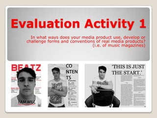
  • 2. Title of Magazine. The respective magazine titles bear similarities. The existing 'Vibe' magazine is a single word title, portrayed as a large, bold masthead in red (dictating the colour palette). It is a short, punchy title, as seems to be the typical scheme between magazine titles in the hip-hop genre (eg, 'XXL', 'The Source'). My magazine title 'Beatz' is also punchy, boldly displayed and dictates the cover's colour palette (red, black & white). As my magazine title is undoubtedly similar to that of other hip-hop magazines, and therefore follows hip-hop magazine conventions and fits the genre.
  • 3. Graphology/Page Layouts. The layouts of my magazine also match the conventions of typical hip-hop magazines. Like the ‘Vibe’ cover pictured, my cover has the masthead spanning the width of the page at the top and is layered behind an image of the featured artist positioned centrally with a related puff in larger text. The image is also surrounded by other cover lines advertising other content of the magazine. However, unlike ‘Vibe’ , my magazine’s feature cover line is situated centrally layered on top of the image. On the most part though, my cover entertains the conventions of a hip-hop cover. My contents page bears many likenesses to that of ‘Vibe’ magazine also. Like ‘Vibe’ my image takes up the majority of the page on the left, with the contents text situated down the right. I took inspiration from the style of the contents title from ‘Vibe’ magazine, as it is a recurring original feature. However, I changed my image to black and white for my own unique touch and changed the pose. My model is also not smiling, which is a hip-hop convention (looking ‘hard’).
  • 4. Costumes, Props & Iconography My model’s costume is a simple one, which doesn’t follow typical generic hip-hop dress. However, there is a reason for this. I wanted my artist to be relatable and identifiable with the target audience, and also not too extravagant in a way which would be perceived as fake (ie, Lady Gaga, Soulja Boy). If he would be perceived as fake, he would lose his credibility and the articled story would not be accessible for the audience. I believe when my artist does not look like a conventional rapper, it was vital for the article to compensate for it in terms of ‘realness’. Despite his unconventional dress, I thought it was important for my artist to look presentable and stylish, in order for people to idolise him. This is the reason for the choice of clothign selected; though not typically hip-hop style, it is fashionable, individual and flattering for the model. This individuality, combined with the relatable article, created a good, believable role model and hip-hop artist. In addition, the simplicity of the props used (ie, the chair) draws more attention to the appearance of the model and the article as there is less distractions. However, the chair is neither stylish nor impressive. This reinforces the message of my artists roots being simple and not very privileged. This unprivileged background and climbing to the top is a feature of many generic hip-hop artists stories.
  • 5. Camerawork & Framing Images This Vibe cover bears similarities to my magazine cover, in the similar facial expressions used and type of shot. It is a close-up face shot so the expressions can be seen in full detail. The standard close-up is used on several magazine covers (not just hip-hop) and is therefore a convention present across several genres of magazine. This means it is more of a fundamental technique. Some of these are necessary in order for my own magazine to look credible. The second shot, on the contents page, is a mid-shot which shows the upper body of my artist. This kind of shot allows the face to be seen still, but also shows more of the artist and clothing/pose can take more of a part. In this shot for instance, it allows my artist’s folded arms to be visible, which shows authority and seriousness.It also builds on what is shown on the cover (by the close-up shot) by now revealing more of the artist. This revelation reaches a climax on the double page spread. This shot – similar to that of 50 cent adjacent – shows more dimensional depth than the others and therefore more revelation of the artist. This gradual increased showing of the character is done as a subtle technique of making the audience want to purchase the magazine after looking at the cover and contents so they can experience the full revelation of the artist in the DPS. Another notable feature is that all my images have been edited to black and white. I thought this was more appropriate as it looks more fitting for the article inside and keeps simplicity – no unnecessary colours are present.
  • 6. Font Styles Unlike the more block font used for the lines on the cover, the font I utilised for the double page spread was more formal. I felt the cover font I used actually looked like a font suitable for a magazine cover, whereas the font for the DPS was also appropriate: by being suitable for their place magazine, they undoubtedly follow generic conventions. The same font is used for the double page spread title as the text, which gives it unity and continuity. The formal font also reinforces the serious tones of the article, which I thought was important – a more casual font style would’ve been inappropriate. The fonts used, I feel, are also suitable for the target age group; as a mature audience a font like the one used would appeal more. The spread title and subtitles have also been made bold to attract attention.
  • 7. Genre suggestion. As previously mentioned, my magazine’s genre is hip-hop. As a whole project, I feel my magazine is a good example of a hip-hop magazine. Through the way it bears similarities in many areas to several other existing hip-hop samples, I think it suggests its genre very well. For instance, the masthead on the cover is very typical of the hip-hop genre (block capitals/simple font style). The cover also says the magazine features existing hip-hop artists, and my own fictional artist has a believable rapper’s name. The contents carries with it many conventions that have been inspired by Vibe magazine – for example, the layout is similar, as is the title of the contents page. Whilst the first two pieces fit comfortably into the hip-hop genre, the double page spread doesn’t contain that many conventions from hip-hop. The article is written addressed to a targeted hip-hop audience, but aside from this, my DPS doesn’t explicitly look like a hip-hop spread – the image of my artist isn’t depicted (as said before) as a classic rapper due to his dress. However, the pose bares similarities to the picture of 50 cent which was shown earlier. The lack of fitting rigidly into the boundaries of the hip-hop genre isn’t a negative point though; I felt it was important to have some flexibility in my project and not play completely by the guidelines of the genre. This is why my artist isn’t dressed like a typical rapper – he has his own unique style in relation to the genre and therefore pushes it’s boundaries, which in itself could be seen as actually playing up to the generic conventions (rebellion has often been present alongside hip-hop). I feel my products strike a good balance between fitting in and playing up to the generic conventions, and having originality, uniqueness and playing against them.