SlideShare ist ein Scribd-Unternehmen logo
1 von 9
Grab Quote: the grab quote fits in with the main dominant colour of the magazine which is ‘pink’, as the quotes has a pink outline and the size of the quote dominates half of the main picture Barcode/date/price is in a unusual place as it isn't on the corner of the page but is nearer to the left Serif font is used on the magazine Masthead: the masthead is in pink, but the first word ‘smash’ is in a lighter pink, whereas the second word ‘hits’ is in a darker pink , but the words are put in together which makes it more appealing to the audience  Puffs: two puffs have been used in this magazine, the first one is right at the top and is in the shape of a circle and there has also been graphical device used, the puff has been used to get the readers attention and tell them that they have ‘ 6 new song words’  The second main image also dominates the front page, and it is shown as a normal page on top of the front cover, and we know this because the magazines main colour is pink but this images has a yellow background.  Main Image: the main image is related to the main heading of this magazine, also the image used is snazzy and eye catching as the character ‘Shayne’ is making direct eye contact with the reader and his hand is on top of his hat which is a gesture of saying hello Front cover is very busy and no space is left out
Footer: the footer tells us more about what the magazine features without  looking in the contents page & for every ‘+’ sign the colour is in yellow which is the main dominant colour on the front page  Header: the header in this magazine tells us about an event taking place on ‘Wednesday 13’, this would get the readers attention who are aware of the event and want more information on it  Masthead: the masthead is going across on the top of the page under the header, it goes well with the magazine as the letters look like they have been smashed  and goes well with this ‘rock’ theme magazine, is similar to the ‘Smash Hits’ magazine as the head covers a bit of the masthead Main image: the main image dominates the front cover, and is taken as a medium shot, you can see that the colour of the shirt is red which doesn’t have no effect with the colour of the text of the magazine, but they do go well,  Strap line: the strap line fits in with the text colour of the magazine which is yellow, also it is over dramatic with the ‘!’, on the end of the line There are two images on the front cover, the second image is a medium shot of four people who look like they are in a band, this is effective to the audience because they will know that the kerrang magazine would also feature an article on another ‘rock band’  Barcode is in its usual place
Masthead: the mast head in this magazine is smaller than the others, but it is still bold, and the colour is red which is also the dominant colour on the magazine There are 5 extra images used with the main image, with anchors to describe to the audience the other musicians the magazine will feature  Footer: the footer here tells us more what the magazine will feature, just like the kerrang magazine. It uses /  signs whereas kerrang used + signs Header: the header here tells the reader that this magazine is a ‘special’ issue which will attract the audience to the magazine  Puff: a puff has been used, similarly to the smash hits magazine , the colour of the puff is red which is the main colour theme of the magazine ,  the white writing is bold and will attract the reader, there is also another puff next to the barcode but this one is slightly different and graphical techniques have been used to make it glow out Cover line: the cover line in this magazine can be m Main image:   the main image dominates the front cover like the other front covers, but this shot was taken live at a event, whereas the celebrity's shots on kerrang and smash hit were taken at a professional studio
Logo: the magazine logo is also show on the contents page Title: the word ‘content’ is also featured on the magazine   to tell the audience that the magazine features are all on this page. Majority of the contents page is covered with pictures, this is done to focus the audiences attention on the picture so they know there will be an article related to the picture Puffs: puffs are used in the contents page to get the readers attention, as three of the puffs say ‘win’ on it and it will get the audiences attention as they will believe this magazine offers more than I needed Layout: the layout of the contents page is similar to most contents page, it has a ‘ index’ to tell the audience what the magazine features, then on the left hand side of the ‘index’ it has a section with a Grab quote in it to get the readers attention and on the right hand side it is covered with images and cover lines.
Issue and date: the contents page doesn’t have the issue or date on it, but this is hardly recognizable to the reader as the contents page has used all of its space  Title: the contents page has the title on the bottom of the magazine which is a unusual place to put it whereas the other contents pages have there title at the top, this doesn’t make the contents page stand out to the audience Headline: the magazines headline has used three different fonts and colours, which make it appealing to the audience  Colour: the main dominant colour of the contents page is similar to its front cover page as they are both pink Overall contents page is effective as the index column has ‘ Pink’ headings to make it easier to understand Images: the main image doesn’t refer to the front cover of the magazine, as the main image here is ‘west life’ and on the front cover it is ‘Shayne’, this is effective to the audience because if the audience don’t like the main article about ‘Shayne’ they could look at the contents page to see who else might be on there that they would like to hear about  Logo: the logo isn't that vibrant compared to the one on the ‘NME’ magazine also the logo is on the right hand side whereas it is on the left hand side for the ‘NME’  magazine
There has been smash graphical element used on the title of the ‘contents’,  Logo: a logo hasn’t been used on the contents page, whereas the other contents pages have used a logo to make there contents page more lively, however the contents page doesn’t have any free space Index: the index is not in a straight line compared to the other content pages, the index on this page stretches from the left to the right and doesn’t go all the way down Issue and Date: the issue and date is used on the top page similar to the NME contents page, and is put in a appropriate place Images: the main image is also used as the background of the contents page, and alongside this four other images have been used on the top of the contents page  Headlines: the headline has a similar smash graphical element used on it Overall the contents page isn't that effective compared to the other content pages, as the layout of the index page isn't that effectual , and overall the contents page looks dark and not vibrant
Image: the double spread also has a dominant picture covering the pages, and also has 9 extra small pictures along side with it, the double page spread should have more text in it and less pictures  Text: there is only small amount of text used on the double page spread as it is dominated mostly by pictures, this isn't that effective as the audience will want more text to know what the pictures are doing  Anchor: there is also anchor used with the images to explain the images better, this is effective as images are not just given out but also interpreted Logo: the logo is also used on the double page spread, most double pages spread wont use the logo but ‘smash hits’ has used the logo to keep on advertising there logo onto the magazine  Title Anchor: the title anchor used on the main images is effective and gets the audiences attention, as the magazine shares a day trip with the boy band and this will get the readers attention as it is a sneak peak in the boy bands day out  Over all: overall the double page spread is effective, However it has used too many images as other double spread pages on magazines just have one of the side with a image and the rest with text.
The double page spread is very busy and no free space is left on it, it has reviews on music DVDs associated with rock, a lot of text has been used on the double page spread and a right amount of images for the audiences like Images: The main image is taken at a rock concert, it is placed on the top of the left hand page and doesn’t cover up the whole magazine, the second image is slightly smaller and placed on the right hand side of the page this rock band are posing for the picture and are making eye contact with reader, the third image is smaller and placed at the bottom of the page near the middle, this image is similar to the Main image as it is taken in a rock concert which is effective to audience as they want to see who were performing live and where?  Date: the date has also been used on the double page spread but is hardly visible, the magazine has put the date on the bottom so if the audience wants to see when the magazine was published they would be able to find out without going back to the front cover of the magazine   Sub Heading: a sub heading has been used for every review the magazine is doing, the sub heading is Bold & Black which gets to the reader so they know what each review will be about without reading the whole review Just by looking at the double page spread you can tell that this magazine is associated for audiences who are in the ‘Rock’ genre  Title: Two titles have been used on the double page spread, both are bold, white and at a large size font, this is effective as it gets the audiences attention on the main article reviews
Image: one main image has been used on the double page spread, it is covering most of the left hand side, this is effective as magazine producers can put all there text on the right hand side and have the image associated with it to the left hand side. The artist on the main image is also making direct eye contact with the audience and the picture is taken like he is holding the camera, which will lure the reader in  Colour: the dominant colour on this magazine is red, just like the logo of the magazine is red ‘NME’ have chosen to keep the primary colour onto the double page spread Drop Cap: the drop cap of the ‘A’ has been used, and the colour of it is red which is effective as it gets the audiences attention onto the main article straight away Main Title: the main title is bold and has been used with two types of colours black & red, this is effective as it gets attention of the audience and catchy with the word ‘importance’ connotation  that the article will be important Two secondary images have also been used, one has been used next to the text with a grab quote but is fairly small, this gets the readers attention as they will look at the picture then read the grab quote.

Weitere ähnliche Inhalte

Was ist angesagt?

Analysis magazine and newspaper
Analysis magazine and newspaperAnalysis magazine and newspaper
Analysis magazine and newspaper
ChronoPinoyX
 
Front cover analysis - Empire and Total Film magazine
Front cover analysis - Empire and Total Film magazineFront cover analysis - Empire and Total Film magazine
Front cover analysis - Empire and Total Film magazine
ChrisJDonnellan
 
Front cover analysis essay and labelled analysis
Front cover analysis essay and labelled analysisFront cover analysis essay and labelled analysis
Front cover analysis essay and labelled analysis
LizRose2012
 
Conventions of a Fashion Magazine
Conventions of a Fashion Magazine Conventions of a Fashion Magazine
Conventions of a Fashion Magazine
Lexshort
 
Media Analysis of Magazine Articles
Media Analysis of Magazine ArticlesMedia Analysis of Magazine Articles
Media Analysis of Magazine Articles
a2columnd12
 
IGCSE past paper Lit
IGCSE past paper LitIGCSE past paper Lit
IGCSE past paper Lit
Pato_Ch
 
Analysing magazine features and connotations
Analysing magazine features and connotationsAnalysing magazine features and connotations
Analysing magazine features and connotations
JoshWilliamson14
 

Was ist angesagt? (20)

Magazine elements
Magazine elementsMagazine elements
Magazine elements
 
Analysis magazine and newspaper
Analysis magazine and newspaperAnalysis magazine and newspaper
Analysis magazine and newspaper
 
Different Genres of Music Magazine
Different Genres of Music MagazineDifferent Genres of Music Magazine
Different Genres of Music Magazine
 
Media magazine, banners puffs and pugs
Media magazine, banners puffs and pugsMedia magazine, banners puffs and pugs
Media magazine, banners puffs and pugs
 
Front cover analysis - Empire and Total Film magazine
Front cover analysis - Empire and Total Film magazineFront cover analysis - Empire and Total Film magazine
Front cover analysis - Empire and Total Film magazine
 
Front cover analysis essay and labelled analysis
Front cover analysis essay and labelled analysisFront cover analysis essay and labelled analysis
Front cover analysis essay and labelled analysis
 
Conventions of a Fashion Magazine
Conventions of a Fashion Magazine Conventions of a Fashion Magazine
Conventions of a Fashion Magazine
 
Intertextuality in films
Intertextuality in filmsIntertextuality in films
Intertextuality in films
 
Media Analysis of Magazine Articles
Media Analysis of Magazine ArticlesMedia Analysis of Magazine Articles
Media Analysis of Magazine Articles
 
Key terms of a magazine front cover
Key terms of a magazine front coverKey terms of a magazine front cover
Key terms of a magazine front cover
 
Codes and conventions of a double page spread
Codes and conventions of a double page spreadCodes and conventions of a double page spread
Codes and conventions of a double page spread
 
AQA GCSE Media Studies - Coursework assignment 1 - Magazine covers
AQA GCSE Media Studies - Coursework assignment 1 - Magazine coversAQA GCSE Media Studies - Coursework assignment 1 - Magazine covers
AQA GCSE Media Studies - Coursework assignment 1 - Magazine covers
 
GCSE Media Studies Magazine Production
GCSE Media Studies Magazine ProductionGCSE Media Studies Magazine Production
GCSE Media Studies Magazine Production
 
Analysis of magazine websites
Analysis of magazine websitesAnalysis of magazine websites
Analysis of magazine websites
 
IGCSE past paper Lit
IGCSE past paper LitIGCSE past paper Lit
IGCSE past paper Lit
 
Typography Analysis
Typography AnalysisTypography Analysis
Typography Analysis
 
Graphic media language magazine double page spread analysis
Graphic media language magazine double page spread analysisGraphic media language magazine double page spread analysis
Graphic media language magazine double page spread analysis
 
Libro manual de produccion grafica arreglado r
Libro manual de produccion grafica arreglado rLibro manual de produccion grafica arreglado r
Libro manual de produccion grafica arreglado r
 
Analysing magazine features and connotations
Analysing magazine features and connotationsAnalysing magazine features and connotations
Analysing magazine features and connotations
 
Magazine Cover Analysis
Magazine Cover AnalysisMagazine Cover Analysis
Magazine Cover Analysis
 

Andere mochten auch

Compare and contrast of two music magazines
Compare and contrast of two music magazinesCompare and contrast of two music magazines
Compare and contrast of two music magazines
leomatcham
 
MASA TINDAK BALAS DALAM BOLA BALING
MASA TINDAK BALAS DALAM BOLA BALINGMASA TINDAK BALAS DALAM BOLA BALING
MASA TINDAK BALAS DALAM BOLA BALING
jafri1980
 
SMEs LOCAL DEVELOPMENT IN A GLOBALIZED WORLD
SMEs LOCAL DEVELOPMENT  IN A GLOBALIZED WORLDSMEs LOCAL DEVELOPMENT  IN A GLOBALIZED WORLD
SMEs LOCAL DEVELOPMENT IN A GLOBALIZED WORLD
wusme
 
Indexing of biomedical literature
Indexing of biomedical literatureIndexing of biomedical literature
Indexing of biomedical literature
Dr Ajith Karawita
 
Reference materials2
Reference materials2Reference materials2
Reference materials2
habarkle
 
здоровый образ жизни
здоровый образ жизниздоровый образ жизни
здоровый образ жизни
Demanessa
 
Gioithieu_Vietcare
Gioithieu_VietcareGioithieu_Vietcare
Gioithieu_Vietcare
Man Lee
 
Introduction to Google App Engine
Introduction to Google App EngineIntroduction to Google App Engine
Introduction to Google App Engine
saivvit
 
экономич. споры
экономич. спорыэкономич. споры
экономич. споры
Demanessa
 
Primera convención colectiva única y unitaria de las trabajadoras y los traba...
Primera convención colectiva única y unitaria de las trabajadoras y los traba...Primera convención colectiva única y unitaria de las trabajadoras y los traba...
Primera convención colectiva única y unitaria de las trabajadoras y los traba...
Jesús Eliécer
 

Andere mochten auch (20)

Compare and contrast of two music magazines
Compare and contrast of two music magazinesCompare and contrast of two music magazines
Compare and contrast of two music magazines
 
Similarities and differences between music magazines
Similarities and differences between music magazinesSimilarities and differences between music magazines
Similarities and differences between music magazines
 
Presentation on Peter Drucker
Presentation on Peter Drucker Presentation on Peter Drucker
Presentation on Peter Drucker
 
MASA TINDAK BALAS DALAM BOLA BALING
MASA TINDAK BALAS DALAM BOLA BALINGMASA TINDAK BALAS DALAM BOLA BALING
MASA TINDAK BALAS DALAM BOLA BALING
 
Curso CURSO ONLINE: "CÓMO ATRAER MÁS CLIENTES CON UN STATUS DE EXPERTO" int...
Curso   CURSO ONLINE: "CÓMO ATRAER MÁS CLIENTES CON UN STATUS DE EXPERTO" int...Curso   CURSO ONLINE: "CÓMO ATRAER MÁS CLIENTES CON UN STATUS DE EXPERTO" int...
Curso CURSO ONLINE: "CÓMO ATRAER MÁS CLIENTES CON UN STATUS DE EXPERTO" int...
 
Twitter
TwitterTwitter
Twitter
 
ElectionMall Campaign Cloud Webinar
ElectionMall Campaign Cloud Webinar ElectionMall Campaign Cloud Webinar
ElectionMall Campaign Cloud Webinar
 
SMEs LOCAL DEVELOPMENT IN A GLOBALIZED WORLD
SMEs LOCAL DEVELOPMENT  IN A GLOBALIZED WORLDSMEs LOCAL DEVELOPMENT  IN A GLOBALIZED WORLD
SMEs LOCAL DEVELOPMENT IN A GLOBALIZED WORLD
 
つくる現場 - 変化を支える3つの現場アーキテクト -
つくる現場 - 変化を支える3つの現場アーキテクト -つくる現場 - 変化を支える3つの現場アーキテクト -
つくる現場 - 変化を支える3つの現場アーキテクト -
 
Indexing of biomedical literature
Indexing of biomedical literatureIndexing of biomedical literature
Indexing of biomedical literature
 
Reference materials2
Reference materials2Reference materials2
Reference materials2
 
Nam saigon riverside kdc ven sông - mua bán nhà đất giá rẻ tphcm
Nam saigon riverside   kdc ven sông - mua bán nhà đất giá rẻ tphcmNam saigon riverside   kdc ven sông - mua bán nhà đất giá rẻ tphcm
Nam saigon riverside kdc ven sông - mua bán nhà đất giá rẻ tphcm
 
здоровый образ жизни
здоровый образ жизниздоровый образ жизни
здоровый образ жизни
 
Gioithieu_Vietcare
Gioithieu_VietcareGioithieu_Vietcare
Gioithieu_Vietcare
 
Introduction to Google App Engine
Introduction to Google App EngineIntroduction to Google App Engine
Introduction to Google App Engine
 
экономич. споры
экономич. спорыэкономич. споры
экономич. споры
 
Are resumesdead
Are resumesdeadAre resumesdead
Are resumesdead
 
Primera convención colectiva única y unitaria de las trabajadoras y los traba...
Primera convención colectiva única y unitaria de las trabajadoras y los traba...Primera convención colectiva única y unitaria de las trabajadoras y los traba...
Primera convención colectiva única y unitaria de las trabajadoras y los traba...
 
Sesión 1 taller negociando como un profesional capitalizarme
Sesión 1 taller negociando como un profesional   capitalizarmeSesión 1 taller negociando como un profesional   capitalizarme
Sesión 1 taller negociando como un profesional capitalizarme
 
Analiz bg anketa
Analiz bg anketaAnaliz bg anketa
Analiz bg anketa
 

Ähnlich wie Comparing magazine front covers

Front covers, contents pages, double page spreads #5
Front covers, contents pages, double page spreads #5Front covers, contents pages, double page spreads #5
Front covers, contents pages, double page spreads #5
QureshiSohail
 
Analysis of Music Magazines
Analysis of Music MagazinesAnalysis of Music Magazines
Analysis of Music Magazines
Beniboy39
 
Magazine contents page deconstructions
Magazine contents page deconstructionsMagazine contents page deconstructions
Magazine contents page deconstructions
ljones1897
 
Contents page analysis 1
Contents page analysis 1Contents page analysis 1
Contents page analysis 1
JosetteHo
 
Front covers, contents pages, double page spreads #5
Front covers, contents pages, double page spreads #5Front covers, contents pages, double page spreads #5
Front covers, contents pages, double page spreads #5
QureshiSohail
 
Front covers, contents pages, double page spreads #5
Front covers, contents pages, double page spreads #5Front covers, contents pages, double page spreads #5
Front covers, contents pages, double page spreads #5
QureshiSohail
 
Contents Page Analysis
Contents Page AnalysisContents Page Analysis
Contents Page Analysis
banesybaby
 
front cover Analysis
front cover Analysis front cover Analysis
front cover Analysis
chloeditch
 
Music Magazine Analysis
Music Magazine AnalysisMusic Magazine Analysis
Music Magazine Analysis
Gemma
 
Magazine covers
Magazine coversMagazine covers
Magazine covers
rj5453
 
Analysing contents pages prep for blog ppt 2
Analysing  contents pages prep for blog ppt 2Analysing  contents pages prep for blog ppt 2
Analysing contents pages prep for blog ppt 2
milliecleverley
 

Ähnlich wie Comparing magazine front covers (20)

Dizze rascal
Dizze rascalDizze rascal
Dizze rascal
 
Dizze rascal
Dizze rascalDizze rascal
Dizze rascal
 
Dizze rascal
Dizze rascalDizze rascal
Dizze rascal
 
Codes and convention
Codes and conventionCodes and convention
Codes and convention
 
Codes and convention
Codes and conventionCodes and convention
Codes and convention
 
Front covers, contents pages, double page spreads #5
Front covers, contents pages, double page spreads #5Front covers, contents pages, double page spreads #5
Front covers, contents pages, double page spreads #5
 
Analysis of Music Magazines
Analysis of Music MagazinesAnalysis of Music Magazines
Analysis of Music Magazines
 
Magazine contents page deconstructions
Magazine contents page deconstructionsMagazine contents page deconstructions
Magazine contents page deconstructions
 
Contents page analysis 1
Contents page analysis 1Contents page analysis 1
Contents page analysis 1
 
Front covers, contents pages, double page spreads #5
Front covers, contents pages, double page spreads #5Front covers, contents pages, double page spreads #5
Front covers, contents pages, double page spreads #5
 
Front covers, contents pages, double page spreads #5
Front covers, contents pages, double page spreads #5Front covers, contents pages, double page spreads #5
Front covers, contents pages, double page spreads #5
 
Contents Page Analysis
Contents Page AnalysisContents Page Analysis
Contents Page Analysis
 
As unit g321 research and planning presentation
As unit g321 research and planning presentationAs unit g321 research and planning presentation
As unit g321 research and planning presentation
 
front cover Analysis
front cover Analysis front cover Analysis
front cover Analysis
 
Music Magazine Analysis
Music Magazine AnalysisMusic Magazine Analysis
Music Magazine Analysis
 
Magazine resarch
Magazine resarch Magazine resarch
Magazine resarch
 
Magazine covers
Magazine coversMagazine covers
Magazine covers
 
Rocksound analysis
Rocksound analysisRocksound analysis
Rocksound analysis
 
Evaluation presentation
Evaluation presentationEvaluation presentation
Evaluation presentation
 
Analysing contents pages prep for blog ppt 2
Analysing  contents pages prep for blog ppt 2Analysing  contents pages prep for blog ppt 2
Analysing contents pages prep for blog ppt 2
 

Mehr von ajeetrs

Tasks!!!!
Tasks!!!!Tasks!!!!
Tasks!!!!
ajeetrs
 
Tasks!!!!
Tasks!!!!Tasks!!!!
Tasks!!!!
ajeetrs
 
Presentation1
Presentation1Presentation1
Presentation1
ajeetrs
 
Task 4 presentation
Task 4 presentationTask 4 presentation
Task 4 presentation
ajeetrs
 
Task 4 presentation
Task 4 presentationTask 4 presentation
Task 4 presentation
ajeetrs
 

Mehr von ajeetrs (12)

Tasks!!!!
Tasks!!!!Tasks!!!!
Tasks!!!!
 
Tasks!!!!
Tasks!!!!Tasks!!!!
Tasks!!!!
 
Drafts
DraftsDrafts
Drafts
 
Doc2
Doc2Doc2
Doc2
 
Doc1
Doc1Doc1
Doc1
 
Task 10
Task 10Task 10
Task 10
 
Presentation1
Presentation1Presentation1
Presentation1
 
Task 4 presentation
Task 4 presentationTask 4 presentation
Task 4 presentation
 
Task 4 presentation
Task 4 presentationTask 4 presentation
Task 4 presentation
 
Task 4
Task 4Task 4
Task 4
 
Task 4
Task 4Task 4
Task 4
 
Task 4
Task 4Task 4
Task 4
 

Kürzlich hochgeladen

1029-Danh muc Sach Giao Khoa khoi 6.pdf
1029-Danh muc Sach Giao Khoa khoi  6.pdf1029-Danh muc Sach Giao Khoa khoi  6.pdf
1029-Danh muc Sach Giao Khoa khoi 6.pdf
QucHHunhnh
 
1029 - Danh muc Sach Giao Khoa 10 . pdf
1029 -  Danh muc Sach Giao Khoa 10 . pdf1029 -  Danh muc Sach Giao Khoa 10 . pdf
1029 - Danh muc Sach Giao Khoa 10 . pdf
QucHHunhnh
 
Russian Escort Service in Delhi 11k Hotel Foreigner Russian Call Girls in Delhi
Russian Escort Service in Delhi 11k Hotel Foreigner Russian Call Girls in DelhiRussian Escort Service in Delhi 11k Hotel Foreigner Russian Call Girls in Delhi
Russian Escort Service in Delhi 11k Hotel Foreigner Russian Call Girls in Delhi
kauryashika82
 

Kürzlich hochgeladen (20)

2024-NATIONAL-LEARNING-CAMP-AND-OTHER.pptx
2024-NATIONAL-LEARNING-CAMP-AND-OTHER.pptx2024-NATIONAL-LEARNING-CAMP-AND-OTHER.pptx
2024-NATIONAL-LEARNING-CAMP-AND-OTHER.pptx
 
Basic Civil Engineering first year Notes- Chapter 4 Building.pptx
Basic Civil Engineering first year Notes- Chapter 4 Building.pptxBasic Civil Engineering first year Notes- Chapter 4 Building.pptx
Basic Civil Engineering first year Notes- Chapter 4 Building.pptx
 
Unit-IV; Professional Sales Representative (PSR).pptx
Unit-IV; Professional Sales Representative (PSR).pptxUnit-IV; Professional Sales Representative (PSR).pptx
Unit-IV; Professional Sales Representative (PSR).pptx
 
PROCESS RECORDING FORMAT.docx
PROCESS      RECORDING        FORMAT.docxPROCESS      RECORDING        FORMAT.docx
PROCESS RECORDING FORMAT.docx
 
1029-Danh muc Sach Giao Khoa khoi 6.pdf
1029-Danh muc Sach Giao Khoa khoi  6.pdf1029-Danh muc Sach Giao Khoa khoi  6.pdf
1029-Danh muc Sach Giao Khoa khoi 6.pdf
 
1029 - Danh muc Sach Giao Khoa 10 . pdf
1029 -  Danh muc Sach Giao Khoa 10 . pdf1029 -  Danh muc Sach Giao Khoa 10 . pdf
1029 - Danh muc Sach Giao Khoa 10 . pdf
 
Explore beautiful and ugly buildings. Mathematics helps us create beautiful d...
Explore beautiful and ugly buildings. Mathematics helps us create beautiful d...Explore beautiful and ugly buildings. Mathematics helps us create beautiful d...
Explore beautiful and ugly buildings. Mathematics helps us create beautiful d...
 
Russian Escort Service in Delhi 11k Hotel Foreigner Russian Call Girls in Delhi
Russian Escort Service in Delhi 11k Hotel Foreigner Russian Call Girls in DelhiRussian Escort Service in Delhi 11k Hotel Foreigner Russian Call Girls in Delhi
Russian Escort Service in Delhi 11k Hotel Foreigner Russian Call Girls in Delhi
 
ICT role in 21st century education and it's challenges.
ICT role in 21st century education and it's challenges.ICT role in 21st century education and it's challenges.
ICT role in 21st century education and it's challenges.
 
ComPTIA Overview | Comptia Security+ Book SY0-701
ComPTIA Overview | Comptia Security+ Book SY0-701ComPTIA Overview | Comptia Security+ Book SY0-701
ComPTIA Overview | Comptia Security+ Book SY0-701
 
Mehran University Newsletter Vol-X, Issue-I, 2024
Mehran University Newsletter Vol-X, Issue-I, 2024Mehran University Newsletter Vol-X, Issue-I, 2024
Mehran University Newsletter Vol-X, Issue-I, 2024
 
psychiatric nursing HISTORY COLLECTION .docx
psychiatric  nursing HISTORY  COLLECTION  .docxpsychiatric  nursing HISTORY  COLLECTION  .docx
psychiatric nursing HISTORY COLLECTION .docx
 
How to Create and Manage Wizard in Odoo 17
How to Create and Manage Wizard in Odoo 17How to Create and Manage Wizard in Odoo 17
How to Create and Manage Wizard in Odoo 17
 
SKILL OF INTRODUCING THE LESSON MICRO SKILLS.pptx
SKILL OF INTRODUCING THE LESSON MICRO SKILLS.pptxSKILL OF INTRODUCING THE LESSON MICRO SKILLS.pptx
SKILL OF INTRODUCING THE LESSON MICRO SKILLS.pptx
 
Third Battle of Panipat detailed notes.pptx
Third Battle of Panipat detailed notes.pptxThird Battle of Panipat detailed notes.pptx
Third Battle of Panipat detailed notes.pptx
 
Unit-IV- Pharma. Marketing Channels.pptx
Unit-IV- Pharma. Marketing Channels.pptxUnit-IV- Pharma. Marketing Channels.pptx
Unit-IV- Pharma. Marketing Channels.pptx
 
microwave assisted reaction. General introduction
microwave assisted reaction. General introductionmicrowave assisted reaction. General introduction
microwave assisted reaction. General introduction
 
How to Give a Domain for a Field in Odoo 17
How to Give a Domain for a Field in Odoo 17How to Give a Domain for a Field in Odoo 17
How to Give a Domain for a Field in Odoo 17
 
Making communications land - Are they received and understood as intended? we...
Making communications land - Are they received and understood as intended? we...Making communications land - Are they received and understood as intended? we...
Making communications land - Are they received and understood as intended? we...
 
Sociology 101 Demonstration of Learning Exhibit
Sociology 101 Demonstration of Learning ExhibitSociology 101 Demonstration of Learning Exhibit
Sociology 101 Demonstration of Learning Exhibit
 

Comparing magazine front covers

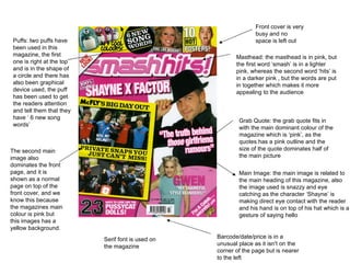
  • 1. Grab Quote: the grab quote fits in with the main dominant colour of the magazine which is ‘pink’, as the quotes has a pink outline and the size of the quote dominates half of the main picture Barcode/date/price is in a unusual place as it isn't on the corner of the page but is nearer to the left Serif font is used on the magazine Masthead: the masthead is in pink, but the first word ‘smash’ is in a lighter pink, whereas the second word ‘hits’ is in a darker pink , but the words are put in together which makes it more appealing to the audience Puffs: two puffs have been used in this magazine, the first one is right at the top and is in the shape of a circle and there has also been graphical device used, the puff has been used to get the readers attention and tell them that they have ‘ 6 new song words’ The second main image also dominates the front page, and it is shown as a normal page on top of the front cover, and we know this because the magazines main colour is pink but this images has a yellow background. Main Image: the main image is related to the main heading of this magazine, also the image used is snazzy and eye catching as the character ‘Shayne’ is making direct eye contact with the reader and his hand is on top of his hat which is a gesture of saying hello Front cover is very busy and no space is left out
  • 2. Footer: the footer tells us more about what the magazine features without looking in the contents page & for every ‘+’ sign the colour is in yellow which is the main dominant colour on the front page Header: the header in this magazine tells us about an event taking place on ‘Wednesday 13’, this would get the readers attention who are aware of the event and want more information on it Masthead: the masthead is going across on the top of the page under the header, it goes well with the magazine as the letters look like they have been smashed and goes well with this ‘rock’ theme magazine, is similar to the ‘Smash Hits’ magazine as the head covers a bit of the masthead Main image: the main image dominates the front cover, and is taken as a medium shot, you can see that the colour of the shirt is red which doesn’t have no effect with the colour of the text of the magazine, but they do go well, Strap line: the strap line fits in with the text colour of the magazine which is yellow, also it is over dramatic with the ‘!’, on the end of the line There are two images on the front cover, the second image is a medium shot of four people who look like they are in a band, this is effective to the audience because they will know that the kerrang magazine would also feature an article on another ‘rock band’ Barcode is in its usual place
  • 3. Masthead: the mast head in this magazine is smaller than the others, but it is still bold, and the colour is red which is also the dominant colour on the magazine There are 5 extra images used with the main image, with anchors to describe to the audience the other musicians the magazine will feature Footer: the footer here tells us more what the magazine will feature, just like the kerrang magazine. It uses / signs whereas kerrang used + signs Header: the header here tells the reader that this magazine is a ‘special’ issue which will attract the audience to the magazine Puff: a puff has been used, similarly to the smash hits magazine , the colour of the puff is red which is the main colour theme of the magazine , the white writing is bold and will attract the reader, there is also another puff next to the barcode but this one is slightly different and graphical techniques have been used to make it glow out Cover line: the cover line in this magazine can be m Main image: the main image dominates the front cover like the other front covers, but this shot was taken live at a event, whereas the celebrity's shots on kerrang and smash hit were taken at a professional studio
  • 4. Logo: the magazine logo is also show on the contents page Title: the word ‘content’ is also featured on the magazine to tell the audience that the magazine features are all on this page. Majority of the contents page is covered with pictures, this is done to focus the audiences attention on the picture so they know there will be an article related to the picture Puffs: puffs are used in the contents page to get the readers attention, as three of the puffs say ‘win’ on it and it will get the audiences attention as they will believe this magazine offers more than I needed Layout: the layout of the contents page is similar to most contents page, it has a ‘ index’ to tell the audience what the magazine features, then on the left hand side of the ‘index’ it has a section with a Grab quote in it to get the readers attention and on the right hand side it is covered with images and cover lines.
  • 5. Issue and date: the contents page doesn’t have the issue or date on it, but this is hardly recognizable to the reader as the contents page has used all of its space Title: the contents page has the title on the bottom of the magazine which is a unusual place to put it whereas the other contents pages have there title at the top, this doesn’t make the contents page stand out to the audience Headline: the magazines headline has used three different fonts and colours, which make it appealing to the audience Colour: the main dominant colour of the contents page is similar to its front cover page as they are both pink Overall contents page is effective as the index column has ‘ Pink’ headings to make it easier to understand Images: the main image doesn’t refer to the front cover of the magazine, as the main image here is ‘west life’ and on the front cover it is ‘Shayne’, this is effective to the audience because if the audience don’t like the main article about ‘Shayne’ they could look at the contents page to see who else might be on there that they would like to hear about Logo: the logo isn't that vibrant compared to the one on the ‘NME’ magazine also the logo is on the right hand side whereas it is on the left hand side for the ‘NME’ magazine
  • 6. There has been smash graphical element used on the title of the ‘contents’, Logo: a logo hasn’t been used on the contents page, whereas the other contents pages have used a logo to make there contents page more lively, however the contents page doesn’t have any free space Index: the index is not in a straight line compared to the other content pages, the index on this page stretches from the left to the right and doesn’t go all the way down Issue and Date: the issue and date is used on the top page similar to the NME contents page, and is put in a appropriate place Images: the main image is also used as the background of the contents page, and alongside this four other images have been used on the top of the contents page Headlines: the headline has a similar smash graphical element used on it Overall the contents page isn't that effective compared to the other content pages, as the layout of the index page isn't that effectual , and overall the contents page looks dark and not vibrant
  • 7. Image: the double spread also has a dominant picture covering the pages, and also has 9 extra small pictures along side with it, the double page spread should have more text in it and less pictures Text: there is only small amount of text used on the double page spread as it is dominated mostly by pictures, this isn't that effective as the audience will want more text to know what the pictures are doing Anchor: there is also anchor used with the images to explain the images better, this is effective as images are not just given out but also interpreted Logo: the logo is also used on the double page spread, most double pages spread wont use the logo but ‘smash hits’ has used the logo to keep on advertising there logo onto the magazine Title Anchor: the title anchor used on the main images is effective and gets the audiences attention, as the magazine shares a day trip with the boy band and this will get the readers attention as it is a sneak peak in the boy bands day out Over all: overall the double page spread is effective, However it has used too many images as other double spread pages on magazines just have one of the side with a image and the rest with text.
  • 8. The double page spread is very busy and no free space is left on it, it has reviews on music DVDs associated with rock, a lot of text has been used on the double page spread and a right amount of images for the audiences like Images: The main image is taken at a rock concert, it is placed on the top of the left hand page and doesn’t cover up the whole magazine, the second image is slightly smaller and placed on the right hand side of the page this rock band are posing for the picture and are making eye contact with reader, the third image is smaller and placed at the bottom of the page near the middle, this image is similar to the Main image as it is taken in a rock concert which is effective to audience as they want to see who were performing live and where? Date: the date has also been used on the double page spread but is hardly visible, the magazine has put the date on the bottom so if the audience wants to see when the magazine was published they would be able to find out without going back to the front cover of the magazine Sub Heading: a sub heading has been used for every review the magazine is doing, the sub heading is Bold & Black which gets to the reader so they know what each review will be about without reading the whole review Just by looking at the double page spread you can tell that this magazine is associated for audiences who are in the ‘Rock’ genre Title: Two titles have been used on the double page spread, both are bold, white and at a large size font, this is effective as it gets the audiences attention on the main article reviews
  • 9. Image: one main image has been used on the double page spread, it is covering most of the left hand side, this is effective as magazine producers can put all there text on the right hand side and have the image associated with it to the left hand side. The artist on the main image is also making direct eye contact with the audience and the picture is taken like he is holding the camera, which will lure the reader in Colour: the dominant colour on this magazine is red, just like the logo of the magazine is red ‘NME’ have chosen to keep the primary colour onto the double page spread Drop Cap: the drop cap of the ‘A’ has been used, and the colour of it is red which is effective as it gets the audiences attention onto the main article straight away Main Title: the main title is bold and has been used with two types of colours black & red, this is effective as it gets attention of the audience and catchy with the word ‘importance’ connotation that the article will be important Two secondary images have also been used, one has been used next to the text with a grab quote but is fairly small, this gets the readers attention as they will look at the picture then read the grab quote.