
Empfohlen
Weitere ähnliche Inhalte
Was ist angesagt?
Was ist angesagt? (20)
Ähnlich wie Front cover analysis
Ähnlich wie Front cover analysis (20)
Mehr von aimeelouisasmith
Kürzlich hochgeladen
Kürzlich hochgeladen (20)
Front cover analysis
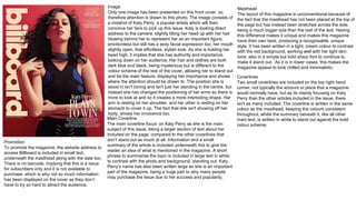
- 1. Masthead The layout of this magazine is unconventional because of the fact that the masthead has not been placed at the top of the page but has instead been stretched across the side, being a much bigger size than the rest of the text. Having this difference makes it unique and makes this magazine have their own twist, producing a recognisable, unique style. It has been written in a light, cream colour to contrast with the red background, working well with her light skin tone, also in a simple but bold sharp font to continue to make it stand out. As it is in lower cases, this makes the magazine appear to look chilled and minimalistic. Promotion To promote the magazine, the website address to access Billboard is included in small text, underneath the masthead along with the date too. There is no barcode, implying that this is a issue for subscribers only and it is not available to purchase, which is why not so much information has been displayed on the cover as they don’t have to try so hard to attract the audience. Main Coverline The main coverline focus’ on Katy Perry as she is the main subject of this issue, being a larger section of text about her included on the page, compared to the other coverlines that don’t stand out as much at all. Information and a small summary of the article is included underneath this to give the reader an idea of what is mentioned in the magazine. A short phrase to summarise the topic is included in large text in white to contrast with the photo and background, standing out. Katy Perry’s name has also been written large as she is an important part of the magazine, being a huge part to why many people may purchase the issue due to her success and popularity. Coverlines Two small coverlines are included on the top right hand corner, not typically the amount or place that a magazine would normally have, but as its mainly focusing on Katy Perry than the other articles included in the issue, there isn't as many included. The coverline is written in the same colour as the masthead, keeping the colours consistent throughout, whilst the summary beneath it, like all other main text, is written in white to stand out against the bold colour scheme. Image Only one image has been presented on this front cover, so therefore attention is drawn to this photo. The image consists of a midshot of Katy Perry, a popular artists which will then convince her fans to pick up this issue. Katy is looking direct address to the camera, slightly tilting her head up with her hair blowing behind her to represent her as an important figure, emotionless but still has a sexy facial expression too; her mouth slightly open, that effortless, stylish look. As she is holding her head high, it implies that she has authority and importance, looking down on her audience. Her hair and clothes are both dark blue and black, being mysterious but is different to the colour scheme of the rest of the cover, allowing her to stand out and be the main feature, displaying her importance and shows where the attention should be drawn to. The position she is stood in isn't boring and isn't just her standing in the centre, but instead she has changed the positioning of her arms so there is more to look at and so it creates a more interesting shape. Her arm is resting on her shoulder, and her other is resting on her stomach to cover it up. The fact that she isn't showing off her body, shows her innocence too.
- 2. Image The image on the front cover is a close up of Tinie Tempah, being full bleed, taking up the whole page to draw the attention to this artist. The background of this image is a very light blue to ensure that it doesn’t draw the attention away from the image. In this photo Tinie Tempah is wearing dark sunglasses to cover most of his face, giving him a mysterious look and also makes him look like he has importance and a high status. This mysterious look will entice the audience and make them want to read more to find out about him, his hands are also included in the image so there is more to look at. He is doing up his top button of his shirt, showing how smart and neat he is in appearance. By his neat and well presented hair cut, this also emphasises how he is a smart young man. However, Tempah has a small earing on his right ear, making him look slightly edgy and gives him a cool look too - This makes him look young and hip, connecting with the younger audience of the magazine. Text The main text consists of a list of artists that are included in this edition. Having this list will give the audience an insight of what kind of artists and the information that they will be able to read about if they buy this issue. This text used is written in a messy, hand writing like font that has also been used for the name of the main artist, keeping this consistent so it doesn’t look random. The colours chosen for this and the other text on the page is black as it contrasts with the background. However, ‘Tinie Tempah’ stands out and is more bold as it is in a white font, being large and is written across the bottom of the image, showing his importance again. This looks like it has been written as an autograph, giving a personal touch which may interest those who are fans as they could feel like they'd connect with the artist. Being able to connect and relate to the artist on the front cover means that it follows the uses and gratifications theory as the reader would be able to identify with this product. Masthead The masthead of this magazine is unconventional as it is not in the centre of the cover, but it is still large and at the top of the page. This masthead is ‘Q’, being written in white in a bold, clear font to stand out from the contrasting, bright red box that it is in. Along with the text, this box frames the artist in the photo and as it is in the left hand corner as apposed to across the top of the cover, this makes the magazines by Q more original and recognisable. Coverline The coverline is a quote that has been presented at the top of the page in a bold font written in capitals to stand out, and is a black font to continue with the text’s colour scheme used across the front cover. Having a light blue box behind this text will make it stand out and be more bold and vibrant, bringing colour to the page to reflect the fun energetic music produced buy this artist. A pink has also been brought into this box to match with the pink shirt the artist is wearing. Another coverline on the page promotes the collector editions magazines, written in the same style with a 3D effect to stand out and make it pop. Layout The layout of this issue isn't particularly structured compared to other magazines, having a slightly messy style to it created by the hand writing like font used. The positioning of the text is slightly more random, not bordering the image so much as there aren't typical cover lines used.
- 3. Image This image of Adele is full bleed and takes up the entire cover, to draw attention to her as she is popular and would attract a crowd and convince people to buy the magazine. As there is only one person in this shot, it implies that she is a solo artist too. Adele has slightly tilted her head, giving the camera direct address to connect and draw in the audience, also displaying how she has authority and power in the music industry. She has been presented as a sexy, young women as her hair is messy, being very 70’s inspired and she is in a stereotypical pose, pouting to look dramatic and flirty. This dramatic mood created could reflect on the music that adel produces, giving the audience an idea of what genre the magazine is. Creating this sexy mood will appeal to the large male audience, as this is the find of style that typically would interest men and entice them. Because of the plain pale blue back ground, all of the attention is drawn to the image and the writing on the front cover, making the artist stand out as much as possible. Masthead On this issue, the masthead consists of ‘Rolling Stone’, written in a 70’s style, reflecting on the image used. A classic red colour has been chosen, being bright and bold so stands out large on the top of the cover, written across the artists forehead. As it is in front of the image, it could suggest that the name of the magazine is the most important section of the magazine, being iconic and easily recognised. A white colour has been traced around the text to make it pop and stand out, also being the same colours of the text so it brings it together and is consistent. Having a black shadow behind the masthead also makes it stand out more than the other text as it looks 3D and shows its importance. Coverlines Having white cover lines makes them stand out from the image behind them so they are easy to read. These are summaries of the most important articles written in the magazine issue, used to entice the audience and make the want to read them as they get an idea of what is in it. The title of these summaries is slightly bigger and bolder, showing what is more important on the cover. Puns and interesting sentences are used, ensuring that the article seems interesting and worth reading. Layout This layout is well structured and has been laid out to make the front cover look neat and well organised so it is easy to read and so it also looks attractive. Having the masthead across the top of the page, the name of the artist at the bottom and the coverlines at the side gives a frame to the image, not covering the main part of it, but draws attention to the centre of the picture, Artist Name Considering that this is a significant part of the front cover, this is the biggest text written. Being across the bottom of the page in a contrasting colour to the background, it makes it easy to read and frames the image again but it is not as bright and bold as the masthead. The few words written underneath this, ‘heartbreak superstar’, gives the audience an idea of who this artist may be, and what the focus of the article written is. As this is quite general, it leaves the audience questioning what this may be referring to so is interesting and mysterious.