Digital C-Type Printing: Revolutionizing The Future Of Photographic Prints
Graphic elements analysis ii
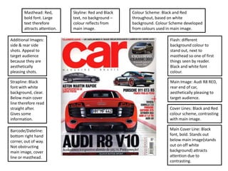
1. Skyline: Red and Black
text, no background –
colour reflects from
main image.
Flash: different
background colour to
stand out, next to
masthead so one of first
things seen by reader.
Black and white font
colour.
Masthead: Red,
bold font. Large
text therefore
attracts attention.
Additional Images:
side & rear side
shots. Appeal to
target audience
because they are
aesthetically
pleasing shots.
Main Image: Audi R8 RED,
rear end of car,
aesthetically pleasing to
target audience.
Cover Lines: Black and Red
colour scheme, contrasting
with main image.
Main Cover Line: Black
font, bold. Stands out
below main image(stands
out on off white
background) attracts
attention due to
contrasting.
Strapline: Black
font with white
background, clear.
Below main cover
line therefore read
straight after.
Gives some
information.
Colour Scheme: Black and Red
throughout, based on white
background. Colour Scheme developed
from colours used in main image.
Barcode/Dateline:
bottom right hand
corner, out of way.
Not obstructing
main image, cover
line or masthead.
2. Skyline: Black background,
orange & white font. Stands
out on background. Orange
theme based on main image.
Screamer: Black outline and
font, orange background
colour based on main image
colours.
Masthead: Large, bold font
type. White with shadow,
stands out more against the
background.
Main Image: Red Ferrari,
Orange McLaren in
background. Moving shot
(blurred wheels and road).
Additional Images: Jeremy
Clarkson in top right corner.
Presenter from the show,
liked by audience therefore
appeals to the target
audience.
Main Cover Line: “SPIDERS”
in much larger font. Rest of
main cover line on black
background with orange
font to match colour
scheme.
Strapline: White font on
dark grey background.
Orange speech marks
attracts attention.
Font Types: Bell MT
Cover Lines: Orange
background with black font.
Contrasting and therefore
more visible.
Colour Scheme: White, black
and orange. Orange based
on second car in main
image. Black and white
contrasting so stands out
more.
Barcode/Dateline: None.
3. Skyline: Red background to match colour
scheme and stand out. White font colour to
contrast on red. Big font for visibility.
Masthead: Yellow
Background, Red font, top
left hand corner. Bold font
type.
Strapline: Black and red
font. Below masthead
therefore easily seen.
Main Cover Line: Very
large, red background and
white font. Bold font type,
across top half of cover.
Main Image: Red Jaguar F-
Type, convertible. Moving
image(blurred wheels).
Additional Cover Lines:
White font on dark
backgrounds, contrasting
therefore visible and clear.
Additional Images: All on
right side of page.
Separated from each other
and main image. Only
focuses on the cars.
Barcode/Dateline: Bottom
right hand corner. Quite
large, takes some space off
of additional image.
Colour Scheme: Red, white
and yellow. Clear colours.
Stand out and contrast with
each other.
Font Types: Blackoak STD,
Arial.
4. Skyline: Orange
background, black font.
Connected to top of
masthead. Clear and
attention grabbing. Also
has an additional image.
Masthead: Orange, fitting
with colour scheme. Bold.
Appealing to audience.
Strapline: just below
masthead. Short &
intriguing. Matches colour
scheme.
Colour Scheme: Mainly
orange. Based around
main image. Also uses
black and white
(contrasting. Also matches
background car in main
image).
Barcode/Dateline: Small.
Bottom left corner.
Isolated. Aligned with an
additional cover line.
Main Cover Line: White,
clear font and just below
masthead. Simple and
intriguing.
Additional Cover Lines:
Bottom left corner.
Excluded from main
image but still obvious.
Stands out on dark
background.
Additional Images: Just
below skyline. Next to
masthead. Obvious and
intriguing.
Font Types: Arial Black,
Big Calson
Screamer: Orange to match colour scheme on
dark background. Contrasts. Black font to stand
out.
5. Skyline: Consists of 4
additional images and
additional cover lines.
Shows a lot of content in
magazine.
Masthead: top of page.
Easily visible, clear and
bold. Red and black font.
Colour Scheme: based on
black, white and red. All
contrast with each other
and bold. Does not
coincide with main image.
Barcode/Dateline: bottom
right hand corner. Avoids
main image and additional
images, text etc. small and
therefore out of the way.
Main Image: Simple, calm
feeling. Lacks excitement
displayed in other
examples. Neutral.
Font Types: Arial black.
Cover Lines: black font.
Clear, tends to be on a
white background. Fits the
colour scheme.
Main Cover Line: White
font. Bold, clear to read and
grabs attention but slightly
bland. More appealing to
age group due to maturity.
Screamer: Gold with white
font. Clear to read and
stands out.
Additional Images: in
skyline and one at bottom
on white background. Clear.
Strapline: within masthead.
‘greatest’ in bold font.